 DayPilot
Overview
The React Scheduler component provides several height modes. We will discuss which modes can be used to display the Scheduler to fill the available space (full screen mode).
The selected Scheduler height mode affects performance (especially the rendering optimizations) and vertical scrollbars.
The attached React project lets you experiment with different height modes and see the effect immediately.
License
Licensed for testing and evaluation purposes. Please see the license agreement included in the sample project. You can use the source code of the tutorial if you are a licensed user of DayPilot Pro for JavaScript.
How to set the React Scheduler height?
You can set the Scheduler height using two properties:
The heightSpec property sets the height mode.
The height property sets the pixel height of the grid (excluding time headers) for some
"Fixed"and"Max"height modes.
The default mode is "Max" which extends the height automatically according to the grid content until the height value is reached. Then, a vertical scrollbar is added.
The "Max" mode works well for testing purposes because it doesn’t have any requirements on the page layout but you will probably want tighter integration into your application.
How to extend the React Scheduler height automatically?

You can switch the heightSpec mode to "Auto". This mode will extend the height automatically and you never see a vertical scrollbar in the Scheduler. Normally, there is no reason to use this mode unless you display a very small data set (a small number of rows).
How to avoid a duplicate vertical scrollbar?

If you use the React Scheduler on a long page you might see two vertical scrollbars - the page scrollbar and the Scheduler component scrollbar. This doesn’t make a good user experience - it is confusing and uncomfortable. When scrolling the page, the Scheduler time header can get out of the browser viewport.
The best way is to arrange the page element using position: absolute and fill the screen. This way the page scrollbar is never displayed and the users can use the Scheduler scrollbar to access the grid.
How does the React Scheduler height affect performance?
The React Scheduler component optimizes the content rendering. It only renders the data for the Scheduler viewport. If you make the the Scheduler height grow beyond the screen size (browser viewport) it will not be able to apply the optimizations. All data will have to render at once. See also the list of most common performance mistakes.
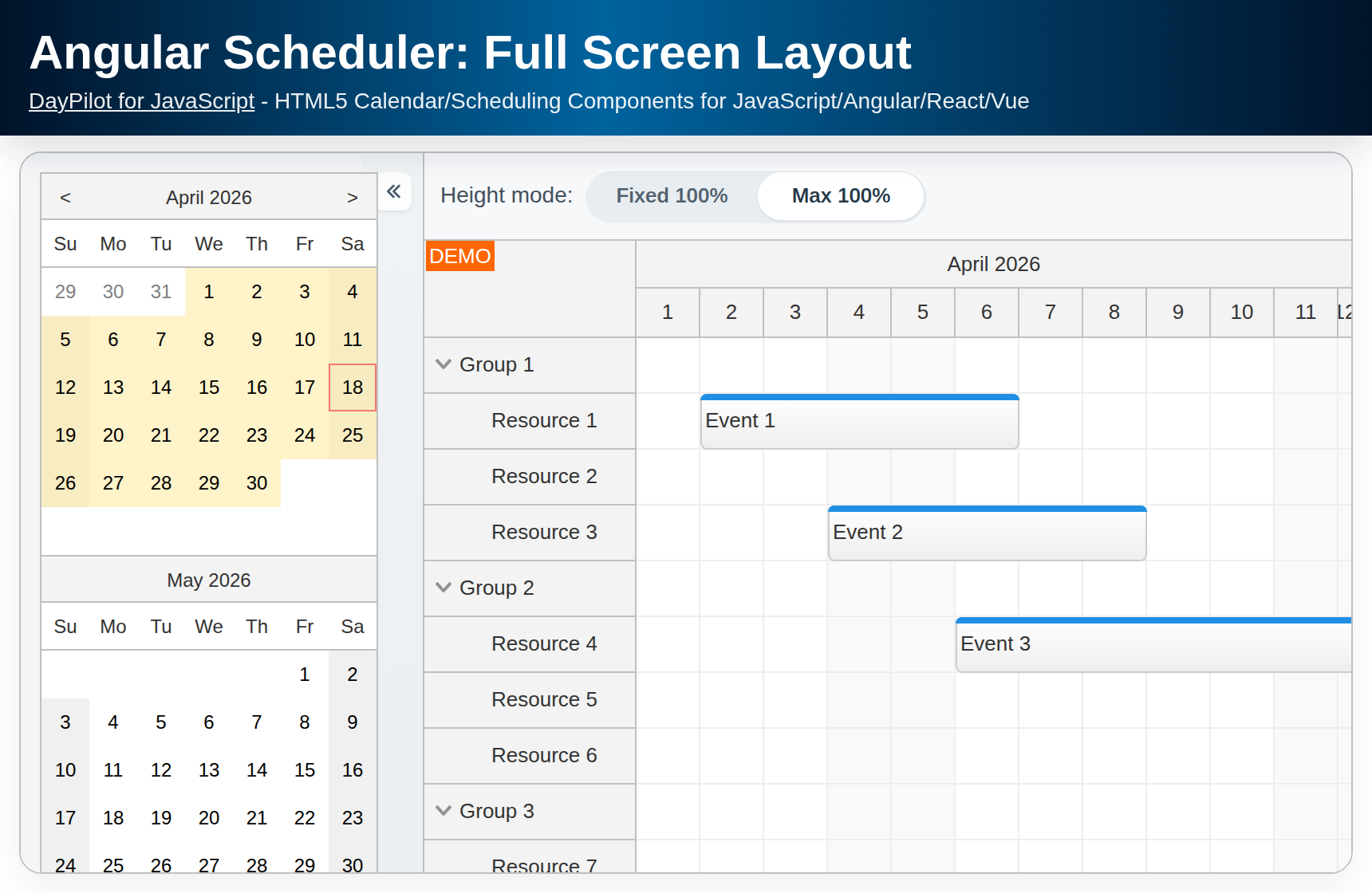
How to fill the screen with the React Scheduler grid (full screen mode)?
First, you need to anchor the parent element. The dimensions need be determined by the external boundaries and not the auto-growing content.
JSX
<div style={{position: "absolute", top: "50px", left: "0px", right: "0px", bottom: "0px", borderTop: "1px solid #ccc", overflow:"hidden"}}>
  <DayPilotScheduler
    {...config}
    ref={component => {
      this.scheduler = component && component.control;
    }}
  />
  <div style={{borderBottom: "1px solid #ccc"}}></div>
</div>
There are two ways to fill the parent element with the Scheduler grid:
1. Always fill the available screen space

The Parent100Pct mode will always fill the available space. If there are only a few rows, the Scheduler will display a blank space below the last one. The horizontal scrollbar will be displayed at the very bottom, below the blank space.
It is useful to hide the main Scheduler border in this case. Usually the layout will include borders between page panels or the Scheduler will touch the browser borders. You can hide the border using hideBorderFor100PctHeight property.
In the following example, we add the top border to the parent element. There will be no border at the bottom as the Scheduler extends to the browser window border.
<div style={{position: "absolute", top: "50px", left: "0px", right: "0px", bottom: "0px", borderTop: "1px solid #ccc"}}>
<DayPilotScheduler
{...config}
heightSpec={"Parent100Pct"}
hideBorderFor100PctHeight={true}
ref={component => {
this.scheduler = component && component.control;
}}
/>
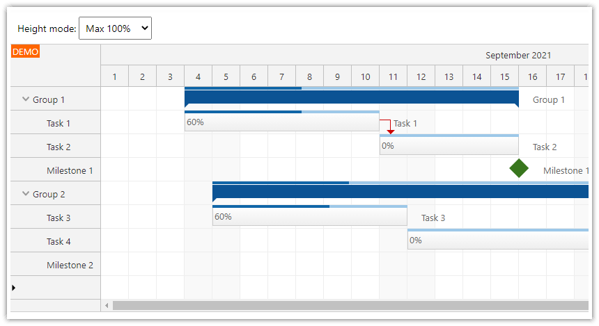
</div>2. Increase the height until the available screen space is filled

The Max100Pct mode will set the height according to the content (the number of Scheduler rows). If the height reaches the available space, a vertical scrollbar is added. If there are not enough rows to fill the available space, the horizontal scrollbar will be displayed right below the last row.
In this example, we use hideBorderFor100PctHeight property to hide the main React Scheduler border like in the Parent100Pct example. To add the bottom border (which may be necessary if the height is smaller than the available space), we add a special div below the Scheduler and set the parent overflow style to hidden. This will ensure that the bottom border will be visible when necessary but it won’t add an additional vertical scrollbar to the parent element.
<div style={{position: "absolute", top: "50px", left: "0px", right: "0px", bottom: "0px", borderTop: "1px solid #ccc", overflow:"hidden"}}>
  <DayPilotScheduler
    {...config}
    heightSpec={"Max100Pct"}
    hideBorderFor100PctHeight={true}
    ref={component => {
      this.scheduler = component && component.control;
    }}
  />
  <div style={{borderBottom: "1px solid #ccc"}}></div>
</div>
You can test all the height modes using the attached React project.