 DayPilot
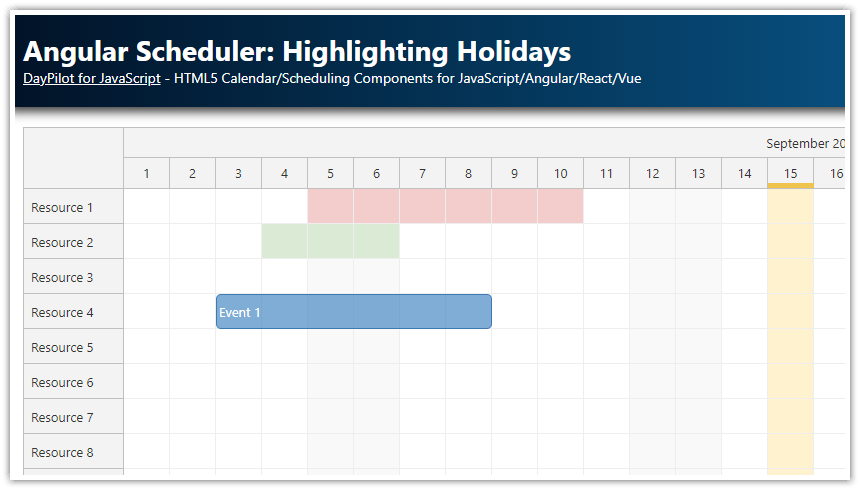
Features
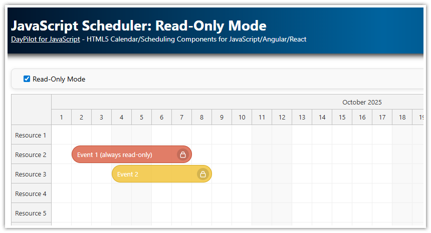
A checkbox switches the Angular Scheduler component to read-only mode by disabling all actions
Selected context menu items are disabled
Active area icons with context-specific actions (row editing) are hidden
Uses DayPilot Lite for JavaScript (open-source)
Built using Angular 21 with standalone components and zoneless change detection
For an introduction to Scheduler installation and configuration, please see the basic tutorial:
License
Licensed under the Apache License 2.0. See the license file included in the sample project for details.
Which Drag and Drop Actions Are Enabled by Default?

By default, the following actions are enabled in the Scheduler:
drag and drop event moving
drag and drop event resizing
drag and drop time range selecting
When a user completes event moving or resizing, the Scheduler is updated automatically to display the new event position (the default handling type is set to "Update"). Time range selection stays active but nothing else happens by default (event creating has to be mapped using the onTimeRangeSelected event handler).
The following actions are also enabled by default, but there is no default action specified:
time range context menu (on right click)
event clicking (single click, right click, double click)
row header clicking
How to Switch Angular Scheduler to Read-Only Mode?

You can switch the Angular Scheduler to read-only mode by disabling individual actions.
The following code toggles all user actions. When activating the read-only mode, the current values are stored in the this.original property. The original values are then restored when the read-only mode is deactivated.
The Scheduler config uses an Angular signal, so changes are applied using this.config.update():
import {Component, ViewChild, AfterViewInit, signal} from '@angular/core';
import {FormsModule} from '@angular/forms';
import {DayPilot, DayPilotModule, DayPilotSchedulerComponent} from '@daypilot/daypilot-lite-angular';
import {DataService} from './data.service';

@Component({
  selector: 'scheduler-component',
  standalone: true,
  imports: [DayPilotModule, FormsModule],
  providers: [DataService],
  template: `
    <div class="space">
      <label for="readonly"><input type="checkbox" id="readonly" [(ngModel)]="readonly" (change)="changed()"> Read-Only</label>
    </div>
    <daypilot-scheduler [config]="config" [events]="events" #scheduler></daypilot-scheduler>
  `,
  styles: [``]
})
export class SchedulerComponent implements AfterViewInit {

  @ViewChild('scheduler')
  scheduler!: DayPilotSchedulerComponent;

  readonly: boolean = false;

  events = signal<DayPilot.EventData[]>([]);

  config = signal<DayPilot.SchedulerConfig>({
    timeHeaders: [
      {groupBy: "Month", format: "MMMM yyyy"},
      {groupBy: "Day", format: "d"}
    ],
    eventHeight: 40,
    scale: "Day",
    days: 60,
    startDate: DayPilot.Date.today().firstDayOfMonth(),
    rowHeaderWidth: 120,
    eventDeleteHandling: "Update",
    contextMenu: new DayPilot.Menu({
      items: [
        {
          text: "Edit",
          onClick: async args => {
            const e = args.source;
            const form = [
              {name: "Name", id: "text", type: "text"},
              {name: "Start", id: "start", type: "date"},
              {name: "End", id: "end", type: "date"},
            ];
            const modal = await DayPilot.Modal.form(form, e.data);
            if (modal.canceled) { return; }
            this.scheduler.control.events.update(modal.result);
          }
        },
        {
          text: "Details",
          onClick: async args => {
            const e = args.source;
            const text = DayPilot.Util.escapeHtml(e.data.text);
            await DayPilot.Modal.alert(`Event details: ${text}`);
          }
        }
      ],
      onShow: args => {
        args.menu.items![0].disabled = this.readonly;
      }
    }),
    onTimeRangeSelected: async (args) => {
      const dp = args.control;
      const modal = await DayPilot.Modal.prompt("Create a new event:", "Event 1");
      dp.clearSelection();
      if (modal.canceled) { return; }
      dp.events.add({
        start: args.start,
        end: args.end,
        id: DayPilot.guid(),
        resource: args.resource,
        text: modal.result,
        barColor: "#38761d"
      });
    },
    onBeforeRowHeaderRender: args => {
      if (!this.readonly) {
        args.row.areas = [
          {
            right: 3,
            top: 13,
            width: 14,
            height: 14,
            style: "cursor: pointer",
            fontColor: "#aaa",
            symbol: "icons/daypilot.svg#edit",
            visibility: "Hover",
            onClick: async args => {
              const form = [
                {name: "Name", id: "name", type: "text"},
              ];
              const row = args.source;
              const data = row.data;
              const modal = await DayPilot.Modal.form(form, data);
              if (modal.canceled) { return; }
              this.scheduler.control.rows.update(modal.result);
            }
          }
        ];
      }
    },
    onEventClick: args => {
      DayPilot.Modal.prompt("Event name:", args.e.data.text).then(modal => {
        if (modal.canceled) {
          return;
        }
        args.e.data.text = modal.result;
        this.scheduler.control.events.update(args.e);
      });
    }
  });

  constructor(private ds: DataService) {
  }

  ngAfterViewInit(): void {
    this.ds.getResources().subscribe(result => {
      this.config.update(c => ({...c, resources: result}));
    });

    const from = this.scheduler.control.visibleStart();
    const to = this.scheduler.control.visibleEnd();
    this.ds.getEvents(from, to).subscribe(result => {
      this.events.set(result);
    });
  }

  private original: Record<string, any> = {};

  changed(): void {
    const properties = [
      "eventClickHandling",
      "eventDeleteHandling",
      "eventMoveHandling",
      "eventResizeHandling",
      "rowClickHandling",
      "timeRangeClickHandling",
      "timeRangeSelectedHandling",
    ];

    if (this.readonly) {
      this.original = {};
      properties.forEach(name => {
        this.original[name] = (this.scheduler.control as any)[name];
      });
      this.config.update(c => {
        const patch: any = {};
        properties.forEach(name => patch[name] = "Disabled");
        return {...c, ...patch};
      });
      this.scheduler.control.clearSelection();
    } else {
      this.config.update(c => {
        const patch: any = {};
        properties.forEach(name => patch[name] = this.original[name]);
        return {...c, ...patch};
      });
    }
  }
}
How to Disable Scheduler Context Menu Items?
Event context menu in "edit" mode:

Event context menu in "read-only" mode:

The Scheduler event context menu supports an onShow() event handler that lets you customize the context menu properties and items in runtime depending on the current application state. In this case, the "Edit" item opens a modal dialog (DayPilot.Modal.form()) for editing the event properties and the "Details" item displays the event name. The "Edit" menu item is disabled when the read-only checkbox is active:
config = signal<DayPilot.SchedulerConfig>({
  // ...
  contextMenu: new DayPilot.Menu({
    items: [
      {
        text: "Edit",
        onClick: async args => {
          const e = args.source;
          const form = [
            {name: "Name", id: "text", type: "text"},
            {name: "Start", id: "start", type: "date"},
            {name: "End", id: "end", type: "date"},
          ];
          const modal = await DayPilot.Modal.form(form, e.data);
          if (modal.canceled) { return; }
          this.scheduler.control.events.update(modal.result);
        }
      },
      {
        text: "Details",
        onClick: async args => {
          const e = args.source;
          const text = DayPilot.Util.escapeHtml(e.data.text);
          await DayPilot.Modal.alert(`Event details: ${text}`);
        }
      }
    ],
    onShow: args => {
      args.menu.items![0].disabled = this.readonly;
    }
  }),
});
How to Disable Row Header Active Areas?
If you add any editing capabilities using active areas, they need to be turned off/hidden as well.
Our example adds a row header active area that opens a modal dialog for editing the row name using DayPilot.Modal.form():

In the read-only mode, the active area is not visible:

config = signal<DayPilot.SchedulerConfig>({
  // ...
  onBeforeRowHeaderRender: args => {
    if (!this.readonly) {
      args.row.areas = [
        {
          right: 3,
          top: 13,
          width: 14,
          height: 14,
          style: "cursor: pointer",
          fontColor: "#aaa",
          symbol: "icons/daypilot.svg#edit",
          visibility: "Hover",
          onClick: async args => {
            const form = [
              {name: "Name", id: "name", type: "text"},
            ];
            const row = args.source;
            const data = row.data;
            const modal = await DayPilot.Modal.form(form, data);
            if (modal.canceled) { return; }
            this.scheduler.control.rows.update(modal.result);
          }
        }
      ];
    }
  }
  // ...
});
History
March 21, 2026: Upgraded to Angular 21 (standalone components, zoneless change detection, signals); switched from DayPilot Pro to DayPilot Lite (open-source)
March 3, 2020: Upgraded to Angular 13, DayPilot Pro for JavaScript 2022.1
August 31, 2020: Upgraded to Angular 10, DayPilot Pro for JavaScript 2020.3; event deleting and editing added
June 13, 2018: Upgraded to Angular 6, DayPilot Pro for JavaScript 2018.2.3297
January 19, 2017: Initial release (Angular 2)