 DayPilot
")
Overview
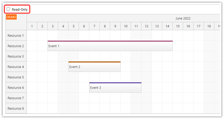
The JavaScript Calendar component supports drag-and-drop operations (event moving, resizing, creation) which are enabled by default.
You can disable the drag and drop operations globally or for selected events.
You can also change the read-only/edit mode on the fly.
This project includes the open-source version of the DayPilot scheduling library.
For an introduction to using the JavaScript Calendar and configuring it for your own application, please see the HTML5/JavaScript Event Calendar (Open-Source).
License
Apache License 2.0
Toggling Read-Only and Edit Mode in the JavaScript Calendar

Let’s have the following minimal JavaScript Calendar component configuration.
HTML:
<!-- calendar placeholder -->
<div id="calendar"></div>
JavaScript:
const calendar = new DayPilot.Calendar("dp", {
  viewType: "Week",
  // ...
});
This calendar instance displays events in a standard week view.
By default, all drag-and-drop actions (e.g., event moving) are enabled. To handle them in your code, you just need to add the corresponding event handlers.
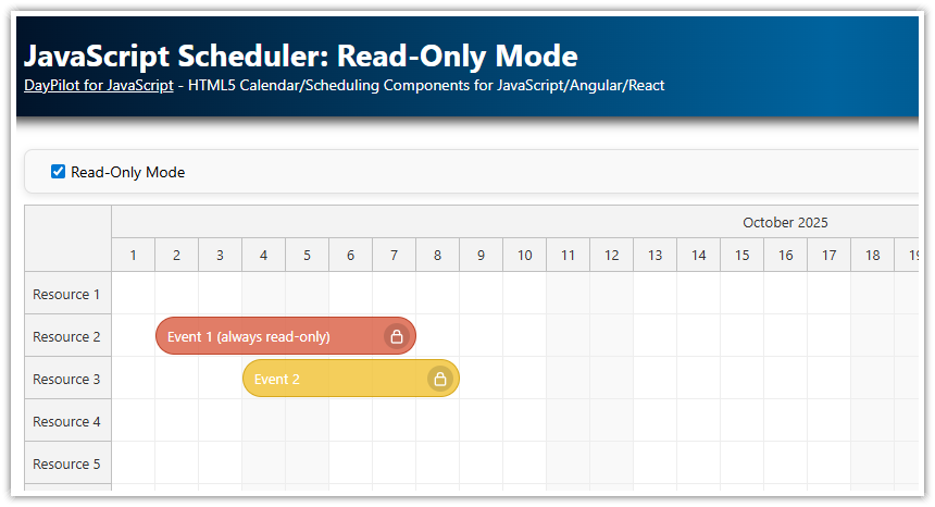
Now we add a toggle switch that will let users enable or disable the read-only mode. This toggle switch is implemented using the standard checkbox control (<input type="checkbox">) and styled using CSS to look like a toggle.
<label class="switch-container">
  <span class="switch-text">Read-only Mode</span>
  <div class="switch">
    <input type="checkbox" id="readonly" />
    <span class="slider round"></span>
  </div>
</label>
You can find the switch CSS in the switch.css file in the attached project.
We also add an event handler that updates the calendar and sets the event handling modes for all related events to "Disabled". :
This will turn on read-only mode, disabling user actions for all events.
addEventHandlers() {
  this.elements.readonly.addEventListener("change", (ev) => {
    const readonly = ev.target.checked;
    const params = {
      eventMoveHandling: readonly ? "Disabled" : "Update",
      eventResizeHandling: readonly ? "Disabled" : "Update",
      timeRangeSelectedHandling: readonly ? "Disabled" : "Enabled",
      eventClickHandling: readonly ? "Disabled" : "Enabled"
    };
    calendar.update(params);
  });
},
Setting the Read-Only Mode for Selected Events

It is possible to disable drag-and-drop action for selected events.
To customize the event behavior, use the onBeforeEventRender event handler.
The following onBeforeEventRender implementation disables event moving, resizing, and clicking for events that have the custom disabled property set to true.
const calendar = new DayPilot.Calendar("calendar", {
  viewType: "Week",
  onBeforeEventRender: (args) => {

    // ...

    if (args.data.disabled) {
      args.data.moveDisabled = true;
      args.data.resizeDisabled = true;
      args.data.clickDisabled = true;
    }

    // ...

  },

  // ...

});
This is what an event data object looks like for a read-only event:
loadData() {
  const firstDay = DayPilot.Date.today().firstDayOfWeek();
  const events = [
    // ...
    {
      id: "3",
      start: firstDay.addDays(3).addHours(10),
      end: firstDay.addDays(3).addHours(12),
      text: "Event 3",
      disabled: true  // custom property
    }
  ];
  calendar.update({events});
}
Displaying a Lock Icon for Read-Only Events

To make it clear that an event is read-only, we add a padlock icon to the upper-right corner.
The icon can be added in the onBeforeEventRender handler using an active area. The padlock icon is defined in the daypilot.svg icon package as a SVG symbol (see a preview of all available SVG symbols).
onBeforeEventRender: (args) => {

  args.data.areas = [];

  if (args.data.disabled) {
    args.data.moveDisabled = true;
    args.data.resizeDisabled = true;
    args.data.clickDisabled = true;
  }

  const readonly = app.elements.readonly.checked || args.data.disabled;
  if (readonly) {
    args.data.areas.push({
      right: 3,
      top: 3,
      width: 18,
      height: 18,
      fontColor: "#555555",
      symbol: "./icons/daypilot.svg#padlock"
    });
  }
}
Full Source Code
Here you can find the full source code of our application that toggles between the read-only and edit modes of the JavaScript calendar component.
The HTML (index.html) defines the Calendar placeholder and the toggle switch:
<!DOCTYPE html>
<html>
<head>
  <meta charset="utf-8"/>
  <meta name="viewport" content="width=device-width, initial-scale=1">
  <title>JavaScript Calendar in Read-Only Mode (Open-Source)</title>

  <style>
    p, body, td, input, select, button { font-family: -apple-system,system-ui,BlinkMacSystemFont,'Segoe UI',Roboto,'Helvetica Neue',Arial,sans-serif; font-size: 14px; }
    body { padding: 0px; margin: 0px; background-color: #ffffff; }
    a { color: #1155a3; }
    .space { margin: 10px 0px 10px 0px; }
    .header { background: #003267; background: linear-gradient(to right, #011329 0%,#00639e 44%,#011329 100%); padding:20px 10px; color: white; box-shadow: 0px 0px 10px 5px rgba(0,0,0,0.75); }
    .header a { color: white; }
    .header h1 a { text-decoration: none; }
    .header h1 { padding: 0px; margin: 0px; }
    .main { padding: 10px; margin-top: 10px; }
    .generated { color: #999; }
    .generated a { color: #999; }
  </style>

  <link rel="stylesheet" href="./css/switch.css" />
  <link rel="stylesheet" href="./css/toolbar.css" />

</head>
<body>
<div class="header">
  <h1><a href='https://code.daypilot.org/23975/javascript-calendar-in-read-only-mode-open-source'>JavaScript Calendar in Read-Only Mode (Open-Source)</a></h1>
  <div><a href="https://javascript.daypilot.org/">DayPilot for JavaScript</a> - HTML5 Calendar/Scheduling Components for JavaScript/Angular/React/Vue</div>
</div>

<div class="main">
  <div class="toolbar">
    <label class="switch-container">
      <span class="switch-text">Read-only Mode</span>
      <div class="switch">
        <input type="checkbox" id="readonly" />
        <span class="slider round"></span>
      </div>
    </label>
  </div>
  <div id="dp"></div>
  <div class="generated">Generated using <a href="https://builder.daypilot.org/">DayPilot UI Builder</a>.</div>
</div>

<script src="app.js"></script>

</body>
</html>
The JavaScript (app.js) initializes and configues the Calendar and defines the event listener for the toggle switch:
import {DayPilot} from "@daypilot/daypilot-lite-javascript";

const calendar = new DayPilot.Calendar("dp", {
  viewType: "Week",
  timeRangeSelectedHandling: "Enabled",
  eventBorderRadius: 10,
  durationBarVisible: false,
  onTimeRangeSelected: async (args) => {
    const modal = await DayPilot.Modal.prompt("Create a new event:", "Event 1");
    const calendar = args.control;
    calendar.clearSelection();
    if (modal.canceled) { return; }
    calendar.events.add({
      start: args.start,
      end: args.end,
      id: DayPilot.guid(),
      text: modal.result
    });
  },
  onEventClick: async (args) => {
    const modal = await DayPilot.Modal.prompt("Update event text:", args.e.data.text);
    if (modal.canceled) { return; }
    args.e.data.text = modal.result;
    calendar.events.update(args.e);
  },
  onBeforeEventRender: (args) => {
    args.data.backColor = "#ffcc66c0";
    args.data.borderColor = "darker";
    args.data.html = "";

    args.data.areas = [{
      left: 0,
      top: 0,
      right: 0,
      height: 24,
      style: "font-size: 13px; text-align: center;",
      fontColor: "#ffffff",
      backColor: "#ec9140c0",
      padding: 3,
      text: args.data.text,
    }];

    if (args.data.disabled) {
      args.data.moveDisabled = true;
      args.data.resizeDisabled = true;
      args.data.clickDisabled = true;
    }

    const readonly = app.elements.readonly.checked || args.data.disabled;
    if (readonly) {
      args.data.areas.push({
        right: 3,
        top: 3,
        width: 18,
        height: 18,
        fontColor: "#555555",
        symbol: "./icons/daypilot.svg#padlock"
      });
    }
  }
});
calendar.init();

const app = {
  elements: {
    readonly: document.getElementById("readonly")
  },
  loadData() {
    const firstDay = DayPilot.Date.today().firstDayOfWeek();
    const events = [
      {
        id: "1",
        start: firstDay.addDays(1).addHours(10),
        end: firstDay.addDays(1).addHours(12),
        text: "Event 1"
      },
      {
        id: "2",
        start: firstDay.addDays(2).addHours(10),
        end: firstDay.addDays(2).addHours(13),
        text: "Event 2"
      },
      {
        id: "3",
        start: firstDay.addDays(3).addHours(10),
        end: firstDay.addDays(3).addHours(12),
        text: "Event 3",
        disabled: true
      }
    ];
    calendar.update({events});
  },
  addEventHandlers() {
    this.elements.readonly.addEventListener("change", (ev) => {
      const readonly = ev.target.checked;
      const params = {
        eventMoveHandling: readonly ? "Disabled" : "Update",
        eventResizeHandling: readonly ? "Disabled" : "Update",
        timeRangeSelectedHandling: readonly ? "Disabled" : "Enabled",
        eventClickHandling: readonly ? "Disabled" : "Enabled"
      };
      calendar.update(params);
    });
  },
  init() {
    this.loadData();
    this.addEventHandlers();
  }
};
app.init();
You can download the full NPM project using the link at the top of the tutorial.