 DayPilot
")
Overview
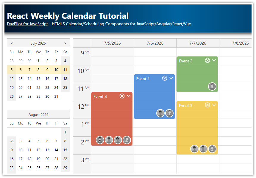
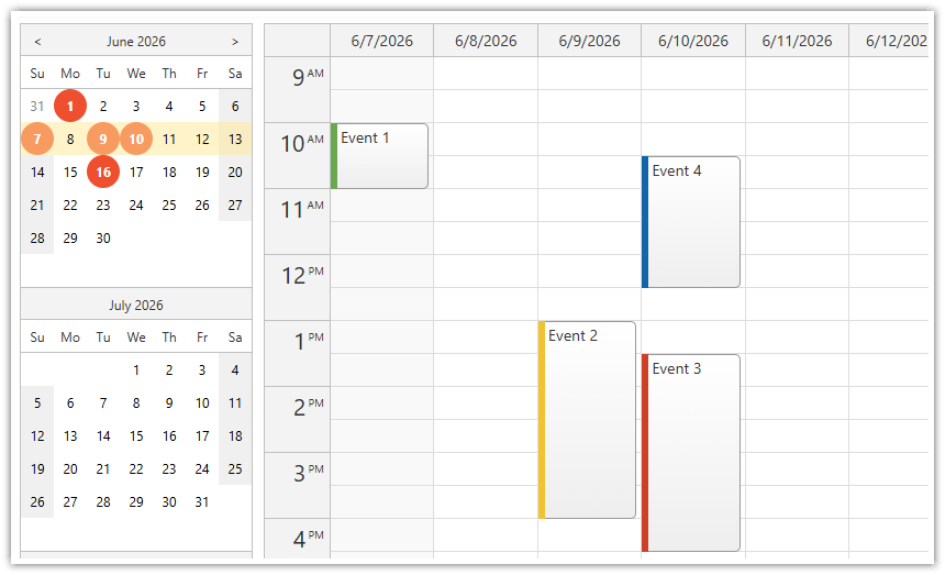
Use a date picker to select the day/week displayed by the React Calendar component
You can bind the date picker to a custom element that displays the current date. This element will be updated automatically on every change.
Detect date changes and change the Calendar view using
onTimeRangeSelectedevent handler.You can replace the “Change date” button with an icon or any other element.
The React project uses the Calendar and DatePicker components from DayPilot Lite - an open-source calendar/scheduling library.
How to Display a Toolbar with Selected Date above the Calendar

The Calendar component in the attached React project uses the following JSX to display a weekly calendar and a toolbar with the selected date:
return (
  <div>
    <div className="toolbar">
      <span ref={dateRef} style={{display: "inline-block"}}></span>{' '}
      <button onClick={changeDate}>Change date</button>
    </div>

    <DayPilotCalendar
      ref={calendarRef}
      viewType="Week"
      startDate={startDate}
      events={events}
      ...
    />
  </div>
);
The selected date is displayed using a <span> element:
<span ref={this.dateRef}></span>The <span> element can be empty. The linked date picker will render the selected date automatically during initialization.
Next to the <span> with the date, there is a “Change date” button lets users change the selected date. The <button> fires a changeDate() method on click:
<button onClick={ev => this.changeDate()}>Change date</button>The next step is to activate the date picker. In componentDidMount() handler, create a new instance of DayPilot.DatePicker:
const dateRef = useRef(null);
const datePickerRef = useRef(null);

const [startDate, setStartDate] = useState('2026-09-07');

// ...

useEffect(() => {

  datePickerRef.current = new DayPilot.DatePicker({
    target: dateRef.current,
    pattern: 'MMMM d, yyyy',
    date: '2026-09-07',
    onTimeRangeSelected: (args) => {
      setStartDate(args.start);
    },
  });

}, []);
Note the key configuration properties:
The target property specifies the target element that displays the date. It accepts an element id or a DOM component.
The pattern property specifies the date format (please see DayPilot.Date.toString() documentation for pattern elements). By default, the date picker uses
"en-us"locale to format the date - you can set a different culture using locale property if needed.The date property sets the initial date. If you don’t specify it, the date picker will use today.
The onTimeRangeSelected handler is fired when the selected date changes. We use the event handler to change the
startDatestate variable. This updates the Calendar component automatically.
The changeDate() function activates the date picker:
const changeDate = () => {
  datePickerRef.current?.show();
};
As soon as a user selects a new date, the date picker updates the target <span> in the toolbar and also load the corresponding week in the React Calendar component.
Customize the Button

You can replace the button with a calendar icon or any other element. You only need to make sure that it activates the the date picker using onClick event handler.
You can also use the target element itself as the date picker trigger. Example:
return (
  <div>
    <div className="toolbar">
      <button ref={dateRef} onClick={changeDate}>Change date</button>
    </div>

    <DayPilotCalendar
      ref={calendarRef}
      viewType="Week"
      ...
    />
  </div>
);