DayPilot
| Demo | |
|---|---|
| Downloads | |
| Repository | |
| Languages | JavaScript |
| Code License | Apache License 2.0 (Open-Source) |
Overview
The JavaScript Scheduler displays resources in rows and dates along a horizontal timeline. This client-side example uses DayPilot Lite and adds visible controls for touch users: resize grips, an event menu, and a tap-to-edit dialog. Single-row event pills leave the body available for native tap-and-hold movement.
| Action | Touch | Mouse |
|---|---|---|
| Create one event | Tap an empty day | Click an empty day |
| Select several days | Hold an empty cell, then drag | Drag across empty cells |
| Move | Hold the event body, then drag | Drag the event body |
| Resize | Drag a visible edge grip | Drag a visible edge grip |
| Edit or delete | Tap the event or its menu button | Click the event or its menu button |
The sample keeps changes in memory; reloading restores the example events. Run npm ci in the downloaded project, then npm run dev. Use npm run build to create a production build.
License
DayPilot Lite and this sample are available under the Apache License 2.0. See the licensing information included in the download. Learn more about DayPilot for JavaScript and its open-source edition.
1. Viewport and Scheduler Layout
The viewport meta tag makes the page use the device's screen width:
<meta name="viewport" content="width=device-width, initial-scale=1">The npm entry point imports DayPilot and the sample stylesheet. The Scheduler starts at the beginning of the current month, with month/day headers and 72-pixel day cells. The timeline scrolls horizontally when it does not fit; the resource column stays visible.
import {DayPilot} from "@daypilot/daypilot-lite-javascript";
import "./style.css";

const dp = new DayPilot.Scheduler("dp", {
  startDate: DayPilot.Date.today().firstDayOfMonth(),
  days: DayPilot.Date.today().daysInMonth(),
  scale: "Day",
  cellWidth: 72,
  timeHeaders: [{groupBy: "Month"}, {groupBy: "Day", format: "d"}],
  rowHeaderWidth: 100,
  eventHeight: 48,
  eventBorderRadius: 24,
  durationBarVisible: false,
  eventTextWrappingEnabled: false,
  eventPadding: "0 12px",
  rowMarginTop: 10,
  rowMarginBottom: 10,
  eventMoveHandling: "Update",
  eventResizeHandling: "Update",
  eventTapAndHoldHandling: "Move",
  tapAndHoldTimeout: 300,
  onEventClick: args => app.edit(args.e),
  // ...
});
dp.init();
The dp element in index.html hosts the Scheduler. After initialization, app.init() loads the resources and sample events. Each event is 48 pixels high, with rounded ends and its normal text label on a single line. One-day events remain wide enough to read as timeline bars.
On a phone, swipe horizontally over the timeline to reach other dates. Tap an event to edit it when its resize grip or menu lies outside the visible area.
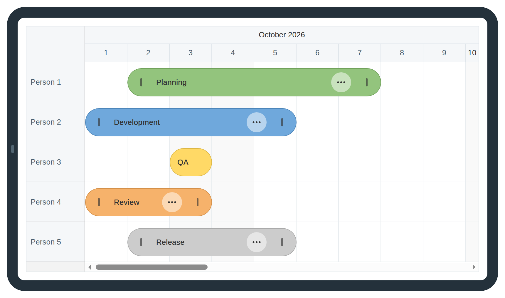
The resource names stay beside the horizontally scrollable timeline. Short events use the same editor as longer events.
2. Creating Events
Tap an empty day cell to create a one-day event. To select several days on touch, hold an empty cell and drag across the grid. With a mouse, drag immediately. The time-range selection handler in src/app.js receives the selected start, end, and resource:
const dp = new DayPilot.Scheduler("dp", {
  // ...
  onTimeRangeSelected: args => {
    dp.clearSelection();
    app.edit(null, {start: args.start, end: args.end, resource: args.resource});
  },
  // ...
});
The handler clears the selection before opening the shared editor. Save adds an event using dp.events.add() and a new DayPilot.guid(). Cancel leaves the schedule unchanged.
The end date is exclusive: an event starting October 3 and ending October 5 occupies October 3 and 4. The editor labels the field End (exclusive) so the date range is explicit.
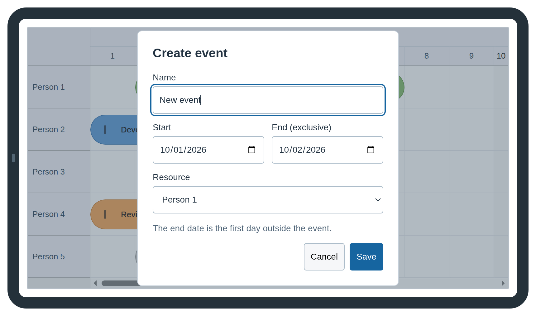
Creation and editing share the same form. The selected cells supply the initial dates and resource.
3. Moving Events on Touch Devices
The built-in move gesture starts when you hold the event body for 300 milliseconds. Drag to a new date or resource, then release. The tapAndHoldTimeout setting controls the delay; eventTapAndHoldHandling selects moving for the hold gesture.
Hold the label or another part of the event body away from the resize grips and action button. Desktop users can drag the body immediately. The Scheduler displays its normal drag shadow and updates the dates and resource when the event is dropped.
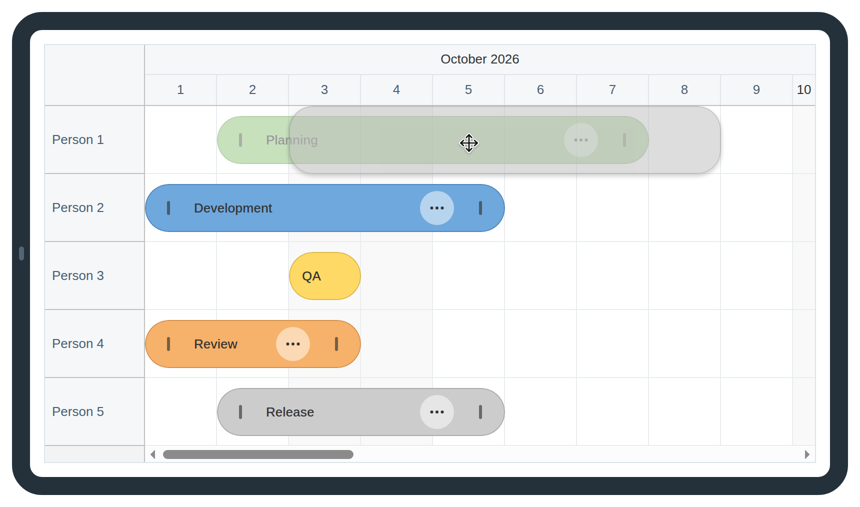
The shadow shows the proposed position. The cursor marks the current desktop drag hotspot; touch uses the same destination feedback after the hold gesture.
4. Resizing Events and Arranging the Controls
Drag the left grip to change the start, or the right grip to change the exclusive end. Both grips start resizing immediately on touch and desktop. Tap the event instead when you want to enter exact dates in the editor.
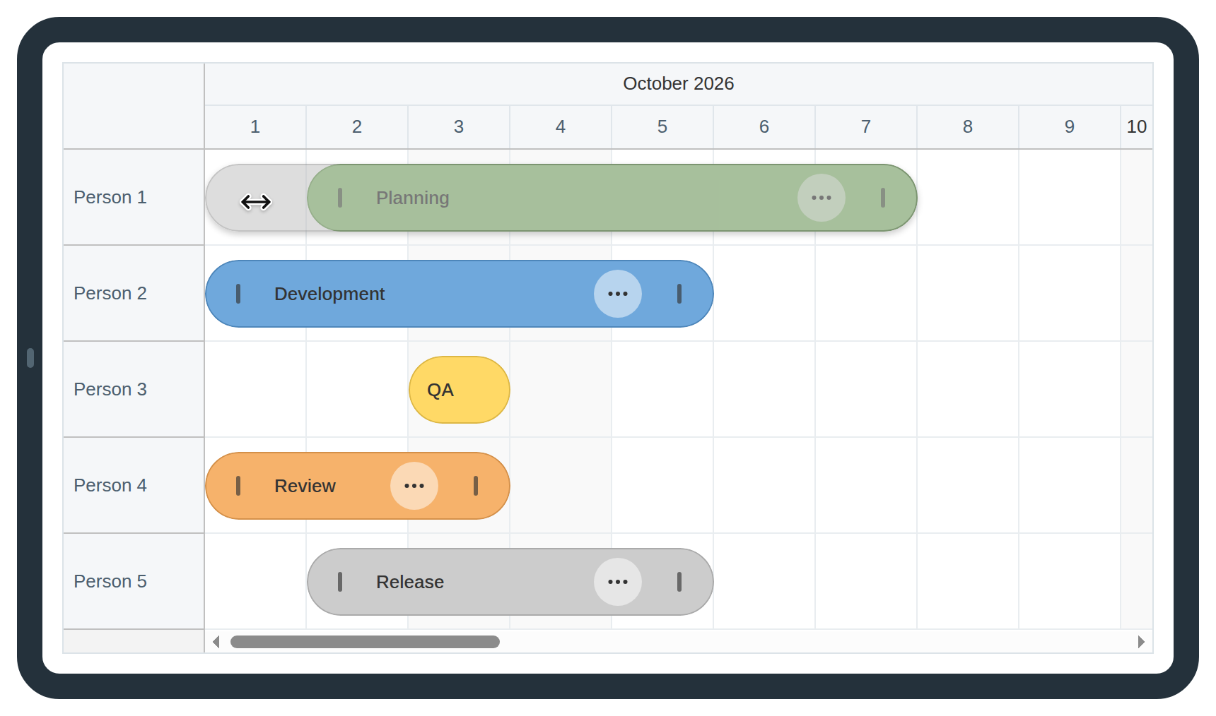
The left resize grip changes the start while keeping the end fixed.
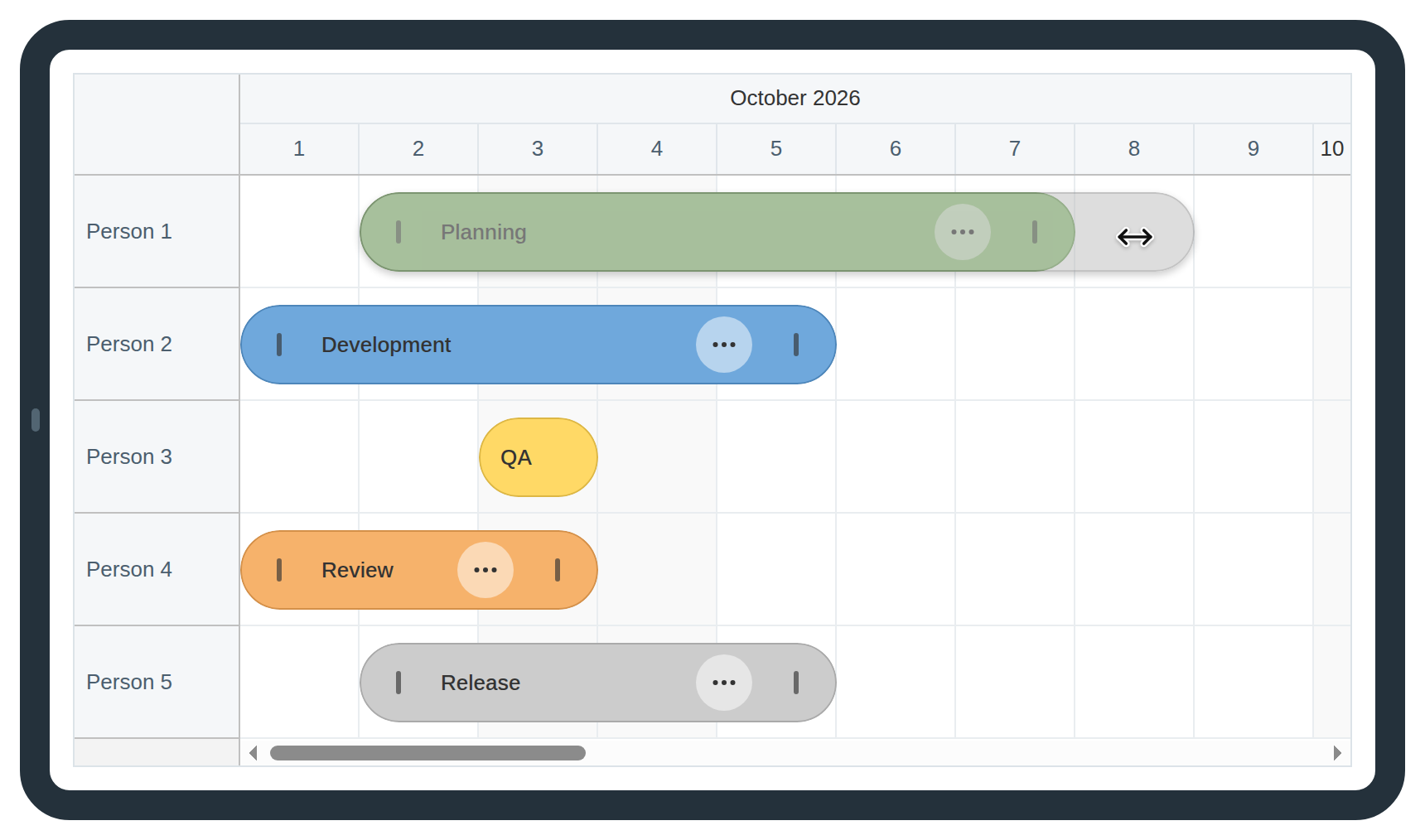
The right resize grip changes the end. The shadow follows the dragged edge.
Define the active areas in onBeforeEventRender. This handler also runs when events are added, edited or resized. It sets the color, reserves text padding, and adds two resize targets plus the menu target:
const dp = new DayPilot.Scheduler("dp", {
  // ...
  onBeforeEventRender: args => {
    const colors = {
      green: {backColor: "#93c47d", borderColor: "darker", fontColor: "#333333"},
      blue: {backColor: "#6fa8dc", borderColor: "darker", fontColor: "#333333"},
      yellow: {backColor: "#ffd966", borderColor: "darker", fontColor: "#333333"},
      orange: {backColor: "#f6b26b", borderColor: "darker", fontColor: "#333333"},
      gray: {backColor: "#cccccc", borderColor: "darker", fontColor: "#333333"}
    };
    Object.assign(args.data, colors[args.data.tags?.color] || colors.green);
    // Three 72px day cells leave room for the controls and a readable label.
    const duration = new DayPilot.Date(args.data.end).getTime() - new DayPilot.Date(args.data.start).getTime();
    args.data.areas = [];
    args.data.padding = "0 12px";
    if (duration < 3 * 24 * 60 * 60 * 1000) {
      return;
    }
    args.data.padding = "0 92px 0 48px";
    args.data.areas = [
      {left: 2, top: 2, width: 44, height: 44, action: "ResizeStart", toolTip: "Resize start", cssClass: "event-control resize-grip", visibility: "Visible"},
      {right: 46, top: 2, width: 44, height: 44, action: "ContextMenu", symbol: "icons/daypilot.svg#threedots-h", toolTip: "Event actions", cssClass: "event-control event-actions", visibility: "Visible"},
      {right: 2, top: 2, width: 44, height: 44, action: "ResizeEnd", toolTip: "Resize end", cssClass: "event-control resize-grip", visibility: "Visible"}
    ];
  }
});
The area properties position each target relative to the event. visibility: "Visible" makes the controls available without hovering. The action values use native Scheduler behavior; symbol selects the three-dot icon from the included SVG sprite.
All three targets are 44 by 44 pixels. The visible menu disk is smaller than its target, and the grips are simple vertical marks. Text padding keeps the label clear of the controls. At this fixed day scale, three cells provide 216 pixels; shorter events omit the controls and retain the default padding.
The following stylesheet rules center the native label, draw the grips, and place the menu icon above its translucent disk:
.scheduler_default_event_inner {
  display: block;
  line-height: 46px;
  text-overflow: ellipsis;
  box-shadow: 0 2px 4px #24334214;
  font-size: 13px;
  font-weight: 500;
}

.event-control {
  color: inherit;
  box-sizing: border-box;
  border-radius: 50%;
}

.event-control svg {
  position: absolute;
  width: 18px !important;
  height: 18px !important;
  left: 13px !important;
  top: 13px !important;
  pointer-events: none;
}

.event-actions {
  cursor: pointer;
}

.event-actions::before {
  content: "";
  position: absolute;
  inset: 5px;
  border-radius: 50%;
  background: #ffffff80;
}

.event-actions:hover::before {
  background: #ffffffbb;
}

.resize-grip {
  cursor: ew-resize;
}

.resize-grip::after {
  content: "";
  position: absolute;
  top: 15px;
  left: 20px;
  width: 3px;
  height: 14px;
  border-radius: 3px;
  background: currentColor;
  opacity: .65;
}

.resize-grip:hover::after {
  opacity: 1;
}
A long event may still have only a narrow segment inside the displayed month. DayPilot marks these events with scheduler_default_event_continueleft or scheduler_default_event_continueright. Hide their inline controls, reset the padding, and square the edge that continues outside the timeline:
/* A continued event can have only a small segment inside this month. */
.scheduler_default_event_continueleft .event-control,
.scheduler_default_event_continueright .event-control {
  display: none !important;
}

.scheduler_default_event_continueleft .scheduler_default_event_inner,
.scheduler_default_event_continueright .scheduler_default_event_inner {
  padding: 0 12px !important;
}

.scheduler_default_event_continueleft .scheduler_default_event_inner {
  border-top-left-radius: 0 !important;
  border-bottom-left-radius: 0 !important;
}

.scheduler_default_event_continueright .scheduler_default_event_inner {
  border-top-right-radius: 0 !important;
  border-bottom-right-radius: 0 !important;
}
The overrides take precedence over native active-area visibility and per-event padding. They preserve the true date geometry: a one-day visible segment stays one cell wide. Short and continued events remain editable by tapping their body, including changing either date or deleting the event. If resizing makes an event shorter than three days, its grips disappear after the drop; the editor remains available.
5. Event Menu, Editing, and Deletion
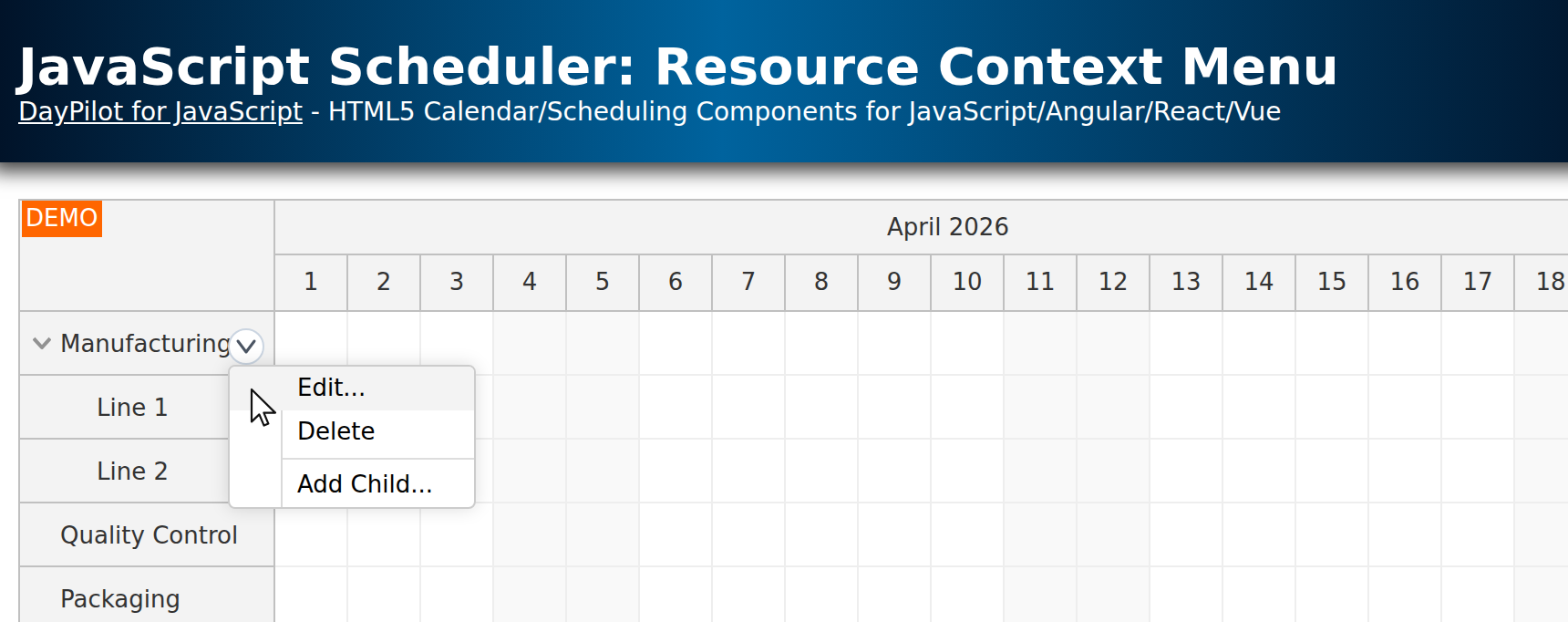
The three-dot control opens a real DayPilot context menu. It contains Edit and Delete actions. The menu belongs to the Scheduler; args.source identifies the event that opened it.
const dp = new DayPilot.Scheduler("dp", {
  // ...
  contextMenu: new DayPilot.Menu({
    items: [
      {text: "Edit…", onClick: args => app.edit(args.source)},
      {text: "Delete", onClick: args => app.remove(args.source)}
    ]
  }),
  // ...
});
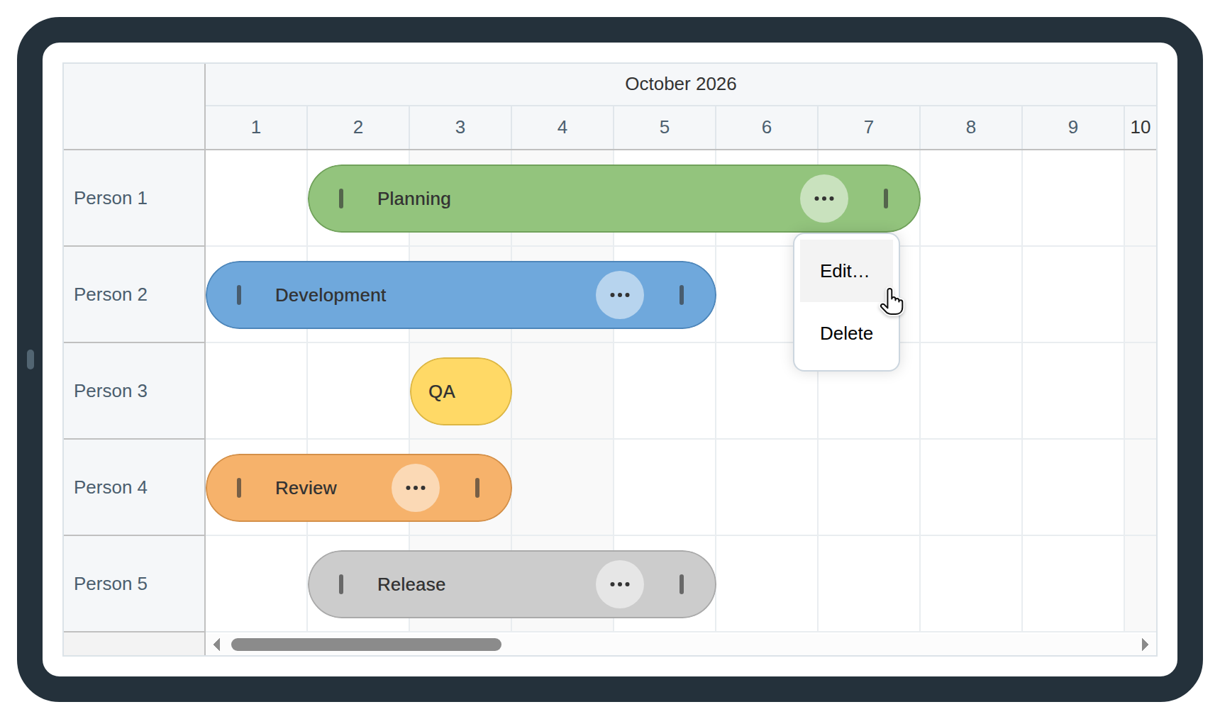
The menu offers Edit and Delete without requiring a hover gesture.
Give each native menu item a 44-pixel line box. Remove the empty icon separator because these items use text labels:
body .menu_default_main {
  border-color: #ccd6df;
  border-radius: 8px;
  padding: 4px;
}

body .menu_default_main::before {
  display: none;
}

.menu_default_main .menu_default_item a {
  min-height: 44px;
  line-height: 44px;
  padding: 0 14px;
  box-sizing: border-box;
}

.menu_default_main .menu_default_item_text {
  height: 44px;
  line-height: 44px;
  padding: 0;
}
Edit opens the same dialog as tapping the event body. The event click handler in the initial configuration calls app.edit(args.e). Creation calls the same helper with the selected dates and resource.
Add the dialog to index.html. Its labeled inputs provide the name, whole-day dates and resource. The Delete button is hidden when creating an event:
<dialog id="editor" aria-labelledby="editor-title">
  <form id="event-form">
    <h2 id="editor-title">Edit event</h2>
    <label>Name <input name="text" required maxlength="100" autocomplete="off"></label>
    <div class="dates">
      <label>Start <input name="start" type="date" required></label>
      <label>End (exclusive) <input name="end" type="date" required></label>
    </div>
    <label>Resource <select name="resource"></select></label>
    <p class="hint">The end date is the first day outside the event.</p>
    <p id="error" role="alert"></p>
    <div class="buttons">
      <button id="delete-event" type="button">Delete</button>
      <button id="cancel" type="button">Cancel</button>
      <button type="submit" class="primary">Save</button>
    </div>
  </form>
</dialog>
The app object stores the dialog and form references. Its edit() helper copies values into the fields before opening the modal. remove() deletes the selected event:
const app = {
  dialog: document.querySelector("#editor"),
  form: document.querySelector("#event-form"),
  event: null,
  // ...
  edit(event, selection) {
    app.event = event;
    const data = event ? event.data : {text: "New event", ...selection};
    const fields = app.form.elements;
    fields.text.value = data.text;
    fields.start.value = new DayPilot.Date(data.start).toString("yyyy-MM-dd");
    fields.end.value = new DayPilot.Date(data.end).toString("yyyy-MM-dd");
    fields.resource.value = data.resource;
    document.querySelector("#editor-title").textContent = event ? "Edit event" : "Create event";
    document.querySelector("#delete-event").hidden = !event;
    document.querySelector("#error").textContent = "";
    app.dialog.showModal();
  },
  remove(event) {
    dp.events.remove(event);
    app.report(`Deleted: ${event.text()}`);
  },
  // ...
};
In app.init(), populate the resource selector from the same resource array used by the Scheduler. Wire Cancel and Delete, then handle Save. Save trims the name and rejects an end date that is not after the start. Existing events are updated in place; new events receive an ID:
const app = {
  // ...
  init() {
    // ...
    for (const resource of resources) {
      app.form.elements.resource.add(new Option(resource.name, resource.id));
    }
    document.querySelector("#cancel").addEventListener("click", () => app.dialog.close());
    document.querySelector("#delete-event").addEventListener("click", () => {
      app.remove(app.event);
      app.dialog.close();
    });
    app.form.addEventListener("submit", event => {
      event.preventDefault();
      const fields = app.form.elements;
      const text = fields.text.value.trim();
      const start = new DayPilot.Date(fields.start.value);
      const end = new DayPilot.Date(fields.end.value);
      if (!text || end <= start) {
        document.querySelector("#error").textContent = "Enter a name and an end date after the start date.";
        return;
      }
      const data = {text, start, end, resource: fields.resource.value};
      if (app.event) {
        Object.assign(app.event.data, data);
        dp.events.update(app.event);
      } else {
        dp.events.add({id: DayPilot.guid(), ...data});
      }
      app.report(`Saved: ${text}`);
      app.dialog.close();
    });
  }
};
app.init();
Delete removes the event immediately using dp.events.remove(). It is available in both the menu and the editor, so short events have the same deletion path. There is no confirmation or undo in this in-memory example.
6. Responsive Styling and Browser Support
The sample keeps the recognizable Scheduler resource column, grouped headers and grid. Green, blue, yellow, orange and gray fills distinguish the events, while darker text and grips remain readable. The normal event label is retained; long names use an ellipsis in the space between controls and can be read in the editor.
The editor is capped at the viewport width. Its date fields sit side by side on larger screens and stack on phones:
dialog {
  box-sizing: border-box;
  width: 420px;
  max-width: calc(100vw - 32px);
  padding: 24px;
  border: 1px solid #c4cfd9;
  border-radius: 8px;
  color: inherit;
}

/* ... */
.dates {
  display: grid;
  grid-template-columns: 1fr 1fr;
  gap: 12px;
}

/* ... */
@media (max-width: 480px) {
  .header, .main {
    padding: 14px 12px;
  }
  .header h1 {
    font-size: 20px;
  }
  dialog {
    padding: 18px;
  }
  .dates {
    grid-template-columns: 1fr;
    gap: 0;
  }
}
The sample schedules whole days and does not include a time-of-day editor. Native date-input presentation depends on the browser. Mouse and emulated touch interactions are verified with the installed DayPilot Lite package; test the finished application on your target iOS and Android devices, including its on-screen keyboard.
You can explore other Scheduler styles in the theme designer. If you change the day width or event height, adjust the control threshold, target positions and label padding together.
History
October 2026: Converted the example to DayPilot Lite with npm imports, a shared event editor, single-row pill events, touch-accessible controls, and new screenshots. Removed the dark theme, font icons, and event bubble. The original example used a DayPilot Pro trial.