 DayPilot
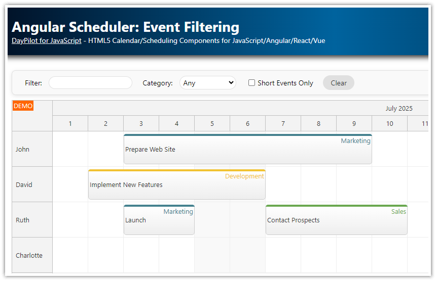
Features
Angular 18 project
Scheduler component that displays events for multiple resources
No backend required (resources and events are defined inline)
Shows how to split events into two or more phases with defined start/end and custom styles
Includes trial version of DayPilot Pro for JavaScript
See also a basic tutorial that explains how to start using DayPilot Scheduler in Angular applications:
License
Licensed for testing and evaluation purposes. Please see the license agreement included in the sample project. You can use the source code of the tutorial if you are a licensed user of DayPilot Pro for JavaScript.
Angular Scheduler with Sample Event

We have a simple event that we want to display:
events: DayPilot.EventData[] = [
  {
    id: "1",
    resource: "R2",
    start: "2025-06-03",
    end: "2025-06-15",
    text: "Event 1"
  }
]
We will display the event using Angular Scheduler from DayPilot Pro package. This is our Scheduler component that displays the schedule using <daypilot-scheduler>:
import {Component, ViewChild, AfterViewInit, ChangeDetectorRef} from "@angular/core";
import {DayPilot} from "daypilot-pro-angular";
import {DataService} from "./data.service";

@Component({
  selector: 'scheduler-component',
  template: `
  <daypilot-scheduler [config]="config" [events]="events" #scheduler></daypilot-scheduler>
`,
  styles: [``]
})
export class SchedulerComponent implements AfterViewInit {

  @ViewChild("scheduler")
  scheduler!: DayPilot.Angular.Scheduler;

  events: DayPilot.EventData[] = [];

  config: DayPilot.SchedulerConfig = {
    timeHeaders : [
      {groupBy: "Month", format: "MMMM yyyy"},
      {groupBy: "Day", format: "d"}
    ],
    scale: "Day",
    days: 365,
    startDate: "2025-01-01"
  };

  constructor(private ds: DataService) {}

  ngAfterViewInit(): void {
    this.ds.getResources().subscribe(result => this.config.resources = result);

    var from = this.scheduler.control.visibleStart();
    var to = this.scheduler.control.visibleEnd();
    this.ds.getEvents(from, to).subscribe(result => {
      this.events = result;
    });
  }

}
Event Phases
We want to split the event into three phases:
Preparation
Main Phase
Evaluation
Let's add the phase data to the event object (together with phase start and end dates):
events: DayPilot.EventData[] = [
  {
    id: "1",
    resource: "R1",
    start: "2025-06-03",
    end: "2025-06-15",
    text: "Event 1",
    phases: [
      { start: "2025-06-03", end: "2025-06-06", text: "Preparation" },
      { start: "2025-06-06", end: "2025-06-12", text: "Main Phase" },
      { start: "2025-06-12", end: "2025-06-15", text: "Evaluation" }
    ]
  }
]
We will use onBeforeEventRender event handler to customize the event. In the event handler, we will read the phase data from the event object and insert custom active areas at the specified dates.

The event handler is specified using onBeforeEventRender method that we add to the config object.
import {Component, ViewChild, AfterViewInit, ChangeDetectorRef} from "@angular/core";
import {DayPilot} from "daypilot-pro-angular";
import {DataService} from "./data.service";

@Component({
  selector: 'scheduler-component',
  template: `
  <daypilot-scheduler [config]="config" [events]="events" #scheduler></daypilot-scheduler>
`,
  styles: [``]
})
export class SchedulerComponent implements AfterViewInit {

  @ViewChild("scheduler")
  scheduler: DayPilot.Angular.Scheduler;

  events: DayPilot.EventData[] = [];

  config: DayPilot.SchedulerConfig = {

    // ...

    onBeforeEventRender: args => {
      if (args.data.phases) {

        // hide the default event content and tooltip
        args.data.barHidden = true;
        args.data.html = '';
        args.data.toolTip = '';

        if (!args.data.areas) {
          args.data.areas = [];
        }
        args.data.phases.forEach(phase => {
          args.data.areas.push({
            start: phase.start,
            end: phase.end,
            top: 0,
            bottom: 0,
            html: phase.text
          });
        });
      }
    }

  };

  // ...

}
The active area positions are specified using a combination of start/end/top/bottom properties. The start and end properties accept a DayPilot.Date object (or an ISO 8601 date/time string that will be converted to DayPilot.Date automatically). The top and bottom properties specify the distance from event edges in pixels.
Customizing the Phases Appearance

By default, the active areas that display the event phases don't use any styling. We will add a few more properties to the phase data object (toolTip, background) that we will use to style the Scheduler event phases:
events: DayPilot.EventData[] = [
  {
    id: "1",
    resource: "R3",
    start: "2025-06-03",
    end: "2025-06-15",
    text: "Event 1",
    phases: [
      { start: "2025-06-03", end: "2025-06-06", text: "Preparation", toolTip: "Preparation", background: "#93c47d"},
      { start: "2025-06-06", end: "2025-06-12", text: "Main Phase", toolTip: "Main Phase", background: "#38761d"},
      { start: "2025-06-12", end: "2025-06-15", text: "Evaluation", toolTip: "Evaluation", background: "#6aa84f"}
    ]
  }
]
The modified version of onBeforeEventRender event handler uses these properties to apply custom CSS styles:
We set the background and foreground color using
args.data.backColorandargs.data.fontColor.We apply custom inline styles to center the content horizontally and vertically (
style: "display: flex; align-items: center; justify-content: center;").
import {Component, ViewChild, AfterViewInit, ChangeDetectorRef} from "@angular/core";
import {DayPilot} from "daypilot-pro-angular";
import {DataService} from "./data.service";

@Component({
  selector: 'scheduler-component',
  template: `
  <daypilot-scheduler [config]="config" [events]="events" #scheduler></daypilot-scheduler>
`,
  styles: [``]
})
export class SchedulerComponent implements AfterViewInit {

  @ViewChild("scheduler")
  scheduler!: DayPilot.Angular.Scheduler;

  events: DayPilot.EventData[] = [];

  config: DayPilot.SchedulerConfig = {

    // ...

    onBeforeEventRender: args => {
      if (args.data.phases) {

        // hide the default event content and tooltip
        args.data.barHidden = true;
        args.data.html = '';
        args.data.toolTip = '';

        if (!args.data.areas) {
          args.data.areas = [];
        }
        args.data.phases.forEach(phase => {
          args.data.areas.push({
            start: phase.start,
            end: phase.end,
            top: 0,
            bottom: 0,
            cssClass: phase.cssClass,
            style: "overflow:hidden; display: flex; align-items: center; justify-content: center;",
            backColor: phase.background,
            fontColor: "#ffffff",
            text: phase.text,
            toolTip: phase.toolTip
            });
        });
      }
    }
  };

  // ...

}
To make the event corners rounded, you can add the following CSS to styles.css file:
.scheduler_default_event {
  border-radius: 20px;
}
Updating Phases during Drag and Drop Moving
In order to display the phases correctly after the event is moved using drag and drop, we will add an onMoveEvent handler that updates the start/end date of each phase according to the new location.
config: DayPilot.SchedulerConfig = {
  // ...
  onEventMove: args => {
    const offset = new DayPilot.Duration(args.e.start(), args.newStart);
    args.e.data.phases.forEach(phase =>{
      phase.start = new DayPilot.Date(phase.start).addTime(offset);
      phase.end = new DayPilot.Date(phase.end).addTime(offset);
    });
  }
  // ..
};
You can use the same approach for event resizing. The event resizing handler isn't implemented - the exact behavior will be different depending on the application logic.
Full Source Code
Here is the full source code of our Angular Scheduler sample that displays multiple phases for each planned event (scheduler.component.ts):
import {Component, ViewChild, AfterViewInit} from '@angular/core';
import {DayPilot, DayPilotModule, DayPilotSchedulerComponent} from 'daypilot-pro-angular';
import {DataService} from './data.service';

@Component({
  selector: 'scheduler-component',
  standalone: true,
  imports: [DayPilotModule],
  providers: [DataService],
  template: `<daypilot-scheduler [config]="config" [events]="events" #scheduler></daypilot-scheduler>`,
  styles: [``]
})
export class SchedulerComponent implements AfterViewInit {

  @ViewChild('scheduler')
  scheduler!: DayPilotSchedulerComponent;

  events: DayPilot.EventData[] = [];

  config: DayPilot.SchedulerConfig = {
    timeHeaders : [
      {groupBy: "Month", format: "MMMM yyyy"},
      {groupBy: "Day", format: "d"}
    ],
    scale: "Day",
    days: 365,
    startDate: "2025-01-01",
    treeEnabled: true,
    onBeforeEventRender: args => {
      if (args.data["phases"]) {

        // hide the default event content and tooltip
        args.data.barHidden = true;
        args.data.html = '';
        args.data.toolTip = '';

        if (!args.data.areas) {
          args.data.areas = [];
        }
        args.data["phases"].forEach((phase:any) => {
          // @ts-ignore
          args.data.areas.push({
            start: phase.start,
            end: phase.end,
            top: 0,
            bottom: 0,
            cssClass: phase.cssClass,
            style: "overflow:hidden; box-sizing: border-box; display: flex; align-items: center; justify-content: center;",
            background: phase.background,
            fontColor: "#ffffff",
            text: phase.text,
            toolTip: phase.toolTip
          });
        });
      }
    },
    onEventMove: args => {
      const offset = new DayPilot.Duration(args.e.start(), args.newStart);
      args.e.data.phases.forEach((phase:any) =>{
        phase.start = new DayPilot.Date(phase.start).addTime(offset);
        phase.end = new DayPilot.Date(phase.end).addTime(offset);
      });
    }
  };

  constructor(private ds: DataService) {
  }

  ngAfterViewInit(): void {
    this.ds.getResources().subscribe(result => this.config.resources = result);

    const from = this.scheduler.control.visibleStart();
    const to = this.scheduler.control.visibleEnd();
    this.ds.getEvents(from, to).subscribe(result => {
      this.events = result;
    });

    this.scheduler.control.scrollTo("2025-06-01");
  }

}
And here is the definition of the scheduled events (data.service.ts):
import {Injectable} from '@angular/core';
import {DayPilot} from 'daypilot-pro-angular';
import {HttpClient} from '@angular/common/http';
import {Observable} from 'rxjs';

@Injectable()
export class DataService {

  resources: DayPilot.ResourceData[] = [
    {
      name: 'Group A', id: 'GA', expanded: true, children: [
        {name: 'Resource 1', id: 'R1', capacity: 10},
        {name: 'Resource 2', id: 'R2', capacity: 30},
        {name: 'Resource 3', id: 'R3', capacity: 20},
        {name: 'Resource 4', id: 'R4', capacity: 40}
      ]
    },
    {
      name: 'Group B', id: 'GB', expanded: true, children: [
        {name: 'Resource 5', id: 'R5', capacity: 20},
        {name: 'Resource 6', id: 'R6', capacity: 40},
        {name: 'Resource 7', id: 'R7', capacity: 20},
        {name: 'Resource 8', id: 'R8', capacity: 40}
      ]
    }
  ];

  events: DayPilot.EventData[] = [
    {
      id: 1,
      resource: "R3",
      start: "2025-06-03",
      end: "2025-06-15",
      text: "Event 1",
      phases: [
        { start: "2025-06-03", end: "2025-06-06", text: "Preparation", toolTip: "Preparation", background: "#A9D18E" },
        { start: "2025-06-06", end: "2025-06-10", text: "Main Phase", toolTip: "Main Phase", background: "#548235" },
        { start: "2025-06-10", end: "2025-06-15", text: "Evaluation", toolTip: "Evaluation", background: "#70AD47" }
      ]
    },
    {
      id: 2,
      resource: "R1",
      start: "2025-06-05",
      end: "2025-06-16",
      text: "Event 2",
      phases: [
        { start: "2025-06-05", end: "2025-06-08", text: "Initial Setup", toolTip: "Initial Setup", background: "#BDD7EE" },
        { start: "2025-06-08", end: "2025-06-12", text: "Execution", toolTip: "Execution", background: "#2E75B6" },
        { start: "2025-06-12", end: "2025-06-16", text: "Wrap-up", toolTip: "Wrap-up", background: "#5B9BD5" }
      ]
    },
    {
      id: 3,
      resource: "R5",
      start: "2025-06-05",
      end: "2025-06-14",
      text: "Event 3",
      phases: [
        { start: "2025-06-05", end: "2025-06-08", text: "Planning", toolTip: "Planning", background: "#F8CBAD" },
        { start: "2025-06-08", end: "2025-06-12", text: "Development", toolTip: "Development", background: "#C65911" },
        { start: "2025-06-12", end: "2025-06-14", text: "Testing", toolTip: "Testing", background: "#ED7D31" }
      ]
    }
  ];


  constructor(private http: HttpClient) {
  }

  getEvents(from: DayPilot.Date, to: DayPilot.Date): Observable<any[]> {

    // simulating an HTTP request
    return new Observable(observer => {
      setTimeout(() => {
        observer.next(this.events);
      }, 200);
    });

    // return this.http.get("/api/events?from=" + from.toString() + "&to=" + to.toString());
  }

  getResources(): Observable<any[]> {

    // simulating an HTTP request
    return new Observable(observer => {
      setTimeout(() => {
        observer.next(this.resources);
      }, 200);
    });

    // return this.http.get("/api/resources");
  }

}