 DayPilot
Features
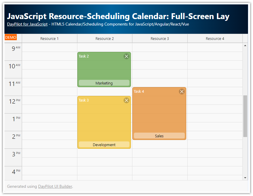
Integrating the Angular Scheduler in a full-page CSS layout
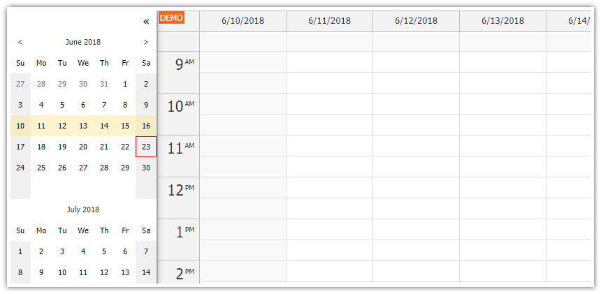
Collapsible sidebar with date navigation
Switching between
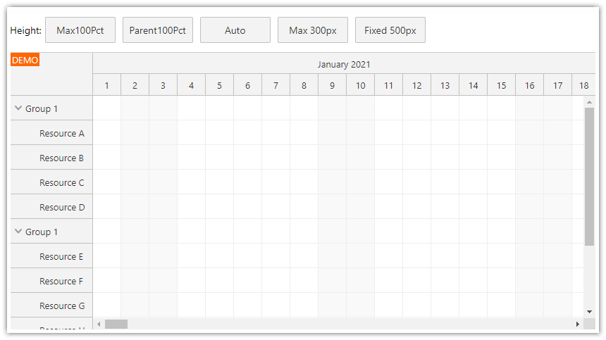
"Parent100Pct"and"Max100Pct"height modesIncludes a trial version of DayPilot Pro for JavaScript (see License below)
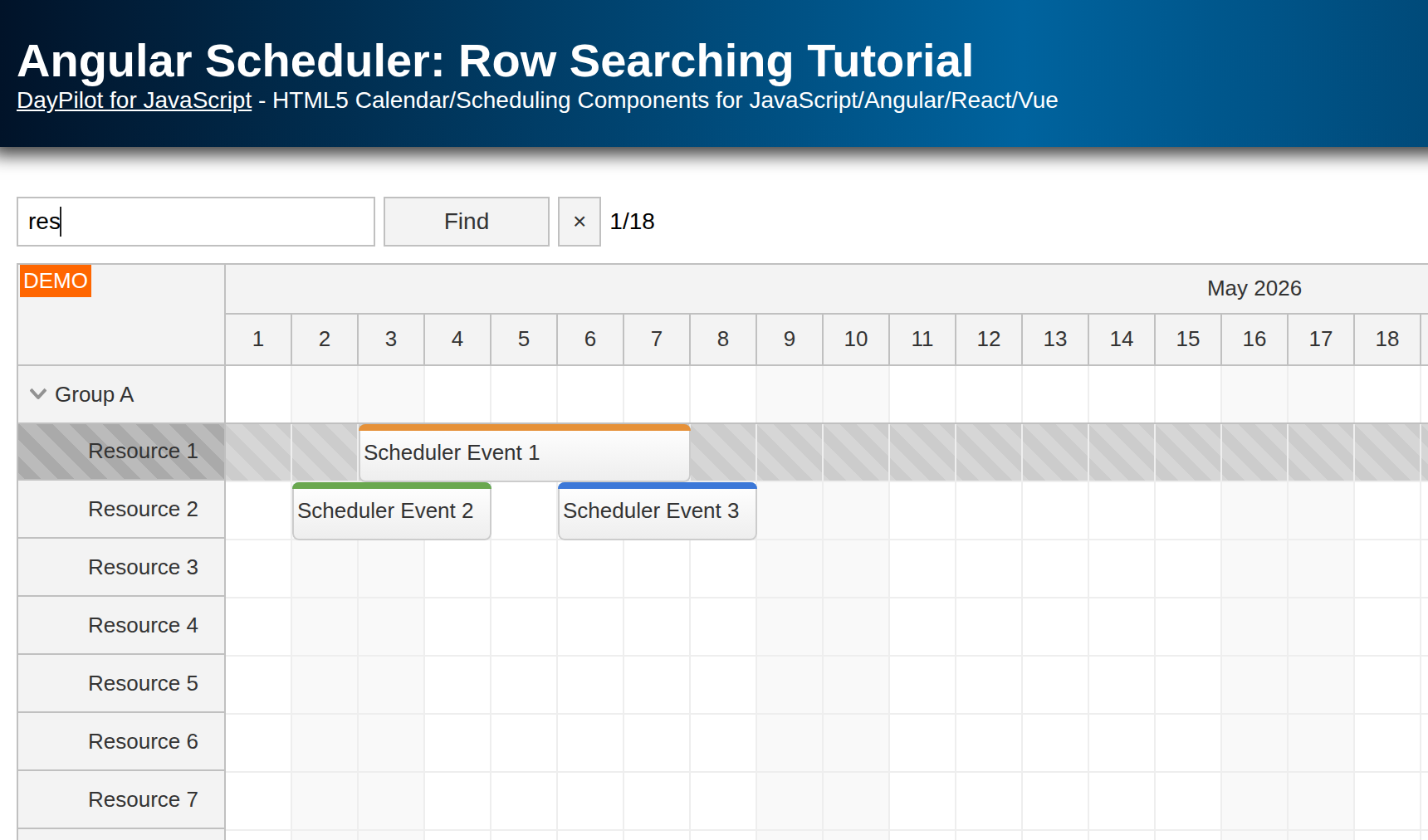
Uses Angular 21 standalone components and signals
Project generated using Scheduler UI Builder
License
Licensed for testing and evaluation purposes. Please see the license agreement included in the sample project. You can use the source code of the tutorial if you are a licensed user of DayPilot Pro for JavaScript.
100% Width
100% width is enabled by default. The built-in Scheduler CSS theme and all themes generated by the online CSS theme designer use the standard display: block style for the main <div> element, so the Scheduler automatically fills the available horizontal space.
100% Height
The default Scheduler height mode is "Auto". In this mode, the Scheduler grows automatically to display all rows, without a vertical scrollbar.
However, in this mode the time header scrolls away with the page. To keep the time header fixed, you can use one of the special 100% height modes.
Fixed Height of 100% of the Parent

In this mode, the Scheduler fills the available height. The parent element needs an explicit height, either using the height style directly or by combining top and bottom in an absolutely positioned layout. The Scheduler measures the parent and adjusts its own height automatically.
In the sample, the main work area fills the available page height and the Scheduler uses hideBorderFor100PctHeight to suppress its own outer border. This avoids a duplicate border when the Scheduler is integrated into custom full-page chrome.
A focused excerpt from scheduler.component.ts:
import { Component, signal } from '@angular/core';
import { DayPilot, DayPilotModule } from 'daypilot-pro-angular';

const currentMonthStart = DayPilot.Date.today().firstDayOfMonth();
const currentMonthDays = DayPilot.Date.today().daysInMonth();

@Component({
  selector: 'scheduler-component',
  standalone: true,
  imports: [DayPilotModule],
  template: `
    <div class="fullscreen">
      <daypilot-scheduler [config]="config" [events]="events"></daypilot-scheduler>
    </div>
  `,
  styles: [`
    .fullscreen {
      position: absolute;
      inset: 0;
    }
  `]
})
export class SchedulerComponent {
  readonly events = signal<DayPilot.EventData[]>([]);

  readonly config = signal<DayPilot.SchedulerConfig>({
    scale: 'Day',
    days: currentMonthDays,
    startDate: currentMonthStart,
    heightSpec: 'Parent100Pct',
    hideBorderFor100PctHeight: true,
  });
}
Height Growing Automatically up to 100% of the Parent

The fixed 100% height mode works well when the layout is full of rows. However, when there are only a few resources or the screen is very tall, the horizontal scrollbar ends up at the very bottom, below the blank space.
The Scheduler includes another mode that helps with this. The "Max100Pct" mode increases the height according to the number of rows until the Scheduler reaches the parent height. This keeps the horizontal scrollbar directly below the last row.
Because the sample hides the Scheduler border using hideBorderFor100PctHeight: true, it adds a separate bottom line below the Scheduler. The surrounding wrapper also uses overflow: hidden so the extra line does not introduce an additional vertical scrollbar.
The relevant configuration and layout excerpts are shown below:
readonly config = signal<DayPilot.SchedulerConfig>({
  // ...
  heightSpec: 'Max100Pct',
  hideBorderFor100PctHeight: true,
});
<div class="main-body">
  <div class="scheduler-frame">
    <daypilot-scheduler [config]="config" [events]="events"></daypilot-scheduler>
    <div class="main-bottom"></div>
  </div>
</div>
.scheduler-frame {
  position: relative;
  height: 100%;
  min-height: 0;
  overflow: hidden;
}

.main-bottom {
  border-top: 1px solid #d5dbe1;
}
Collapsible Sidebar
This project includes a compact sidebar component that makes room for additional controls without wasting space in the main Scheduler area.
Sidebar expanded:

Sidebar collapsed:

The sidebar is built using four lightweight wrapper components:
<sidebar-container>is the outer shell that fills the available width and height.<sidebar-expanded>holds the expanded sidebar content. In this sample it contains a Navigator for month navigation.<sidebar-collapsed>defines the collapsed sidebar state.<sidebar-main>holds the main content, including the height-mode pills and the Scheduler.
The sidebar stays on the left and the rail includes SVG-based collapse/expand buttons. The Navigator updates the visible month using dateChange, and the Scheduler reloads data for the visible range in viewChange.
<sidebar-container [(expanded)]="expanded">
  <sidebar-expanded>
    <div class="navigator-panel">
      <daypilot-navigator
        [config]="navigatorConfig"
        (dateChange)="dateChange()"
        #navigator
      ></daypilot-navigator>
    </div>
  </sidebar-expanded>
  <sidebar-collapsed></sidebar-collapsed>
  <sidebar-main>
    <div class="workspace">
      <div class="controls-row">
        <span class="controls-label">Height mode:</span>
        <div class="mode-switch" role="group" aria-label="Height mode">
          ...
        </div>
      </div>
      <div class="main-body">
        <div class="scheduler-frame">
          <daypilot-scheduler
            [config]="config"
            [events]="events"
            (viewChange)="viewChange()"
            #scheduler
          ></daypilot-scheduler>
          <div class="main-bottom"></div>
        </div>
      </div>
    </div>
  </sidebar-main>
</sidebar-container>
History
April 18, 2026: Migrated the sample to Angular 21, updated the fullscreen layout implementation to the current builder template, and refreshed the sample data.