 DayPilot
Features
This tutorial shows how to manage resources (displayed as rows) using the built-in UI elements.
Angular Scheduler component that displays a timeline for multiple resources
How to load resources from the server-side backend and display them as rows
How to add a row header context menu (including a hint icon)
How to create resource groups using an inline edit box
How to create child resources using a context menu and modal dialog
How to delete resources using a context menu
You can move resources using drag and drop
The Angular project includes a trial version of DayPilot Pro for JavaScript (see License below)
This tutorial focuses on managing resources (rows). For an introduction to the Angular Scheduler component please see the basic tutorial:
License
Licensed for testing and evaluation purposes. Please see the DayPilot trial license included in the sample project. You can use the source code of the tutorial if you are a licensed user of DayPilot Pro for JavaScript. Buy a license.
How to Load Resources and Display Them as Rows in the Scheduler

The Angular Scheduler component displays resources on the vertical axis.
To specify the resources, use the resources property of the config object. It is an array of DayPilot.ResourceData objects:
resources: DayPilot.ResourceData[] = [
  {
    name: 'Group 1',
    id: 'G1',
    expanded: true,
    children: [
      { name: 'Resource 1', id: 'R1' },
      { name: 'Resource 2', id: 'R2' },
    ],
  },
  {
    name: 'Group 2',
    id: 'G2',
    expanded: true,
    children: [
      { name: 'Resource 3', id: 'R3' },
      { name: 'Resource 4', id: 'R4' },
    ],
  },
];
We will use a DataService class to load the data. The sample DataService implementation uses locally-generated data for simplicity. In your application, you can replace this logic with HTTP calls that load data using a server-side backend.
The Angular 21 sample keeps the Scheduler configuration in a signal, so loadData() fetches the grouped resources and then updates config using this.config.update():
private async loadData(): Promise<void> {
  const from = this.scheduler.control.visibleStart();
  const to = this.scheduler.control.visibleEnd();

  const [resources, events] = await Promise.all([
    firstValueFrom(this.ds.getResources()),
    firstValueFrom(this.ds.getEvents(from, to)),
  ]);

  this.config.update((current) => ({ ...current, resources }));
  this.events.set(events);
}
By default, the Scheduler displays a flat list of resources. We want to use a hierarchy of rows, so we need to enable the treeEnabled property:
config = signal<DayPilot.SchedulerConfig>({
  treeEnabled: true,
});
A simplified version of SchedulerComponent that loads resources and events from the data source:
scheduler.component.ts
import { AfterViewInit, Component, ViewChild, signal } from '@angular/core';
import { DayPilot, DayPilotModule, DayPilotSchedulerComponent } from 'daypilot-pro-angular';
import { firstValueFrom } from 'rxjs';
import { DataService } from './data.service';

@Component({
  selector: 'scheduler-component',
  standalone: true,
  imports: [DayPilotModule],
  providers: [DataService],
  template: `<daypilot-scheduler [config]="config" [events]="events" #scheduler></daypilot-scheduler>`,
  styles: [``],
})
export class SchedulerComponent implements AfterViewInit {
  @ViewChild('scheduler')
  scheduler!: DayPilotSchedulerComponent;

  events = signal<DayPilot.EventData[]>([]);

  config = signal<DayPilot.SchedulerConfig>({
    timeHeaders: [
      { groupBy: 'Month', format: 'MMMM yyyy' },
      { groupBy: 'Day', format: 'd' },
    ],
    eventHeight: 40,
    scale: 'Day',
    days: 30,
    startDate: '2026-04-01',
    treeEnabled: true,
  });

  constructor(private ds: DataService) {}

  async ngAfterViewInit(): Promise<void> {
    await this.loadData();
  }

  private async loadData(): Promise<void> {
    const from = this.scheduler.control.visibleStart();
    const to = this.scheduler.control.visibleEnd();

    const [resources, events] = await Promise.all([
      firstValueFrom(this.ds.getResources()),
      firstValueFrom(this.ds.getEvents(from, to)),
    ]);

    this.config.update((current) => ({ ...current, resources }));
    this.events.set(events);
  }
}
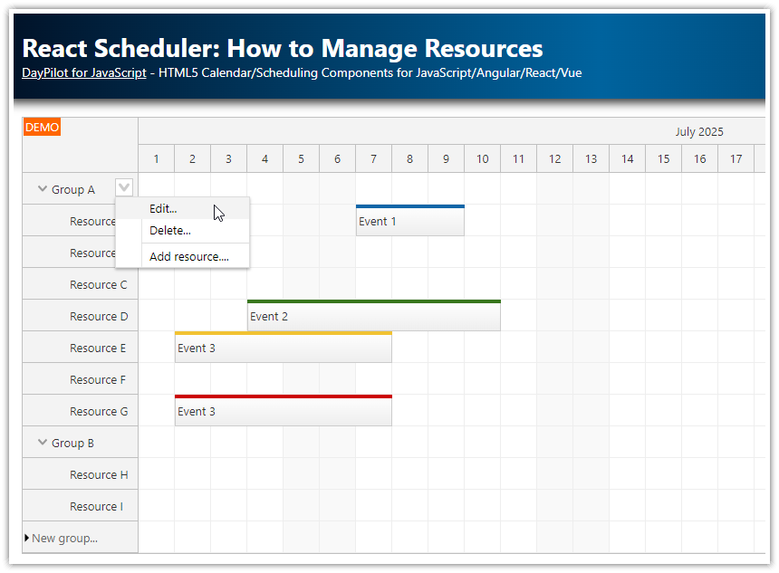
How to Add a Context Menu to the Row Headers

We want to let users access resource-related actions using a context menu. Our context menu will have three items:
Edit
Delete
Add Child
The menu can be created using a DayPilot.Menu object:
menu = new DayPilot.Menu({
  items: [
    { text: 'Edit...' },
    { text: 'Delete' },
    { text: '-' },
    { text: 'Add Child...' },
  ],
});
Next, we will add an onClick event handler to each of the items:
In the current Angular 21 sample, we also use an onShow handler to disable “Add Child…” for regular resource rows before the menu is displayed:
menu = new DayPilot.Menu({
  onShow: (args) => {
    const addChildItem = args.menu.items?.[3];
    const row = args.source;
    if (addChildItem) {
      addChildItem.disabled = !row.id.startsWith('G');
    }
  },
  items: [
    {
      text: 'Edit...',
      onClick: async (args) => {
        const row = args.source;
        const modal = await DayPilot.Modal.form([{ name: 'Resource name', id: 'name' }], {
          name: row.data.name,
        });

        if (modal.canceled) {
          return;
        }

        await firstValueFrom(this.ds.updateResource(row, modal.result.name));

        row.data.name = modal.result.name;
        this.scheduler.control.rows.update(row);
        this.scheduler.control.message('Updated');
      },
    },
    {
      text: 'Delete',
      onClick: async (args) => {
        const row = args.source;
        await firstValueFrom(this.ds.deleteResource(row));

        this.scheduler.control.rows.remove(row);
        this.scheduler.control.message('Deleted');
      },
    },
    {
      text: '-',
    },
    {
      text: 'Add Child...',
      onClick: async (args) => {
        const modal = await DayPilot.Modal.form([{ name: 'Resource name', id: 'name' }], {});

        if (modal.canceled) {
          return;
        }

        const row = args.source;
        const data = await firstValueFrom(this.ds.createResource(row, modal.result.name));

        this.scheduler.control.rows.addChild(row, data);
        this.scheduler.control.message('Created');
      },
    },
  ],
});
In this sample, the onShow handler disables “Add Child…” for regular resource rows. The edit, delete, and child-create handlers update the in-memory data source first and then apply the change directly to the Scheduler row tree using rows.update(), rows.remove(), and rows.addChild().
At this point, we just need to assign the context menu to the resource row headers using the contextMenuResource property of config. The context menu can be activated by right-clicking the row header.
config = signal<DayPilot.SchedulerConfig>({
  // ...
  contextMenuResource: this.menu,
});
This is how our SchedulerComponent looks now:
scheduler.component.ts
import { AfterViewInit, Component, ViewChild, signal } from '@angular/core';
import { DayPilot, DayPilotModule, DayPilotSchedulerComponent } from 'daypilot-pro-angular';
import { firstValueFrom } from 'rxjs';
import { DataService } from './data.service';

@Component({
  selector: 'scheduler-component',
  standalone: true,
  imports: [DayPilotModule],
  providers: [DataService],
  template: `<daypilot-scheduler [config]="config" [events]="events" #scheduler></daypilot-scheduler>`,
})
export class SchedulerComponent implements AfterViewInit {
  @ViewChild('scheduler')
  scheduler!: DayPilotSchedulerComponent;

  events = signal<DayPilot.EventData[]>([]);

  menu = new DayPilot.Menu({
    onShow: (args) => {
      const addChildItem = args.menu.items?.[3];
      const row = args.source;
      if (addChildItem) {
        addChildItem.disabled = !row.id.startsWith('G');
      }
    },
    items: [
      { text: 'Edit...', onClick: async (args) => { /* ... */ } },
      { text: 'Delete', onClick: async (args) => { /* ... */ } },
      { text: '-' },
      { text: 'Add Child...', onClick: async (args) => { /* ... */ } },
    ],
  });

  config = signal<DayPilot.SchedulerConfig>({
    timeHeaders: [
      { groupBy: 'Month', format: 'MMMM yyyy' },
      { groupBy: 'Day', format: 'd' },
    ],
    eventHeight: 40,
    scale: 'Day',
    days: 30,
    startDate: '2026-04-01',
    treeEnabled: true,
    rowMoveHandling: 'Update',
    rowMarginTop: 2,
    rowMarginBottom: 2,
    durationBarHeight: 5,
    contextMenuResource: this.menu,
  });

  constructor(private ds: DataService) {}

  async ngAfterViewInit(): Promise<void> {
    await this.loadData();
  }
}
How to Display a Context Menu Hint Icon
In addition to right-click activation, we also add a hover icon that provides a hint that a context menu is available. We will add a small icon on the right side of the row header and center it vertically. The icon is created using a customizable object called an active area.
The active area uses a chevron SVG icon (daypilot.svg#minichevron-down-2) from the DayPilot Icons collection. In the Angular 21 Builder template, the icon is stored in the public icons directory.
onBeforeRowHeaderRender: (args) => {
  args.row.areas = [
    {
      right: 2,
      top: 'calc(50% - 10px)',
      width: 20,
      height: 20,
      symbol: 'icons/daypilot.svg#minichevron-down-2',
      backColor: '#f9f9f9',
      borderColor: '#cccccc',
      borderRadius: 4,
      padding: 2,
      cursor: 'pointer',
      visibility: 'Hover',
      action: 'ContextMenu',
    },
  ];
},
This defines a 20×20 active area at the right edge of each row header and keeps it vertically centered. The background, border, rounded corners, and padding make it look like a small button, visibility: 'Hover' keeps it hidden until the user hovers the row header, and action: 'ContextMenu' links it to the same resource-row context menu.
scheduler.component.ts
config = signal<DayPilot.SchedulerConfig>({
  // ...
  contextMenuResource: this.menu,
  onBeforeRowHeaderRender: (args) => {
    args.row.areas = [/* active area definition */];
  },
  rowCreateHandling: 'Enabled',
});
How to Create Resource Groups at the Top Level

The Scheduler has a built-in helper for adding new resources at the top level. You can activate it using rowCreateHandling property of the config:
config = signal<DayPilot.SchedulerConfig>({
  // ...
  rowCreateHandling: 'Enabled',
});
When inline row creation is enabled, the Scheduler will display an extra row at the bottom. After clicking the row header, the user can enter a name for the new row:

After a user confirms the new name using <enter>, the Scheduler fires the onRowCreate event handler. In the Angular 21 sample, the handler updates the in-memory data source and then inserts the returned row directly into the Scheduler:
scheduler.component.ts
config = signal<DayPilot.SchedulerConfig>({
  // ...
  rowCreateHandling: 'Enabled',
  rowCreateHtml: 'New group...',
  onRowCreate: async (args) => {
    if (!args.text) {
      return;
    }

    const data = await firstValueFrom(this.ds.createResource(null, args.text));
    this.scheduler.control.rows.add(data);
    this.scheduler.control.message('Created.');
  },
});
How to Create Child Resources

The “Add Child…” context menu item lets users add a new child resource.
In this sample, it is enabled only for rows whose IDs start with G, which is how the demo data service identifies top-level groups.
menu = new DayPilot.Menu({
  items: [
    // ...
    {
      text: 'Add Child...',
      onClick: async (args) => {
        const modal = await DayPilot.Modal.form([{ name: 'Resource name', id: 'name' }], {});

        if (modal.canceled) {
          return;
        }

        const row = args.source;
        const data = await firstValueFrom(this.ds.createResource(row, modal.result.name));

        this.scheduler.control.rows.addChild(row, data);
        this.scheduler.control.message('Created');
      },
    },
  ],
});
It uses DayPilot.Modal to display a modal dialog with the specified fields (resource name in this case).

The onClick event handler of the "Add Child..." menu item opens the modal dialog using DayPilot.Modal.form() and passes the selected row as args.source. The args.source object holds a DayPilot.Row instance with the parent row details. After the data service creates the child resource, the sample inserts it immediately using rows.addChild().
How to Delete Resources

In our example, we use a context menu item to delete a resource:
menu = new DayPilot.Menu({
  items: [
    // ...
    {
      text: 'Delete',
      onClick: async (args) => {
        const row = args.source;
        await firstValueFrom(this.ds.deleteResource(row));

        this.scheduler.control.rows.remove(row);
        this.scheduler.control.message('Deleted');
      },
    },
    // ...
  ],
});
The onClick event handler calls the DataService class and then removes the row from the Scheduler using rows.remove(row). This keeps the UI in sync without reloading the whole row tree. If you prefer a row-level API reference, see DayPilot.Row.remove().
How to Move Rows using Drag and Drop

The Scheduler supports drag and drop row moving. This feature is disabled by default - you need to enable it using rowMoveHandling property of the config:
config = signal<DayPilot.SchedulerConfig>({
  // ...
  rowMoveHandling: 'Update',
  rowMoveSameLevelOnly: true,
  // ...
});
In this example, we also set rowMoveSameLevelOnly to true, which keeps drag-and-drop row moves at the same tree level. That means a row can be reordered among its siblings, but it cannot be dropped as a child of another row. See the DayPilot.Scheduler.rowMoveSameLevelOnly API reference for details.
When you enable drag and drop row moving the row will display a move handle on hover. Users can drag the row by the handle and move it to a new location. The source row remains highlighted during dragging.
In this sample, the row header hover also keeps the context menu active area visible, so users can still open the row menu while the drag handle is available.

As soon as a user drops the row at the target location, the onRowMoved event handler is fired. The event args object holds the operation details:
args.source-DayPilot.Rowobject with source rowargs.target- the targetDayPilot.Rowobjectargs.position- drop position relative to target ("child" | "before" | "after")
config = signal<DayPilot.SchedulerConfig>({
  // ...
  rowMoveHandling: 'Update',
  rowMoveSameLevelOnly: true,
  onRowMoved: async (args) => {
    await firstValueFrom(this.ds.moveResource(args.source, args.target, String(args.position)));
    await this.loadData();
    this.scheduler.control.message('Moved');
  },
  // ...
});
In the Angular 21 sample, onRowMoved updates the in-memory data source using DataService.moveResource() and then reloads the Scheduler data. Because rowMoveSameLevelOnly is enabled in this demo, the drop position is used for sibling reordering rather than turning the row into a child of the target. In a real application, you would typically send args.source, args.target, and args.position to the server and return the updated hierarchy.
History
April 22, 2026: Upgraded the sample to Angular 21 (Builder template, standalone components, signals), updated DayPilot Pro for JavaScript to
2026.2.6907, refreshed the screenshots, and revised the article textSeptember 10, 2022: Upgraded the downloadable sample to Angular 14 and DayPilot Pro for JavaScript
2022.3.5416