DayPilot
| Demo | |
|---|---|
| Downloads | |
| Languages | JavaScript |
Overview
-
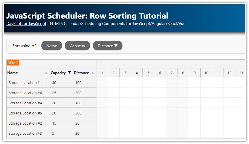
Hide the built-in sort icon for selected columns, but keep the column sortable using the API.
-
Use custom sort icons from Font Awesome.
-
Customize the sort icon behavior.
-
Includes a trial version of DayPilot Pro for JavaScript (see License below)
License
Licensed for testing and evaluation purposes. Please see the license agreement included in the sample project. You can use the source code of the tutorial if you are a licensed user of DayPilot Pro for JavaScript.
Try the JavaScript Scheduler: Row Sorting Customization demo.
Row Sorting Configuration
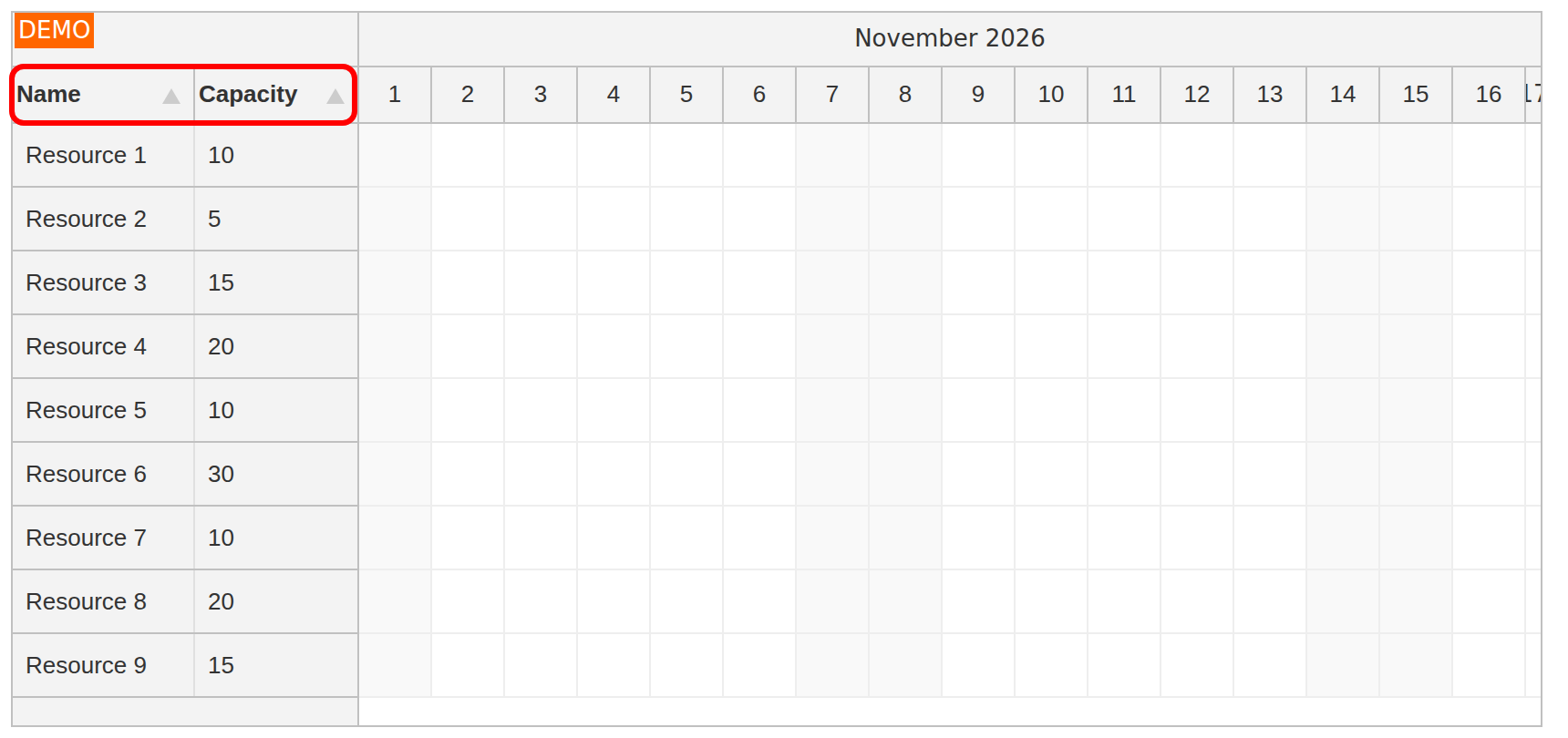
We are going to display two columns in the row header of the JavaScript Scheduler component:
-
Name
-
Capacity
The columns are defined using the rowHeaderColumns property. The array items specify the column title (name), column content field name (display) and field used for sorting (sort).
This enables row sorting using the built-in sort icons.
const resources = [
  {name: "Resource 1", id: "R1", capacity: 10},
  {name: "Resource 2", id: "R2", capacity: 5},
  {name: "Resource 3", id: "R3", capacity: 15},
  // ...
];
In app.init(), pass the resources to dp.update({resources, events: []}). Configure the columns when creating the Scheduler:
const dp = new DayPilot.Scheduler("dp", {
  // ...
  rowHeaderColumns: [
    {name: "Name", display: "name", sort: "name", width: 100},
    {name: "Capacity", display: "capacity", sort: "capacity", width: 90},
  ],
  // ...
});
Hiding the Sort Icon
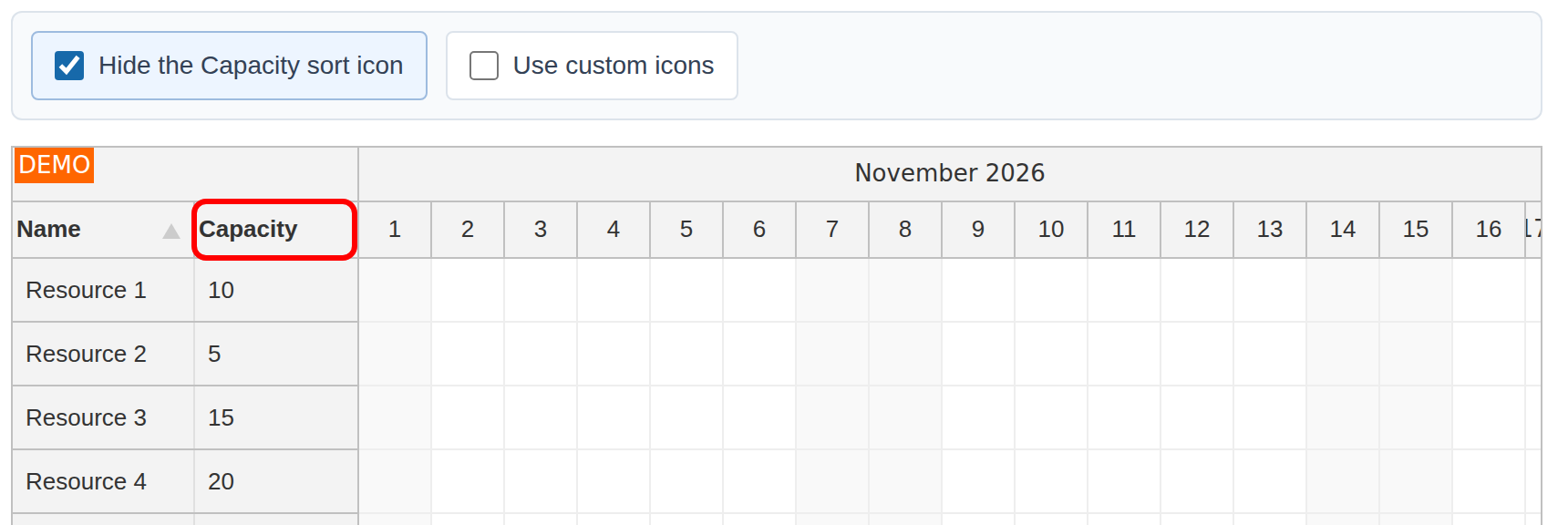
It is possible to hide the built-in sort icon for specified columns using the onBeforeRowHeaderColumnRender event handler.
The following handler uses the checkbox state to hide the sort icon for the "Capacity" column. Setting args.column.sortingEnabled to false affects the built-in icon; you can still sort that column using dp.rows.sort():
const dp = new DayPilot.Scheduler("dp", {
  // ...
  onBeforeRowHeaderColumnRender: (args) => {
    if (args.column.data.name === "Capacity") {
      args.column.sortingEnabled = !app.elements.disableCapacity.checked;
    }
    // ...
  },
  // ...
});
The demo project uses a checkbox which lets you change the sort icon visibility on the fly:
HTML
<div class="space toolbar" role="group" aria-label="Row sorting options">
  <label><input type="checkbox" id="disableCapacity">Hide the Capacity sort icon</label>
  <label><input type="checkbox" id="customIcons">Use custom icons</label>
</div>
<div id="dp"></div>
JavaScript
const app = {
  elements: {
    disableCapacity: document.getElementById("disableCapacity"),
    customIcons: document.getElementById("customIcons"),
  },
  init() {
    this.elements.disableCapacity.addEventListener("change", () => {
      dp.update();
    });
    // ...
  }
};
Custom Icons and Sort Logic
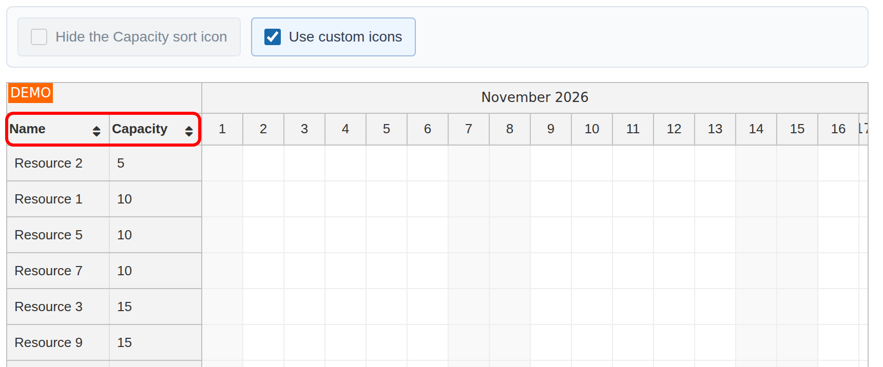
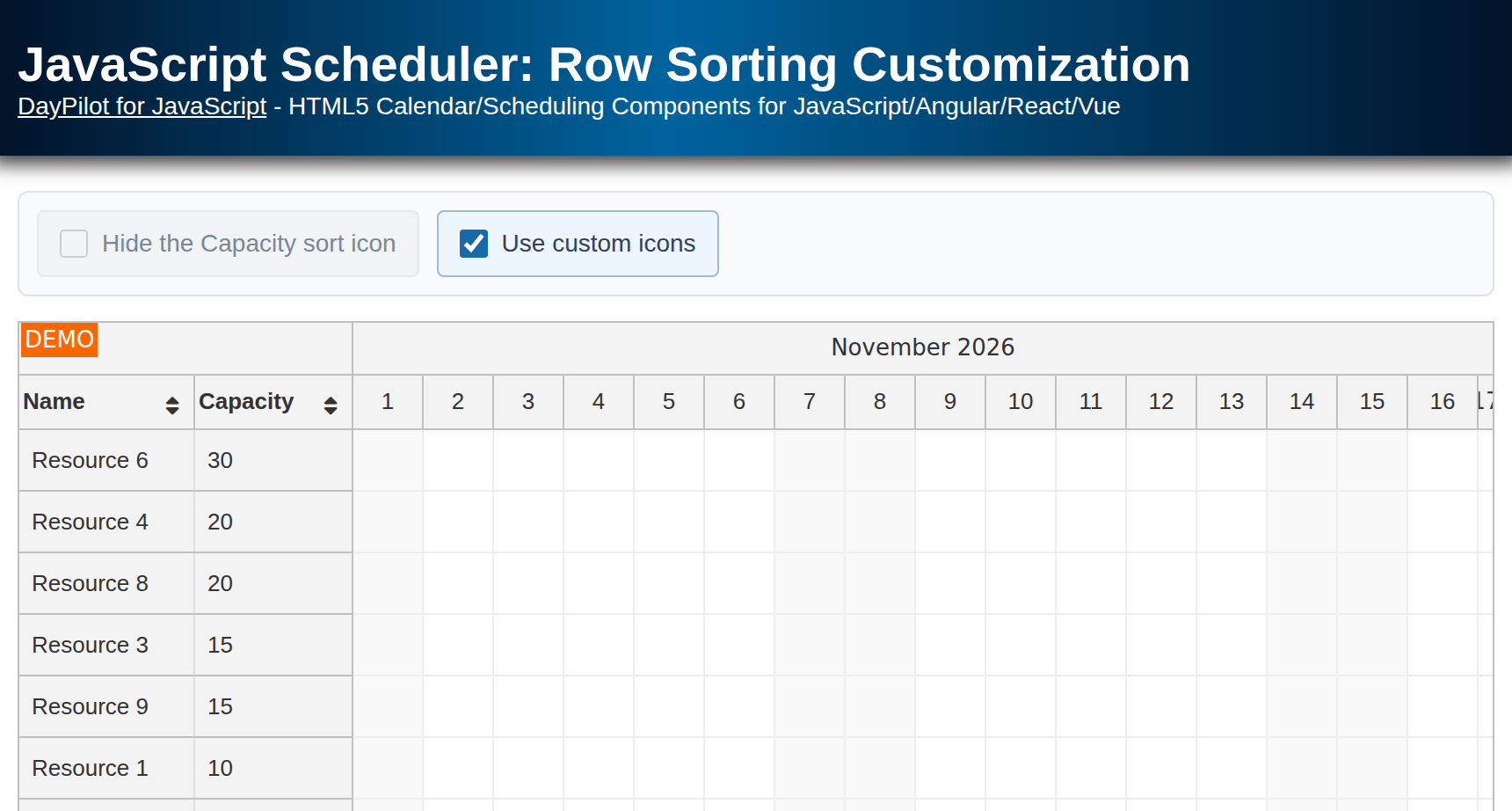
The screenshot shows the custom icons after sorting Capacity in ascending order.
You can also use the onBeforeRowHeaderColumnRender event handler to display a custom sort icon.
First, hide the default sort icon by setting args.column.sortingEnabled = false. This avoids showing the built-in icon alongside the custom one.
Now you can define your own icons using active areas. The active areas support font icons using the icon property so we can use a sorting icon from Font Awesome easily (fa-sort).
const dp = new DayPilot.Scheduler("dp", {
  // ...
  onBeforeRowHeaderColumnRender: (args) => {
    // ...
    if (app.elements.customIcons.checked) {
      args.column.sortingEnabled = false;
      args.column.areas = [
        {
          right: 4,
          top: 10,
          height: 17,
          width: 10,
          icon: "fa fa-sort",
          style: "cursor: pointer",
          onClick: () => {
            dp.rows.sort({
              field: args.column.data.sort,
              order: (dp.rows.sortParam.field === args.column.data.sort && dp.rows.sortParam.order === "asc") ? "desc" : "asc"
            });
          }
        }
      ];
    }
  },
  // ...
});
The active area's onClick handler calls dp.rows.sort() with the column's sort field. If that field is already sorted ascending, the next click switches to descending. Clicking a different column starts with ascending order. dp.rows.sortParam supplies the current field and direction. The Font Awesome icon itself stays the same in both directions.
The sample disables and clears the hide-icon checkbox while custom icons are enabled, so both custom sort controls remain available. Switching back restores the built-in icons.
Full Source Code
Run npm ci and npm run dev in the sample directory. The page loads src/app.js as a JavaScript module and loads Font Awesome from the local fa-5.9.0/css/all.min.css stylesheet. The Scheduler shows the current month.
The page markup (index.html):
<!DOCTYPE html>
<html>
<head>
  <meta charset="utf-8"/>
  <meta name="viewport" content="width=device-width, initial-scale=1">
  <title>JavaScript Scheduler: Row Sorting Customization</title>

  <style>
    p, body, td, input, select, button { font-family: -apple-system,system-ui,BlinkMacSystemFont,'Segoe UI',Roboto,'Helvetica Neue',Arial,sans-serif; font-size: 14px; }
    body { padding: 0px; margin: 0px; background-color: #ffffff; }
    a { color: #1155a3; }
    .toolbar {
      display: flex;
      flex-wrap: wrap;
      gap: 10px;
      margin: 0 0 14px;
      padding: 10px;
      background: #f8fafc;
      border: 1px solid #dce3eb;
      border-radius: 6px;
    }
    .toolbar label {
      display: inline-flex;
      align-items: center;
      gap: 8px;
      min-height: 20px;
      padding: 8px 12px;
      color: #334155;
      background: #ffffff;
      border: 1px solid #dce3eb;
      border-radius: 4px;
      cursor: pointer;
    }
    .toolbar label:hover { border-color: #94a3b8; }
    .toolbar label:has(input:checked) { background: #edf5ff; border-color: #9dbbdf; }
    .toolbar label:has(input:disabled) { color: #7b8794; background: #f1f3f5; border-color: #e2e8f0; cursor: not-allowed; }
    .toolbar input { flex-shrink: 0; width: 16px; height: 16px; margin: 0; accent-color: #1769aa; cursor: inherit; }
    .toolbar input:focus-visible { outline: 2px solid #1769aa; outline-offset: 3px; }
    .header { background: #003267; background: linear-gradient(to right, #011329 0%,#00639e 44%,#011329 100%); padding:20px 10px; color: white; box-shadow: 0px 0px 10px 5px rgba(0,0,0,0.75); }
    .header a { color: white; }
    .header h1 a { text-decoration: none; }
    .header h1 { padding: 0px; margin: 0px; }
    .main { padding: 10px; margin-top: 10px; }
    .generated { color: #999; }
    .generated a { color: #999; }
  </style>

  <link rel="stylesheet" href="/fa-5.9.0/css/all.min.css">
</head>
<body>
<div class="header">
  <h1><a href='https://code.daypilot.org/43915/javascript-scheduler-row-sorting-customization'>JavaScript Scheduler: Row Sorting Customization</a></h1>
  <div><a href="https://javascript.daypilot.org/">DayPilot for JavaScript</a> - HTML5 Calendar/Scheduling Components for JavaScript/Angular/React/Vue</div>
</div>

<div class="main">
  <div class="space toolbar" role="group" aria-label="Row sorting options">
    <label><input type="checkbox" id="disableCapacity">Hide the Capacity sort icon</label>
    <label><input type="checkbox" id="customIcons">Use custom icons</label>
  </div>
  <div id="dp"></div>
  <div class="generated">Generated using <a href="https://builder.daypilot.org/">DayPilot UI Builder</a>.</div>
</div>

<script type="module" src="/src/app.js"></script>

</body>
</html>
The Scheduler configuration and application code (src/app.js):
import {DayPilot} from "daypilot-pro-javascript";

const dp = new DayPilot.Scheduler("dp", {
  timeHeaders: [{groupBy: "Month"}, {groupBy: "Day", format: "d"}],
  scale: "Day",
  days: DayPilot.Date.today().daysInMonth(),
  startDate: DayPilot.Date.today().firstDayOfMonth(),
  rowHeaderColumns: [
    {name: "Name", display: "name", sort: "name", width: 100},
    {name: "Capacity", display: "capacity", sort: "capacity", width: 90},
  ],
  onBeforeRowHeaderColumnRender: (args) => {
    if (args.column.data.name === "Capacity") {
      args.column.sortingEnabled = !app.elements.disableCapacity.checked;
    }
    if (app.elements.customIcons.checked) {
      args.column.sortingEnabled = false;
      args.column.areas = [
        {
          right: 4,
          top: 10,
          height: 17,
          width: 10,
          icon: "fa fa-sort",
          style: "cursor: pointer",
          onClick: () => {
            dp.rows.sort({
              field: args.column.data.sort,
              order: (dp.rows.sortParam.field === args.column.data.sort && dp.rows.sortParam.order === "asc") ? "desc" : "asc"
            });
          }
        }
      ];
    }
  },
  onTimeRangeSelected: async (args) => {
    const modal = await DayPilot.Modal.prompt("Create a new event:", "Event 1");
    dp.clearSelection();
    if (modal.canceled || !modal.result) {
      return;
    }
    dp.events.add({
      start: args.start,
      end: args.end,
      id: DayPilot.guid(),
      resource: args.resource,
      text: modal.result
    });
  },
});

const app = {
  elements: {
    disableCapacity: document.getElementById("disableCapacity"),
    customIcons: document.getElementById("customIcons"),
  },
  init() {
    this.elements.disableCapacity.addEventListener("change", () => {
      dp.update();
    });
    this.elements.customIcons.addEventListener("change", () => {
      const useCustomIcons = this.elements.customIcons.checked;
      this.elements.disableCapacity.disabled = useCustomIcons;
      if (useCustomIcons) {
        this.elements.disableCapacity.checked = false;
      }
      dp.update();
    });
    const resources = [
      {name: "Resource 1", id: "R1", capacity: 10},
      {name: "Resource 2", id: "R2", capacity: 5},
      {name: "Resource 3", id: "R3", capacity: 15},
      {name: "Resource 4", id: "R4", capacity: 20},
      {name: "Resource 5", id: "R5", capacity: 10},
      {name: "Resource 6", id: "R6", capacity: 30},
      {name: "Resource 7", id: "R7", capacity: 10},
      {name: "Resource 8", id: "R8", capacity: 20},
      {name: "Resource 9", id: "R9", capacity: 15},
    ];
    dp.update({resources, events: []});
  }
};
dp.init();
app.init();
The sample was generated using DayPilot UI Builder.