 DayPilot
Overview
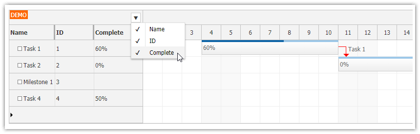
Add a context menu icon to the upper-left corner of the JavaScript Scheduler using an active area.
Dynamically rebuild the context menu items in
DayPilot.Menu.onShowso the check marks always reflect the current visible columns.Use the
hiddenflag ofrowHeaderColumnsitems to toggle row header column visibility.Includes a trial version of DayPilot Pro for JavaScript (see License below).
License
Licensed for testing and evaluation purposes. Please see the license agreement included in the sample project. You can use the source code of the tutorial if you are a licensed user of DayPilot Pro for JavaScript. Buy a license.
Define Columns and Data

Let's start by defining the row header columns and the resource data. The refreshed sample uses the current tabular rowHeaderColumns format, where each column title is defined using text and each row value is loaded from the matching resource property named in display.
const app = {
  columns: [
    { text: "Name", display: "name" },
    { text: "ID", display: "id" },
    { text: "Capacity", display: "capacity" },
  ],
  resources: [
    { name: "Resource 1", id: "R1", capacity: 50 },
    { name: "Resource 2", id: "R2", capacity: 10 },
    { name: "Resource 3", id: "R3", capacity: 10 },
    // ...
  ],
};
The Scheduler receives the column definitions through rowHeaderColumns: app.columns, and the rows are loaded during app.init() using dp.update({ resources, events }).
Add Icon that Opens a Context Menu
The button in the upper-left corner is rendered using a Scheduler active area inside the onBeforeCornerRender event handler.
In the refreshed sample, the corner trigger uses the bundled DayPilot SVG icon set. The symbol property points to icons/daypilot.svg#minichevron-down-2, and the active-area styling properties center the icon inside a small square button:
const dp = new DayPilot.Scheduler("dp", {
  rowHeaderColumns: app.columns,
  onBeforeCornerRender: (args) => {
    args.areas = [
      {
        right: 5,
        top: 5,
        width: 20,
        height: 20,
        padding: 2,
        symbol: "icons/daypilot.svg#minichevron-down-2",
        fontColor: "#4b5563",
        backColor: "#ffffff",
        borderColor: "#cbd5e1",
        borderRadius: 2,
        action: "ContextMenu",
        menu: columnMenu,
        style: "cursor: pointer;",
      },
    ];
  },
});
Add Context Menu Item that Toggles "Capacity" Column

As an intermediate development step, you can start with a single fixed menu item that toggles the third column (Capacity). The actual column update is handled by a small helper that flips the target column's hidden flag and requests a partial update() that refreshes the row headers.
const app = {
  toggleColumn(column) {
    column.hidden = !column.hidden;
    dp.update({ rowHeaderColumns: this.columns });
  },
};

const columnMenu = new DayPilot.Menu({
  items: [
    {
      text: "Toggle 'Capacity' column",
      onClick: () => {
        columnMenu.hide();
        app.toggleColumn(app.columns[2]);
      },
    },
  ],
});
The finished sample keeps the same toggleColumn() helper but replaces this fixed items array with a dynamically generated menu built from the current column list.
Generate the Menu Items Dynamically

The final version builds the menu dynamically inside onShow. That means the menu is rebuilt every time it opens, so the SVG check marks always match the current column visibility.
Before updating the Scheduler, the sample calls DayPilot.Menu.hide() so the menu closes immediately. When only one column remains visible, the sample prevents the final click from hiding that last column.
const columnMenu = new DayPilot.Menu({
  onShow: (args) => {
    args.menu.items = [];

    app.columns.forEach((column) => {
      args.menu.items.push({
        _column: column,
        text: column.text,
        symbol: column.hidden ? "" : "icons/daypilot.svg#checkmark-2",
        onClick: (itemArgs) => {
          columnMenu.hide();
          app.toggleColumn(itemArgs.item._column);
        },
      });
    });

    const visibleItems = args.menu.items.filter((item) => !item._column.hidden);
    if (visibleItems.length === 1) {
      visibleItems[0].disabled = true;
    }
  },
});
In browser verification, after hiding Capacity and ID, clicking the last remaining Name item leaves the Scheduler at exactly one visible column.
Full Source Code
<!DOCTYPE html>
<html>
<head>
  <meta charset="utf-8"/>
  <meta name="viewport" content="width=device-width, initial-scale=1">
  <title>JavaScript Scheduler: Show/Hide Columns using Context Menu</title>

  <style type="text/css">
    p, body, td, input, select, button { font-family: -apple-system,system-ui,BlinkMacSystemFont,'Segoe UI',Roboto,'Helvetica Neue',Arial,sans-serif; font-size: 14px; }
    body { padding: 0px; margin: 0px; background-color: #ffffff; }
    a { color: #1155a3; }
    .space { margin: 10px 0px 10px 0px; }
    .header { background: #003267; background: linear-gradient(to right, #011329 0%,#00639e 44%,#011329 100%); padding:20px 10px; color: white; box-shadow: 0px 0px 10px 5px rgba(0,0,0,0.75); }
    .header a { color: white; }
    .header h1 a { text-decoration: none; }
    .header h1 { padding: 0px; margin: 0px; }
    .main { padding: 10px; margin-top: 10px; }
    .generated { color: #999; }
    .generated a { color: #999; }
  </style>

  <!-- DayPilot library -->
  <script src="js/daypilot/daypilot-all.min.js"></script>
</head>
<body>
<div class="header">
  <h1><a href='https://code.daypilot.org/49959/javascript-scheduler-show-hide-columns-using-context-menu'>JavaScript Scheduler: Show/Hide Columns using Context Menu</a></h1>
  <div><a href="https://javascript.daypilot.org/">DayPilot for JavaScript</a> - HTML5 Calendar/Scheduling Components for JavaScript/Angular/React/Vue</div>
</div>

<div class="main">
  <div id="dp"></div>
  <div class="generated">Generated using <a href="https://builder.daypilot.org/">DayPilot UI Builder</a>.</div>
</div>

<script>
  const app = {
    columns: [
      { text: "Name", display: "name" },
      { text: "ID", display: "id" },
      { text: "Capacity", display: "capacity" },
    ],

    resources: [
      { name: "Resource 1", id: "R1", capacity: 50 },
      { name: "Resource 2", id: "R2", capacity: 10 },
      { name: "Resource 3", id: "R3", capacity: 10 },
      { name: "Resource 4", id: "R4", capacity: 50 },
      { name: "Resource 5", id: "R5", capacity: 20 },
      { name: "Resource 6", id: "R6", capacity: 30 },
      { name: "Resource 7", id: "R7", capacity: 50 },
      { name: "Resource 8", id: "R8", capacity: 60 },
      { name: "Resource 9", id: "R9", capacity: 50 },
    ],

    toggleColumn(column) {
      column.hidden = !column.hidden;
      dp.update({ rowHeaderColumns: this.columns });
    },

    init() {
      dp.update({ resources: this.resources, events: [] });
    },
  };

  const columnMenu = new DayPilot.Menu({
    onShow: (args) => {
      args.menu.items = [];

      app.columns.forEach((column) => {
        args.menu.items.push({
          _column: column,
          text: column.text,
          symbol: column.hidden ? "" : "icons/daypilot.svg#checkmark-2",
          onClick: (itemArgs) => {
            columnMenu.hide();
            app.toggleColumn(itemArgs.item._column);
          },
        });
      });

      const visibleItems = args.menu.items.filter((item) => !item._column.hidden);
      if (visibleItems.length === 1) {
        visibleItems[0].disabled = true;
      }
    },
  });

  const dp = new DayPilot.Scheduler("dp", {
    eventClickHandling: "Disabled",
    timeRangeSelectedHandling: "Enabled",
    onTimeRangeSelected: async (args) => {
      const scheduler = args.control;
      const modal = await DayPilot.Modal.prompt("Create a new event:", "Event 1");
      scheduler.clearSelection();
      if (modal.canceled) { return; }
      scheduler.events.add({
        start: args.start,
        end: args.end,
        id: DayPilot.guid(),
        resource: args.resource,
        text: modal.result,
      });
    },
    eventDeleteHandling: "Update",
    onEventDeleted: (args) => {
      console.log("Event deleted: " + args.e.text());
    },
    eventHoverHandling: "Bubble",
    bubble: new DayPilot.Bubble({
      onLoad: (args) => {
        args.html = "Event details";
      }
    }),
    eventMoveHandling: "Update",
    onEventMoved: (args) => {
      console.log("Event moved: " + args.e.text());
    },
    eventResizeHandling: "Update",
    onEventResized: (args) => {
      console.log("Event resized: " + args.e.text());
    },
    days: DayPilot.Date.today().daysInMonth(),
    startDate: DayPilot.Date.today().firstDayOfMonth(),
    treeEnabled: true,
    rowHeaderColumns: app.columns,
    rowHeaderHideIconEnabled: true,
    timeHeaders: [{ groupBy: "Month" }, { format: "d", groupBy: "Day" }],
    scale: "Day",
    onBeforeCornerRender: (args) => {
      args.areas = [
        {
          right: 5,
          top: 5,
          width: 20,
          height: 20,
          padding: 2,
          symbol: "icons/daypilot.svg#minichevron-down-2",
          fontColor: "#4b5563",
          backColor: "#ffffff",
          borderColor: "#cbd5e1",
          borderRadius: 2,
          action: "ContextMenu",
          menu: columnMenu,
          style: "cursor: pointer;",
        },
      ];
    },
  });

  dp.init();
  app.init();
</script>

</body>
</html>
History
April 20, 2026: Rebuilt the sample from the current JavaScript Scheduler builder template, upgraded it to the included DayPilot Pro for JavaScript
2026.2.6907, switched the trigger and checked states to bundled SVG symbols.