 DayPilot
Overview
React TypeScript project that uses a React Scheduler component to display reservations for multiple locations
The TypeScript definitions provide real-time code completion (including suggestions and type checks) in your IDE (e.g. Visual Studio, IntelliJ WebStorm)
Reservation locations are displayed on the vertical axis
New React Project with TypeScript Support
Lets start with creating a new React project using create-vite. The --template react-ts switch will generate a new React project with TypeScript support.
npx create-vite@latest react-scheduler-typescript --template react-tsWhen using the --typescript react-ts switch, the project source code files will end with *.tsx instead of *.js and the TypeScript code will be automatically compiled during builds.
Creating a React Scheduler Component in TypeScript
In order to create the Scheduler component that will display and manage our reservations it is necessary to install @daypilot/daypilot-lite-react. This package includes a React version of DayPilot Lite for JavaScript and it includes the React Scheduler component which will help us create the reservation UI.
We can add the package to our project using npm:
npm install @daypilot/daypilot-lite-reactNow we can create a functional React component (with Hooks API) that will wrap DayPilot Scheduler:
src/scheduler/Scheduler.tsx
import React, { FC } from 'react';
import { DayPilotScheduler } from "@daypilot/daypilot-lite-react";

interface SchedulerProps {}

const Scheduler: FC<SchedulerProps> = () => {
  return <DayPilotScheduler />;
}

export default Scheduler;
We can add our Scheduler component to App.tsx to test it:
src/App.tsx
import React from 'react';
import './App.css';
import Scheduler from "./scheduler/Scheduler";

const App: React.FC = () => {
  return (
      <div>
        <Scheduler />
      </div>
  );
}

export default App;
It doesn't display much at this moment but we got it working!

Displaying Locations on the Y Axis
Now that our Scheduler is initialized we can start adding features.
The first thing to configure is the Y axis which will display the reservation locations. In the Scheduler component, the rows are defined using resources property and this property is also available in the React component. So lets load the resources as a static array first:
import React, { FC } from 'react';
import { DayPilotScheduler } from "@daypilot/daypilot-lite-react";

interface SchedulerProps {}

const Scheduler: FC<SchedulerProps> = () => {
  return (
    <DayPilotScheduler
      resources={[
        {name: "Location A", id: "A"},
        {name: "Location B", id: "B"},
        {name: "Location C", id: "C"},
        {name: "Location D", id: "D"},
        {name: "Location E", id: "E"},
        {name: "Location F", id: "F"},
      ]}
    />
  );
}

export default Scheduler;
If you open the React web application in the browser now you will see the rows with our locations:

Defining the Time Axis of the Scheduler
By default, the Scheduler displays a single day and one cell per hour. The default start of the time line is today.
We want it to show the full year and one cell per day instead. This can be set using startDate, days, and scale properties. Lets also adjust the time headers on the X axis using timeHeaders property:
import React, { FC } from 'react';
import { DayPilotScheduler } from "@daypilot/daypilot-lite-react";

interface SchedulerProps {}

const Scheduler: FC<SchedulerProps> = () => {
  return (
    <DayPilotScheduler
      startDate={"2026-01-01"}
      days={365}
      scale={"Day"}
      timeHeaders={[
        {groupBy: "Month"},
        {groupBy: "Day", format: "d"}
      ]}
      resources={[
        {name: "Location A", id: "A"},
        {name: "Location B", id: "B"},
        {name: "Location C", id: "C"},
        {name: "Location D", id: "D"},
        {name: "Location E", id: "E"},
        {name: "Location F", id: "F"},
      ]}
    />
  );
}

export default Scheduler;
Our updated reservation scheduler looks like this now:

Loading Reservations
The last step of this tutorial will be adding the reservation data that will be displayed in the Scheduler grid.
The reservations are defined using the events attribute of the Scheduler component:
import React, { FC } from 'react';
import { DayPilotScheduler } from "@daypilot/daypilot-lite-react";

interface SchedulerProps {}

const Scheduler: FC<SchedulerProps> = () => {
  return (
    <DayPilotScheduler
      startDate={"2026-01-01"}
      days={365}
      scale={"Day"}
      timeHeaders={[
        {groupBy: "Month"},
        {groupBy: "Day", format: "d"}
      ]}
      resources={[
        {name: "Location A", id: "A"},
        {name: "Location B", id: "B"},
        {name: "Location C", id: "C"},
        {name: "Location D", id: "D"},
        {name: "Location E", id: "E"},
        {name: "Location F", id: "F"},
      ]}
      events={[
        {
          id: 1,
          text: "Reservation 1",
          start: "2026-11-03T00:00:00",
          end: "2026-11-09T00:00:00",
          resource: "A",
          barColor: "#3d85c6"
        },
        {
          id: 2,
          text: "Reservation 2",
          start: "2026-11-04T00:00:00",
          end: "2026-11-08T00:00:00",
          resource: "C",
          barColor: "#38761d"
        }
      ]}
    />
  );
}

export default Scheduler;
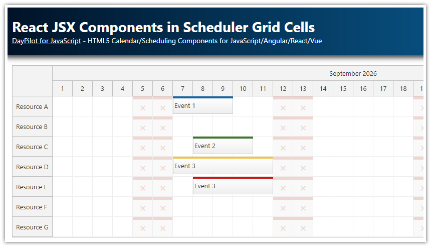
You can see that the reservations are now displayed in the matching rows:

Full TypeScript Source Code
Here is the full TypeScript source code of our Scheduler component:
import React, { useEffect, useRef, useState } from "react";
import { DayPilot, DayPilotScheduler } from "@daypilot/daypilot-lite-react";

const Scheduler: React.FC = () => {
    const [scheduler, setScheduler] = useState<DayPilot.Scheduler>();

    const [resources, setResources] = useState<DayPilot.ResourceData[]>([]);
    const [events, setEvents] = useState<DayPilot.EventData[]>([]);
    const [startDate, setStartDate] = useState<DayPilot.Date>(new DayPilot.Date("2026-01-01"));

    const onEventMoved = (args: DayPilot.SchedulerEventMovedArgs) => {
        console.log("Event moved: ", args);
    };

    const onEventResized = (args: DayPilot.SchedulerEventResizedArgs) => {
        console.log("Event resized: ", args);
    };

    const onBeforeEventRender = (args: DayPilot.SchedulerBeforeEventRenderArgs) => {
        args.data.areas = [
            {
                top: 14,
                right: 4,
                width: 20,
                height: 20,
                symbol: "/icons/daypilot.svg#trash",
                fontColor: "#999999",
                onClick: args => {
                    const e = args.source;
                    scheduler?.events.remove(e);
                }
            }
        ];
    }

    const onTimeRangeSelected = async (args: DayPilot.SchedulerTimeRangeSelectedArgs) => {
        const modal = await DayPilot.Modal.prompt("New reservation:", "Reservation");
        scheduler?.clearSelection();
        if (modal.canceled) {
            return;
        }
        scheduler?.events.add({ id: DayPilot.guid(), text: modal.result!, start: args.start, end: args.end, resource: args.resource });
    };

    const onEventClicked = async (args: DayPilot.SchedulerEventClickedArgs) => {
        const modal = await DayPilot.Modal.prompt("Edit reservation:", args.e.data.text);
        scheduler?.clearSelection();
        if (modal.canceled) {
            return;
        }
        args.e.data.text = modal.result;
        scheduler?.events.update(args.e);
    };

    // Load resources/events + initial scroll
    useEffect(() => {
        setResources([
            { name: "Location A", id: "A" },
            { name: "Location B", id: "B" },
            { name: "Location C", id: "C" },
            { name: "Location D", id: "D" },
            { name: "Location E", id: "E" },
            { name: "Location F", id: "F" },
        ]);

        setEvents([
            {
                id: 1,
                text: "Reservation 1",
                start: "2026-11-03T00:00:00",
                end: "2026-11-09T00:00:00",
                resource: "A",
                barColor: "#3d85c6",
            },
            {
                id: 2,
                text: "Reservation 2",
                start: "2026-11-04T00:00:00",
                end: "2026-11-08T00:00:00",
                resource: "C",
                barColor: "#38761d",
            },
            {
                id: 3,
                text: "Reservation 3",
                start: "2026-11-02T00:00:00",
                end: "2026-11-05T00:00:00",
                resource: "D",
                barColor: "#f1c232",
            },
            {
                id: 4,
                text: "Reservation 4",
                start: "2026-11-03T00:00:00",
                end: "2026-11-06T00:00:00",
                resource: "E",
                barColor: "#cc0000",
            },
        ]);

        scheduler?.scrollTo("2026-11-01");
    }, [scheduler]);

    return (
        <div>
            <DayPilotScheduler
                controlRef={setScheduler}
                startDate={startDate}
                days={startDate.daysInYear()}
                scale={"Day"}
                eventHeight={50}
                timeHeaders={[
                    { groupBy: "Month" },
                    { groupBy: "Day", format: "d" },
                ]}
                cellWidth={50}
                rowMarginTop={2}
                rowMarginBottom={2}
                resources={resources}
                events={events}
                onEventMoved={onEventMoved}
                onEventResized={onEventResized}
                onTimeRangeSelected={onTimeRangeSelected}
                onEventClicked={onEventClicked}
                onBeforeEventRender={onBeforeEventRender}
            />
        </div>
    );
};

export default Scheduler;
History
January 7, 2026: Upgraded to DayPilot Lite 5.
October 21, 2025: Delete icon, controlRef, row margins.
September 20, 2025: Upgraded to React 19. Switched to DayPilot Lite for JavaScript (open-source).
May 29, 2023: Upgraded to React 18, Hooks API, DayPilot Pro 2023.2.5582
December 16, 2020: Upgraded to React 17, DayPilot Pro 2020.4.4817
October 1, 2019: Initial release. React 16.