DayPilot
| Demo | |
|---|---|
| Downloads | |
| Languages | TypeScript |
| Technologies | angular |
Overview
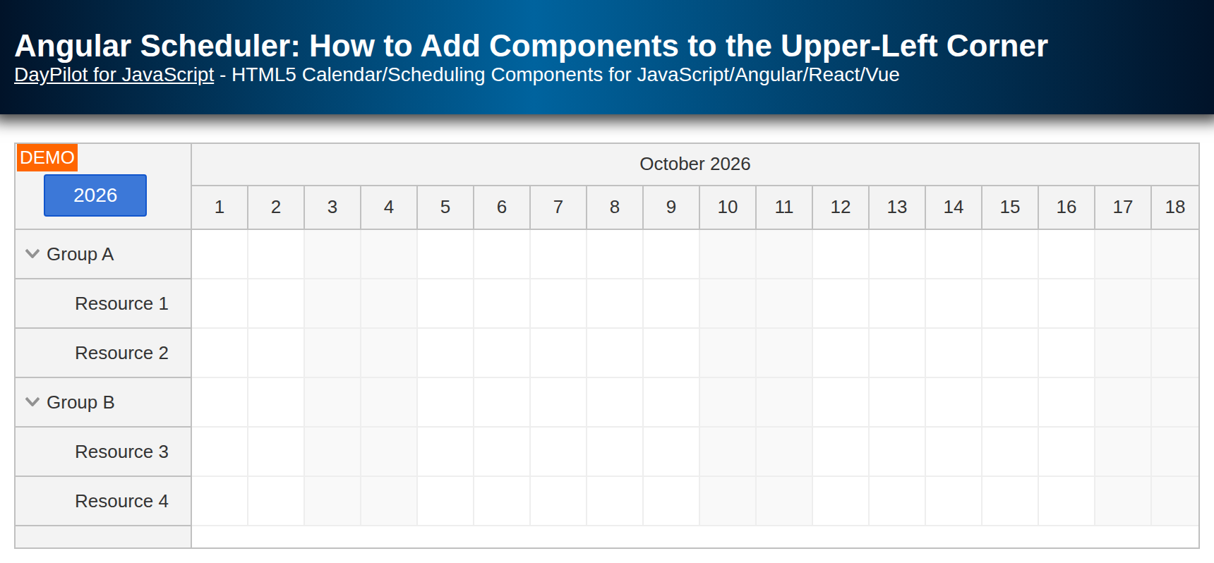
The upper-left corner of the Angular Scheduler component is empty by default. You can add custom content using the cornerHtml property. However, this property only supports raw HTML; it does not compile Angular bindings or components.
To display Angular content, place an ng-template with daypilotTemplate="corner" inside the Scheduler. You can use a custom Angular component directly in this template. Dynamic component creation is not necessary.
This template integration requires DayPilot Pro for Angular 2026.4.7099 or later. The sample uses Angular 22 and includes a trial version of DayPilot Pro for JavaScript (see License below).
License
Licensed for testing and evaluation purposes. Please see the license agreement included in the sample project. You can use the source code of the tutorial if you are a licensed user of DayPilot Pro for JavaScript.
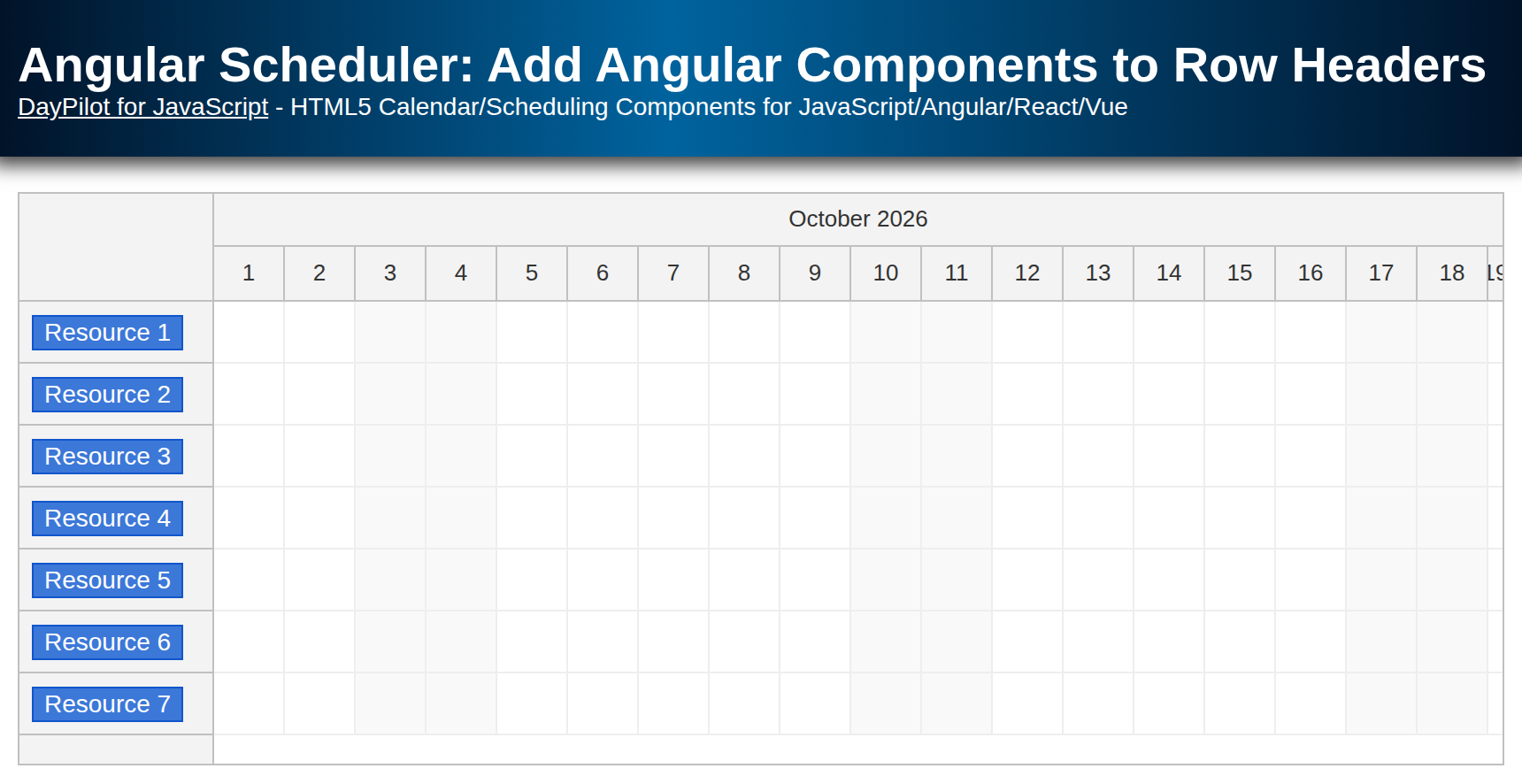
Button: Custom Angular Component
First, let’s create a simple ButtonComponent Angular component. Its text input sets the label, and its click handler opens a DayPilot modal alert. The component is standalone, so we can import it directly into the Scheduler component.
import {Component, Input} from '@angular/core';
import {DayPilot} from "daypilot-pro-angular";

@Component({
  selector: 'scheduler-button',
  standalone: true,
  template: `<button (click)="click()">{{text}}</button>`,
  styles: [`
  button {
    margin: 6px 0 0 20px;

    display: inline-block;
    text-align: center;
    background-color: #3c78d8;
    border: 1px solid #1155cc;
    color: #fff;
    padding: 6px 20px;
    border-radius: 2px;
    cursor: pointer;
    text-decoration: none;
  }
  `]

})
export class ButtonComponent {

  @Input()
  text: string = "button";

  click() {
    DayPilot.Modal.alert("Button clicked");
  }
}
How to Add the Button to the Upper-Left Corner of the Angular Scheduler?
Import DayPilotModule and ButtonComponent in the containing component. DayPilotModule provides both the Scheduler and the template directive.
Place the named template directly inside <daypilot-scheduler>. The corner has no template context variables; the year binding below reads a property of SchedulerComponent. Both the button label and the Scheduler timeline use the current date, so the button displays the year shown in the initial timeline.
import {Component, ViewChild, AfterViewInit, signal} from '@angular/core';
import {DayPilot, DayPilotModule, DayPilotSchedulerComponent} from 'daypilot-pro-angular';
import {DataService} from './data.service';
import {ButtonComponent} from './button.component';

@Component({
  selector: 'scheduler-component',
  standalone: true,
  imports: [DayPilotModule, ButtonComponent],
  providers: [DataService],
  template: `
    <daypilot-scheduler [config]="config" [events]="events" #scheduler>
      <ng-template daypilotTemplate="corner">
        <scheduler-button [text]="year"></scheduler-button>
      </ng-template>
    </daypilot-scheduler>
  `,
  styles: [``]
})
export class SchedulerComponent implements AfterViewInit {

  @ViewChild('scheduler')
  scheduler!: DayPilotSchedulerComponent;

  readonly year = DayPilot.Date.today().toString("yyyy");

  // ...
}
The [text]="year" binding passes the label to the child component. Angular handles the binding and the button’s (click) event normally. Clicking the year button displays “Button clicked”. You do not need to assign a native DOM element to args.element or call change detection manually.
The sample keeps Scheduler configuration and events in Angular signals. Resource loading updates the configuration signal, while the corner content remains defined in the template.
Cleanup: Template Views
The DayPilot Angular wrapper creates and disposes the template views as the Scheduler renders and removes their elements. There is no manually created component reference to store or destroy, so this example does not need onBeforeCornerDomAdd or onBeforeCornerDomRemove handlers.
If you use the lower-level DOM callbacks instead, Angular’s ViewContainerRef API remains an option for creating components dynamically. In that approach, you are responsible for destroying the component when its DOM content is removed. The corner template replaces that manual approach for this example.