 DayPilot
Overview
Use
DayPilot.Scheduler.makeDraggable()to activate external DOM elements.DraggableItemReact component embeds the activation logic and lets you create the draggable items transparently.The attached React 19 project includes a trial version of DayPilot Pro for JavaScript (see also License below).
This tutorial shows how to activate items in a custom list (plain <div> elements, ordered or unordered list, table rows). You can also use the built-in Queue component to display a queue of unscheduled tasks. The Queue React component supports bi-directional drag and drop (to and from the React Scheduler), reordering list items, and CSS themes. It uses an API compatible with the Scheduler component. To learn more, please see the React Work Order Planning tutorial.
License
Licensed for testing and evaluation purposes. Please see the license agreement included in the sample project. You can use the source code of the tutorial if you are a licensed user of DayPilot Pro for JavaScript. Buy a license.
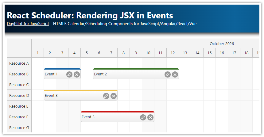
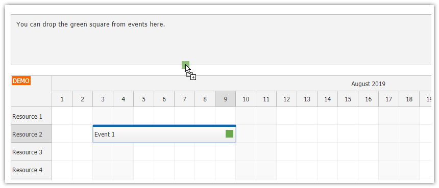
Creating Elements Draggable to the React Scheduler

The React Scheduler component supports dragging items from an external source. The drag and drop event moving (within the Scheduler) is enabled by default and the Scheduler also accepts external items automatically. However, the external DOM elements need to be activated first using the DayPilot.Scheduler.makeDraggable() method.
You can activate any type of DOM element (
<div>,<span>,<li>and other).The source element will be removed automatically on drop (this is configurable).
You need to define basic event properties when activating the external item:
id,textanddurationin seconds.
Let's see how the makeDraggable() method works. We will create a small standalone component that renders a <div> element and gets the DOM element reference using useRef(). After React mounts the component, useEffect() activates the element using makeDraggable():
import { useEffect, useRef } from "react";
import { DayPilot } from "daypilot-pro-react";

const ExternalItem = () => {
  const itemRef = useRef(null);

  useEffect(() => {
    const element = itemRef.current;
    if (!element) {
      return;
    }

    DayPilot.Scheduler.makeDraggable({
      element,
      id: 101,
      text: "Item #101",
      duration: 24 * 60 * 60
    });
  }, []);

  return (
    <div className="draggable-item" ref={itemRef}>
      Item #101
    </div>
  );
};

export default ExternalItem;
Note that we have defined element, id, text, and duration options - these are required.
The effect checks that the DOM element is available before calling makeDraggable(). This first example hard-codes the values for one external item; the next section generalizes the same setup into component props.
DraggableItem React Component

In order to make the code cleaner, we will wrap the activation logic in a special DraggableItem React component. We will use the same logic as in the previous example but we will load the variable values from the component props.
import { useEffect, useRef } from "react";
import { DayPilot } from "daypilot-pro-react";

const DraggableItem = ({ id, text, days }) => {
  const itemRef = useRef(null);

  useEffect(() => {
    const element = itemRef.current;
    if (!element) {
      return;
    }

    DayPilot.Scheduler.makeDraggable({
      element,
      id,
      text,
      duration: days * 24 * 60 * 60,
      onDragStart: args => {
        args.options.element.classList.add("draggable-source");
      },
      onDrop: args => {
        args.options.element.classList.remove("draggable-source");
      }
    });
  }, [days, id, text]);

  return (
    <div className="draggable-item" ref={itemRef}>
      {text}
    </div>
  );
};

export default DraggableItem;
As you can see, the component accepts three properties:
id- ID of the eventtext- text of the eventdays- duration in days
We are using the "Day" scale in the Scheduler component and the duration of the items is defined in days as well. We calculate the seconds from the days automatically in the DraggableItem component.
The DraggableItem React component defines onDragStart and onDrop event handlers using the DayPilot.Scheduler.makeDraggable() method - these events let us highlight the source item during dragging.
Now we can use the DraggableItem component to define the draggable items easily:
<DraggableItem id={101} text={"Item #101"} days={1} />
<DraggableItem id={102} text={"Item #102"} days={2} />
<DraggableItem id={103} text={"Item #103"} days={3} />
Handling the External Item Drop in the Scheduler

As soon as the user drops the item in the Scheduler, the standard onEventMoved event will be fired. You can test if the item was dragged from the external source by checking the args.external value:
<DayPilotScheduler
// ...
eventMoveHandling={"Update"}
onEventMoved={args => {
args.control.message("Event moved: " + args.e.text() + ", external: " + args.external);
}}
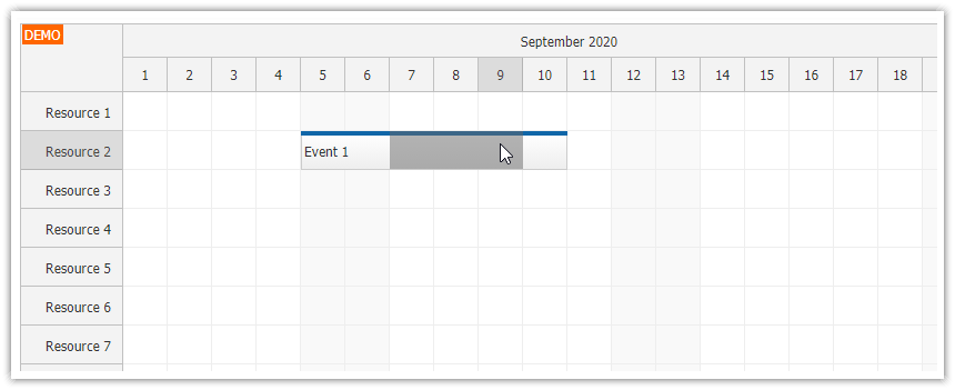
/>The Scheduler automatically detects that this is a new event, adds it to the internal store and displays it:

Full Source Code
src/scheduler/Scheduler.jsx
import { DayPilot, DayPilotScheduler } from "daypilot-pro-react";
import DraggableItem from "./DraggableItem.jsx";

const eventsData = [];

const resourcesData = [
  {name: "Resource A", id: "A"},
  {name: "Resource B", id: "B"},
  {name: "Resource C", id: "C"},
  {name: "Resource D", id: "D"},
  {name: "Resource E", id: "E"},
  {name: "Resource F", id: "F"},
  {name: "Resource G", id: "G"}
];

const Scheduler = () => {
  return (
    <div className="scheduler-shell">
      <div className="draggable-container">
        <div className="draggable-header">
          <span className="draggable-header-title">External items</span>
          <span className="draggable-header-subtitle">Drag to the Scheduler</span>
        </div>
        <div className="draggable-list">
          <DraggableItem id={101} text={"Item #101"} days={1} />
          <DraggableItem id={102} text={"Item #102"} days={2} />
          <DraggableItem id={103} text={"Item #103"} days={3} />
        </div>
      </div>

      <div className="scheduler-container">
        <DayPilotScheduler
          timeHeaders={[{"groupBy": "Month"}, {"groupBy": "Day", "format": "d"}]}
          scale={"Day"}
          days={DayPilot.Date.today().daysInMonth()}
          startDate={DayPilot.Date.today().firstDayOfMonth()}
          treeEnabled={true}
          durationBarVisible={false}
          eventMoveHandling={"Update"}
          onEventMoved={args => {
            args.control.message("Event moved: " + args.e.text() + ", external: " + args.external);
          }}
          events={eventsData}
          resources={resourcesData}
        />
      </div>
    </div>
  );
};

export default Scheduler;
src/scheduler/DraggableItem.jsx
import { useEffect, useRef } from "react";
import { DayPilot } from "daypilot-pro-react";

const DraggableItem = ({ id, text, days }) => {
  const itemRef = useRef(null);

  useEffect(() => {
    const element = itemRef.current;
    if (!element) {
      return;
    }

    DayPilot.Scheduler.makeDraggable({
      element,
      id,
      text,
      duration: days * 24 * 60 * 60,
      onDragStart: args => {
        args.options.element.classList.add("draggable-source");
      },
      onDrop: args => {
        args.options.element.classList.remove("draggable-source");
      }
    });
  }, [days, id, text]);

  return (
    <div className="draggable-item" ref={itemRef}>
      {text}
    </div>
  );
};

export default DraggableItem;
App.css (global CSS)
#root {
    --color-event-background: #2f74c0;
    --color-event-background-hover: #2868ad;
    --color-event-text: #ffffff;
    --color-panel-background: #f7f9fc;
    --color-panel-border: #d6dde8;
}

.scheduler-shell {
    display: flex;
    align-items: flex-start;
    gap: 20px;
    margin-bottom: 30px;
}

.draggable-container {
    box-sizing: border-box;
    flex: none;
    width: 220px;
    padding: 12px;
    border: 1px solid var(--color-panel-border);
    border-radius: 8px;
    background: var(--color-panel-background);
    box-shadow: 0 8px 24px rgba(24, 43, 68, 0.08);
}

.draggable-header {
    display: flex;
    flex-direction: column;
    gap: 2px;
    padding: 0 2px 12px;
    margin-bottom: 12px;
    border-bottom: 1px solid #dfe5ee;
}

.draggable-header-title {
    color: #1f2f45;
    font-weight: 700;
}

.draggable-header-subtitle {
    color: #66788f;
    font-size: 12px;
}

.draggable-list {
    display: flex;
    flex-direction: column;
    gap: 8px;
}

.draggable-item {
    min-height: 34px;
    display: flex;
    align-items: center;
    padding: 0 12px;
    border: 1px solid rgba(255, 255, 255, 0.35);
    border-radius: 7px;
    background: var(--color-event-background);
    color: var(--color-event-text);
    box-shadow: 0 2px 8px rgba(47, 116, 192, 0.22);
    cursor: move;
    user-select: none;
}

.draggable-item:hover {
    background: var(--color-event-background-hover);
}

.draggable-source {
    opacity: 0.55;
}

.scheduler-container {
    flex: 1;
    min-width: 0;
}

#root .scheduler_default_event_inner {
    border: 0;
    border-radius: 7px;
    background: var(--color-event-background);
    color: var(--color-event-text);
    padding-left: 10px;
}

@media (max-width: 720px) {
    .scheduler-shell {
        flex-direction: column;
    }

    .draggable-container {
        width: 100%;
    }
}
History
June 2, 2026: Upgraded to React 19, Vite, and DayPilot Pro 2026.2.6946.
October 10, 2022: Upgraded to React 18, DayPilot Pro 2022.4.5442. Updated CSS.
December 16, 2020: Upgraded to React 17, DayPilot Pro 2020.4.4807
October 2, 2019: Initial release, React 16.