 DayPilot
")
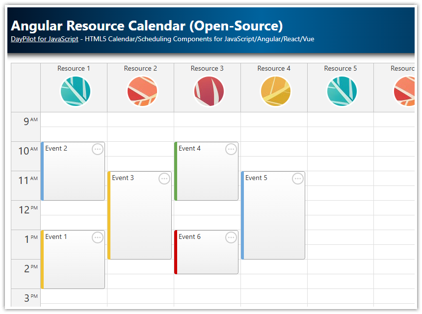
Angular Scheduler Component
The Angular Scheduler component displays a horizontal timeline for multiple resources—such as people, locations, tools, machines, and vehicles.
It helps you:
manage reservations, plan projects, and visualize manufacturing workflows;
create staff rosters for hotels, restaurants, and call‑center agents;
schedule patients and rooms in hospitals or outpatient clinics;
allocate classrooms, labs, and exam halls for schools and universities;
plan aircraft gate assignments and turnaround times at airports;
dispatch delivery fleets and lock in last‑mile route blocks;
coordinate volunteers and shifts for large events or NGOs;
book event venues and stages for conferences, theaters, or festivals;
set preventive‑maintenance windows for factory equipment or data‑center racks;
build broadcast rundowns for TV or radio shows;
assign rail‑freight paths on shared tracks and in yards.
This tutorial shows how to install and configure the Angular Scheduler component. It uses the open-source DayPilot Lite version.
License
Apache License 2.0
Angular Scheduler: Installation
To install DayPilot Lite for Angular (@daypilot/daypilot-lite-angular), use NPM:
npm install @daypilot/daypilot-lite-angularThe Scheduler component is included since version 2025.2.667 (NPM package 4.0.0).
Minimal Working Configuration
Here is a minimal Angular Scheduler component example for a quick start:
import { Component } from '@angular/core';
import { DayPilot, DayPilotModule } from '@daypilot/daypilot-lite-angular';

@Component({
  selector: 'scheduler-component',
  standalone: true,
  imports: [DayPilotModule],
  template: `<daypilot-scheduler [config]="config" [events]="events"></daypilot-scheduler>`
})
export class SchedulerComponent {
  events = signal<DayPilot.EventData[]>([
    {
      id: 1,
      text: "Event 1",
      start: "2025-10-07T08:00:00",
      end: "2025-10-07T12:00:00",
      resource: "R1"
    }
  ]);

  config = signal<DayPilot.SchedulerConfig>({
    startDate: "2026-10-07",
    days: 7,
    scale: 'Hour',
    resources: [
      { name: "Resource 1", id: "R1" }
    ]
  });
}
To create a new Angular project with a pre-configured Scheduler, you can use the UI Builder online app.
Horizontal Timeline

The Scheduler displays the timeline on the horizontal axis.
Three core properties define what you see:
startDate- date of the first visible columndays- number of calendar days to renderscale- duration represented by one cell
Above the grid, the Scheduler shows a time header. You can stack as many rows as you like, each grouping the cells by a larger unit (year → quarter → month → week → day → hour → minute).
For our manufacturing demo we will use the following timeline:
the current month;
one hour per cell (24 columns per day);
three header rows – month ▸ day ▸ hour.
This is the corresponding config:
config = signal<DayPilot.SchedulerConfig>({
  timeHeaders: [{groupBy:"Month"},{groupBy:"Day",format:"dddd MMMM d, yyyy"}, {groupBy:"Hour",format:"HH:mm"}],
  scale: "Hour",
  days: DayPilot.Date.today().daysInMonth(),
  startDate: DayPilot.Date.today().firstDayOfMonth(),
});
Adjusting Density
The cell width can be adjusted as needed:
Wider cells (
cellWidth> 100 px) improve readability.Narrower cells let you fit more days on screen – reduce
cellWidthor usescale: "CellDuration"andcellDuration: 30for finer resolution.
Scrolling Programmatically
After loading data, you can move the viewport to the specified time:
this.scheduler.control.scrollTo(DayPilot.Date.today().firstDayOfMonth().addHours(8));Custom CSS Theme: Rounded Corners

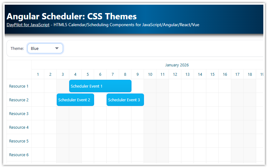
DayPilot ships with a clean but generic theme. In production you’ll want your scheduler to match your brand. The quickest route is the online Theme Designer.
In our Angular project, we will use a slightly modified CSS theme that uses rounded corners and gray background (rounded.css).
To create a new theme, follow these steps:
1. Navigate to https://themes.daypilot.org and select Scheduler.
2. You can tune and review the most common properties:
Global – font family and base size
Time & Row Headers – background, text color, horizontal/vertical alignment
Events – background color, text color, border radius, border color, optional drop shadow
Grid – separate background for business vs. non‑business cells
3. Click Download and save the file zip file which contains the generated CSS theme (rounded.css). Save it as src/themes/rounded.css.
Importing the Theme in Angular
/* styles.css */
@import 'themes/rounded.css';
Enabling the Theme in the Scheduler
config = signal<DayPilot.SchedulerConfig>({
  theme: 'rounded',            // matches rounded.css
  durationBarVisible: false,   // hide the colored stripe at the top of events
  // ...other settings...
});
The theme string must match the CSS file name (without extension). Multiple schedulers in the same app can each specify a different theme.
Dark‑Mode tip: Export a second file — e.g.
rounded-dark.css— then toggle programmatically:this.config.update(cfg => ({ ...cfg, theme: prefersDark ? 'rounded-dark' : 'rounded' }));
Tweaking the Theme Manually
The generated theme uses CSS variables which can be changed as needed.
The defaults, defined for the .rounded_main selector, are overriden by the theme-specific values under .rounded_main:not(.default).
/*
DayPilot Scheduler Theme
https://themes.daypilot.org/scheduler/theme/snthkz
Theme Designer Version: 2025.06.18.39140
*/

/* overrides */
.rounded_main:not(.default) {
    --dp-scheduler-border-color: #c0c0c0;
    --dp-scheduler-border-inner-color: var(--dp-scheduler-border-color);
    --dp-scheduler-font-family: -apple-system,system-ui,BlinkMacSystemFont,'Segoe UI',Roboto,'Helvetica Neue',Arial,sans-serif;
    --dp-scheduler-font-size: 13px;
    --dp-scheduler-header-color: #333333;
    --dp-scheduler-header-bg-color: #f3f3f3;
    --dp-scheduler-message-padding: 10px;
    --dp-scheduler-message-bg-color: #ffa216;
    --dp-scheduler-message-color: #ffffff;
    --dp-scheduler-grid-line-color: #eeeeee;
    --dp-scheduler-event-color: #333333;
    --dp-scheduler-event-border-color: #969696;
    --dp-scheduler-event-border-radius: 6px;
    --dp-scheduler-event-padding: 3px;
    --dp-scheduler-event-bar-bg-color: #9dc8e8;
    --dp-scheduler-event-bar-color: #1066a8;
    --dp-scheduler-event-bar-left: 0px;
    --dp-scheduler-event-bar-right: 0px;
    --dp-scheduler-event-bar-top: 0px;
    --dp-scheduler-event-bar-height: 4px;
    --dp-scheduler-event-bar-display: none;
    --dp-scheduler-cell-bg-color: #f9f9f9;
    --dp-scheduler-cell-business-bg-color: #ffffff;
    --dp-scheduler-event-vertical-align: flex-start;
    --dp-scheduler-event-horizontal-align: ;
    --dp-scheduler-rowheader-padding: 7px;
    --dp-scheduler-rowheader-vertical-align: center;
    --dp-scheduler-timeheader-padding: 7px;
    --dp-scheduler-timeheader-horizontal-align: center;
    --dp-scheduler-timeheader-vertical-align: center;
    --dp-scheduler-event-background: #bfbfbf;
}

/* defaults */
.rounded_main {
    --dp-scheduler-border-color: #c0c0c0;
    --dp-scheduler-border-inner-color: #e0e0e0;
    --dp-scheduler-cell-bg-color: #f9f9f9;
    --dp-scheduler-cell-business-bg-color: #ffffff;
    --dp-scheduler-event-background: linear-gradient(to bottom, var(--dp-scheduler-event-bg-top-color) 0%, var(--dp-scheduler-event-bg-bottom-color) 100%);
    --dp-scheduler-event-bg-bottom-color: #eeeeee;
    --dp-scheduler-event-bg-top-color: #ffffff;
    --dp-scheduler-event-bar-bg-color: #9dc8e8;
    --dp-scheduler-event-bar-color: #1066a8;
    --dp-scheduler-event-bar-display: block;
    --dp-scheduler-event-bar-height: 4px;
    --dp-scheduler-event-bar-left: 0px;
    --dp-scheduler-event-bar-right: 0px;
    --dp-scheduler-event-bar-top: 0px;
    --dp-scheduler-event-border: 1px solid var(--dp-scheduler-event-border-color);
    --dp-scheduler-event-border-color: #ccc;
    --dp-scheduler-event-border-radius: 0px;
    --dp-scheduler-event-box-shadow: none;
    --dp-scheduler-event-color: #333;
    --dp-scheduler-event-horizontal-align: flex-start;
    --dp-scheduler-event-milestone-color: #38761d;
    --dp-scheduler-event-padding: 2px;
    --dp-scheduler-event-selected-bg-color: #ddd;
    --dp-scheduler-event-vertical-align: center;
    --dp-scheduler-focus-outline-color: red;
    --dp-scheduler-font-family: -apple-system, system-ui, BlinkMacSystemFont, "Segoe UI", Roboto, "Helvetica Neue", Arial, sans-serif;
    --dp-scheduler-font-size: 13px;
    --dp-scheduler-grid-line-break-color: #999;
    --dp-scheduler-grid-line-color: #eee;
    --dp-scheduler-header-bg-color: #f3f3f3;
    --dp-scheduler-header-color: #333;
    --dp-scheduler-link-color: #cc0000;
    --dp-scheduler-message-bg-color: #ffa216;
    --dp-scheduler-message-color: #ffffff;
    --dp-scheduler-message-padding: 10px;
    --dp-scheduler-rowheader-padding: 7px;
    --dp-scheduler-rowheader-vertical-align: center;
    --dp-scheduler-selectionrectangle-color: #1066a8;
    --dp-scheduler-shadow-border-color: #888888;
    --dp-scheduler-shadow-color: #bbbbbb;
    --dp-scheduler-timeheader-horizontal-align: center;
    --dp-scheduler-timeheader-padding: 0px;
    --dp-scheduler-timeheader-vertical-align: center;
}

/* ... */
Define Resources and Load Events
Let’s create a simple DataService that returns the resource an event data:
import {Injectable} from "@angular/core";
import {Observable} from "rxjs";
import {DayPilot} from "@daypilot/daypilot-lite-angular";
import {HttpClient} from "@angular/common/http";
import EventData = DayPilot.EventData;

@Injectable()
export class DataService {

  events: EventData[] = [
    {
      id: 6,
      start: DayPilot.Date.today().firstDayOfMonth().addHours(9),
      end:   DayPilot.Date.today().firstDayOfMonth().addHours(10),
      text:  "",
      resource: "R2",
      tags: { type: "calibration" }
    },

    // ...

  ];

  resources: any[] = [
      { name: "Resource 1", id: "R1"},
      { name: "Resource 2", id: "R2"},
      { name: "Resource 3", id: "R3"},
      { name: "Resource 4", id: "R4"},
      { name: "Resource 5", id: "R5"},
      { name: "Resource 6", id: "R6"},
      { name: "Resource 7", id: "R7"},
      { name: "Resource 8", id: "R8"}
  ];

  constructor(private http : HttpClient){
  }

  getEvents(from: DayPilot.Date, to: DayPilot.Date): Observable<any[]> {

    // simulating an HTTP request
    return new Observable(observer => {
      setTimeout(() => {
        observer.next(this.events);
        observer.complete();
      }, 200);
    });

    // return this.http.get("/api/events?from=" + from.toString() + "&to=" + to.toString());
  }

  getResources(): Observable<any[]> {

    // simulating an HTTP request
    return new Observable(observer => {
      setTimeout(() => {
        observer.next(this.resources);
        observer.complete();
      }, 200);
    });

    // return this.http.get("/api/resources");
  }

}
Structure matters: Event objects must satisfy DayPilot.Event.data; resource objects must satisfy DayPilot.Scheduler.resources. Stick to the expected field names (id, start, end, resource, …) or the Scheduler will ignore them.
After both observables resolve we update the grid in one atomic call:
ngAfterViewInit(): void {
  const from = this.scheduler.control.visibleStart();
  const to   = this.scheduler.control.visibleEnd();

  forkJoin({
    resources: this.ds.getResources(),
    events:    this.ds.getEvents(from, to)
  }).subscribe(({ resources, events }) => {

    this.scheduler.control.update({
      resources,
      events,
    });

    this.scheduler.control.scrollTo(DayPilot.Date.today().firstDayOfMonth().addHours(8));
  });
}
We use forkJoin to wait until both streams finish emitting, preventing the UI from flickering half‑loaded content.
Performance Optimizations
The Scheduler component implements progressive row rendering and progressive event rendering to support large data sets. With these features enabled, the Scheduler only rendered the elements required for the current viewport. This allows loading tens of thousands events at once.
Event Types and Custom Colors

In most real‑world scenarios a single color for all events is not enough. We want to highlight different manufacturing stages such as “Production”, “Setup”, or “QA Check”.
Adding a Type to Each Event
We store custom data inside tags (a reserved property guaranteed never to clash with future DayPilot keys):
const events: EventData[] = [
  {
    id: 6,
    start:  DayPilot.Date.today().firstDayOfMonth().addHours(9),
    end:    DayPilot.Date.today().firstDayOfMonth().addHours(10),
    resource: 'R2',
    text: '',                      // user label will come later
    tags: { type: 'calibration' }  // <‑‑ references an id from eventTypes
  }
];
Type → Color Lookup Table
This array maps each event type to a special color:
eventTypes = [
  { id: 'production',  name: 'Production',  color: '#93c47d' },
  { id: 'setup',       name: 'Setup',       color: '#6fa8dc' },
  { id: 'calibration', name: 'Calibration', color: '#f6b26b' },
  { id: 'qa',          name: 'QA Check',    color: '#ffd966' },
  { id: 'cleaning',    name: 'Cleaning',    color: '#cccccc' }
];
Coloring Events
The onBeforeEventRender event is called for every event before it gets painted, so it’s the perfect hook for appearance logic:
onBeforeEventRender: args => {
  // 1 Find the color definition
  const def = this.eventTypes.find(t => t.id === args.data.tags?.type);
  if (def) {
    args.data.backColor   = def.color;  // background
    args.data.borderColor = 'darker';   // automatic darker shade

    // Optional: prefix event text with the type name
    args.data.text = args.data.text
      ? `${def.name}: ${args.data.text}`
      : def.name;
  }
};
At runtime the Scheduler will now paint “Calibration” events orange, “QA Check” events yellow, and so on.
Display Event Duration in a Badge

To show the length of each task directly on the bar, add an active area inside onBeforeEventRender. The handler computes the duration, formats it as hours:minutes, and places a small badge in the bottom‑left corner of the event.
onBeforeEventRender: args => {

  const duration = new DayPilot.Duration(args.data.start, args.data.end);
  const totalHours = Math.floor(duration.totalHours());
  const durationText = duration.toString(`${totalHours}:mm`);

  args.data.areas = [
    {
      bottom: 3,
      left: 3,
      width: 94,
      height: 20,
      backColor: "#ffffff99",
      borderRadius: 6,
      verticalAlignment: "center",
      horizontalAlignment: "center",
      text: durationText,
    }
  ];

}
Every bar now carries a subtle badge like 2:30, helping users see task length at a glance without opening a modal or tooltip.
Inline Delete Icon on Each Event

Give users a one‑click way to remove entries by overlaying a small ✕ icon in the event’s top‑right corner.
We’ll reuse the built‑in SVG symbol daypilot.svg#x-2 (preview all bundled icons at https://icons.daypilot.org/) and attach a click handler that removes the bar from the UI (and, optionally, from the server).
onBeforeEventRender: args => {

  args.data.areas = [
    {
      top: 3,
      right: 3,
      width: 20,
      height: 20,
      backColor: "#ffffff99",
      borderRadius: "50%",
      padding: 3,
      fontColor: "#666666",
      symbol: "icons/daypilot.svg#x-2",
      onClick: args => {
        const e = args.source;
        this.scheduler.control.events.remove(e);
      }
    },
  ];

}
Full Source Code
Here is the full source code of our Angular Scheduler component implementation.
import {Component, ViewChild, AfterViewInit, signal} from '@angular/core';
import {DayPilot, DayPilotModule, DayPilotSchedulerComponent} from '@daypilot/daypilot-lite-angular';
import {DataService} from './data.service';
import {forkJoin} from 'rxjs';

@Component({
  selector: 'scheduler-component',
  standalone: true,
  imports: [DayPilotModule],
  providers: [DataService],
  template: `<daypilot-scheduler [config]="config" #scheduler></daypilot-scheduler>`,
  styles: [``]
})
export class SchedulerComponent implements AfterViewInit {

  @ViewChild('scheduler')
  scheduler!: DayPilotSchedulerComponent;

  eventTypes = [
    { name: "Production", id: "production", color: "#93c47d" },
    { name: "Setup", id: "setup", color: "#6fa8dc" },
    { name: "Calibration", id: "calibration", color: "#f6b26b" },
    { name: "QA Check", id: "qa", color: "#ffd966" },
    { name: "Cleaning", id: "cleaning", color: "#cccccc" }
  ];

  form: DayPilot.ModalFormItem[] = [
    { name: "Text", id: "text", type: "text"},
    { name: "Type", id: "tags.type", type: "select", options: this.eventTypes.map(t => ({name: t.name, id: t.id})) }
  ];

  config = signal<DayPilot.SchedulerConfig>({
    timeHeaders: [{groupBy:"Month"},{groupBy:"Day",format:"dddd MMMM d, yyyy"}, {groupBy:"Hour",format:"HH:mm"}],
    scale: "Hour",
    days: DayPilot.Date.today().daysInMonth(),
    startDate: DayPilot.Date.today().firstDayOfMonth(),
    timeRangeSelectedHandling: "Enabled",
    onTimeRangeSelected: async (args) => {
      const scheduler = args.control;
      const e = {
        id: DayPilot.guid(),
        start: args.start,
        end: args.end,
        resource: args.resource,
        text: "",
        tags : {
          type: "production",
        }
      };
      const modal = await DayPilot.Modal.form(this.form, e);
      scheduler.clearSelection();
      if (modal.canceled) { return; }
      scheduler.events.add(modal.result);
    },
    eventHeight: 50,
    cellWidth: 100,
    durationBarVisible: false,
    theme: "rounded",
    rowMarginTop: 2,
    rowMarginBottom: 2,
    onBeforeEventRender: args => {
      args.data.borderColor = "darker";

      let typeText = "";
      const type = this.eventTypes.find(t => t.id === args.data.tags?.type);
      if (type) {
        typeText = type.name;
        args.data.backColor = type.color;
      }

      args.data.toolTip = args.data.text;

      if (args.data.text) {
        args.data.text = `${typeText}: ${args.data.text}`;
      }
      else {
        args.data.text = typeText;
      }

      const duration = new DayPilot.Duration(args.data.start, args.data.end);
      const totalHours = Math.floor(duration.totalHours());
      const durationText = duration.toString(`${totalHours}:mm`);

      args.data.areas = [
        {
          top: 3,
          right: 3,
          width: 20,
          height: 20,
          backColor: "#ffffff99",
          borderRadius: "50%",
          padding: 3,
          fontColor: "#666666",
          symbol: "icons/daypilot.svg#x-2",
          onClick: args => {
            const e = args.source;
            this.scheduler.control.events.remove(e);
          }
        },
        {
          bottom: 3,
          left: 3,
          width: 94,
          height: 20,
          backColor: "#ffffff99",
          borderRadius: 6,
          verticalAlignment: "center",
          horizontalAlignment: "center",
          text: durationText,
        }
      ];

    },
  });

  constructor(private ds: DataService) {
  }

  ngAfterViewInit(): void {
    const from = this.scheduler.control.visibleStart();
    const to   = this.scheduler.control.visibleEnd();

    forkJoin({
      resources: this.ds.getResources(),
      events:    this.ds.getEvents(from, to)
    }).subscribe(({ resources, events }) => {

      this.scheduler.control.update({
        resources,
        events,
      });

      this.scheduler.control.scrollTo(DayPilot.Date.today().firstDayOfMonth().addHours(8));
    });
  }

}