Overview
-
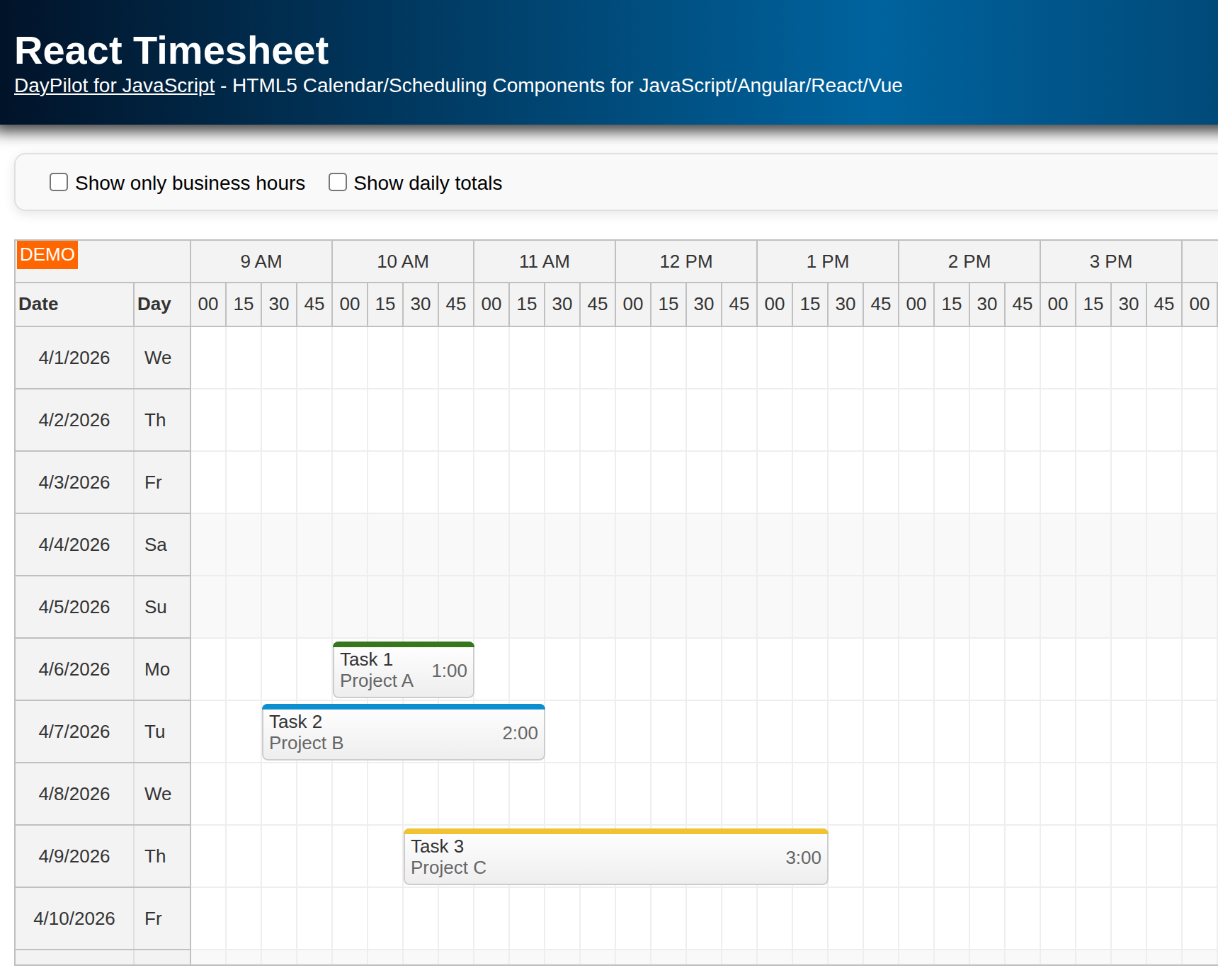
The React Scheduler component can switch to timesheet mode, where days are displayed on the vertical axis and hours on the horizontal axis.
-
Learn how to hide non-business hours, add daily totals to the row headers, scroll to a specific time of day, and keep drag-and-drop edits synchronized with React state.
-
Tasks listed in the timesheet can be assigned to a project and differentiated using project-specific colors.
-
You can generate your own React starter project with a preconfigured timesheet using the UI Builder online application.
License
Licensed for testing and evaluation purposes. Please see the license agreement included in the sample project. You can use the source code of the tutorial if you are a licensed user of DayPilot Pro for JavaScript.
How to Set Up the React Timesheet?
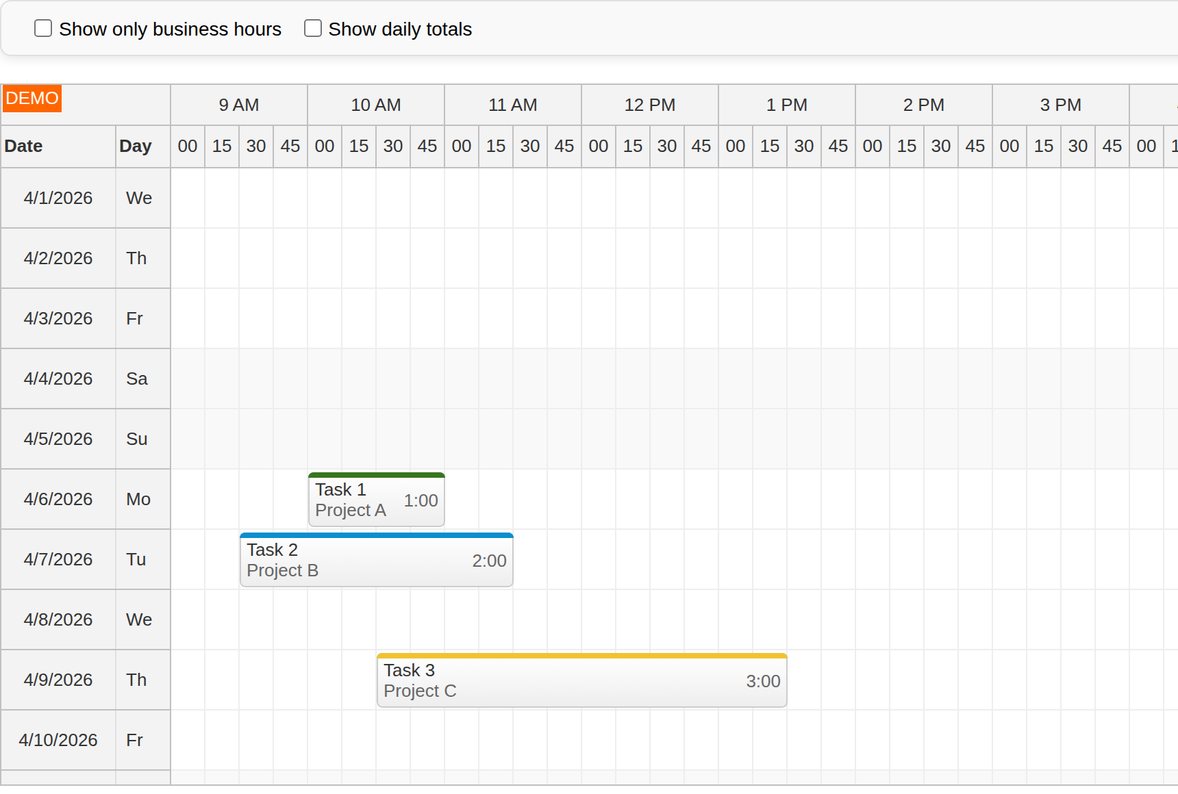
The React timesheet is implemented using the React Scheduler component from DayPilot Pro for JavaScript. To display the timesheet, switch the Scheduler to the timesheet mode using the viewType property. In this mode, the Scheduler displays days on the vertical axis and hours on the horizontal axis, with one day per row.
The visible range is derived from the current month. We calculate startDate using DayPilot.Date.today().firstDayOfMonth() and use the same value to determine how many day rows should be displayed.
The row headers show the date in the first column and the abbreviated day name in the second column. The horizontal time axis uses 15-minute cells and a two-level header with hours and minutes.
The cell width is calculated automatically using cellWidthSpec="Auto". The Scheduler fills the available horizontal space, but cellWidthMin keeps the cells readable on narrower screens by enabling the horizontal scrollbar when needed.
import { DayPilot, DayPilotScheduler } from 'daypilot-pro-react';

const startDate = DayPilot.Date.today().firstDayOfMonth();

const baseRowHeaderColumns = [
  { title: 'Date' },
  { title: 'Day', width: 40 },
];

<DayPilotScheduler
  viewType="Days"
  startDate={startDate}
  days={startDate.daysInMonth()}
  scale="CellDuration"
  cellDuration={15}
  timeHeaders={[{ groupBy: 'Hour' }, { groupBy: 'Cell', format: 'mm' }]}
  cellWidthSpec="Auto"
  cellWidthMin={25}
  rowHeaderColumns={baseRowHeaderColumns}
  onBeforeRowHeaderRender={(args) => {
    args.row.columns[0].horizontalAlignment = 'center';
    args.row.columns[1].text = args.row.start.toString('ddd');
  }}
/>
How to Load and Display Timesheet Records?
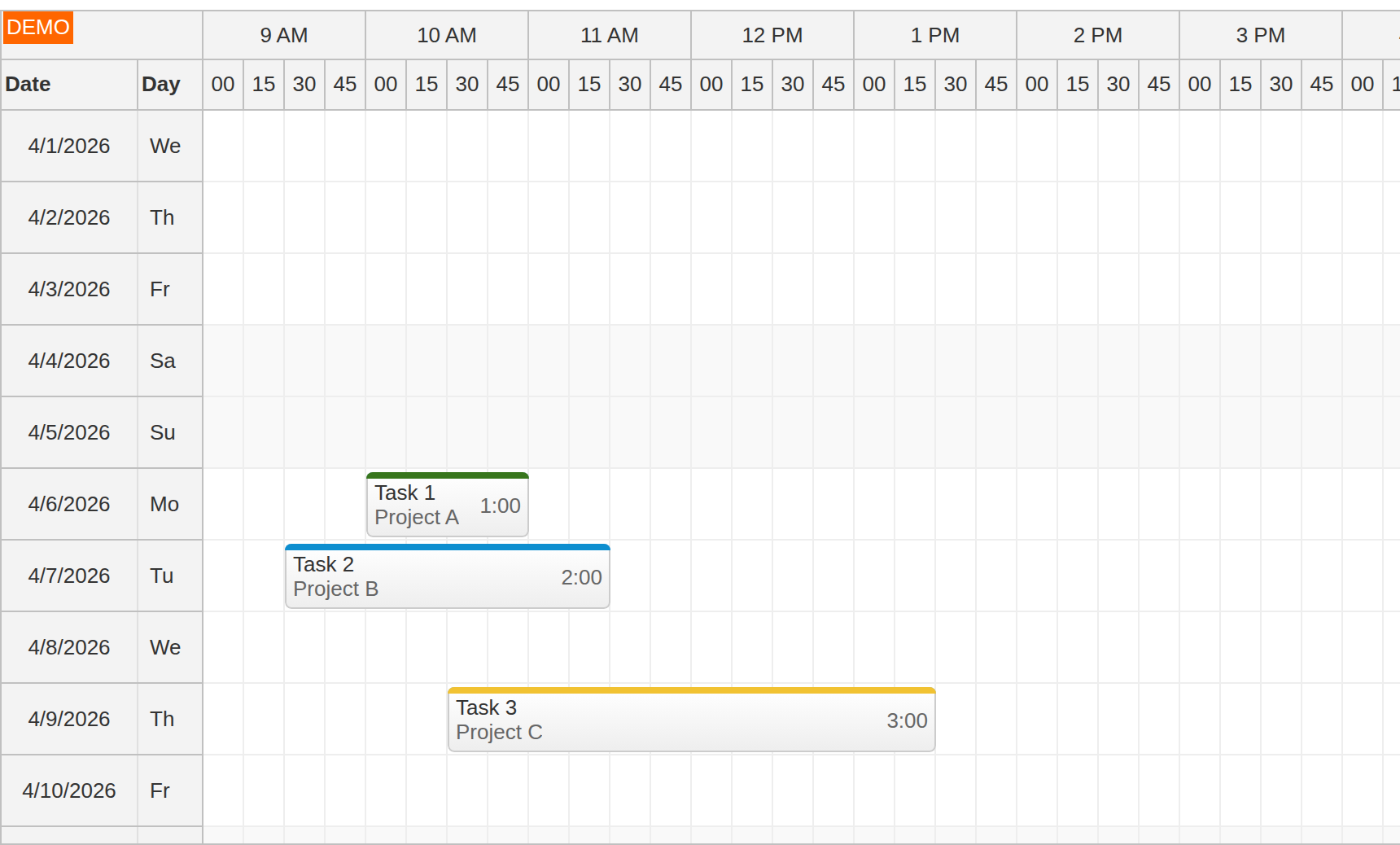
The sample uses a small helper that returns demo event data for the current month. To keep the visible rows meaningful when business hours are hidden, the demo tasks start on the first Monday of the month.
const findFirstMonday = (date) => {
  let current = date;
  while (current.getDayOfWeek() !== 1) {
    current = current.addDays(1);
  }
  return current;
};

const firstMonday = findFirstMonday(startDate);

const createEvents = () => [
  {
    id: 1,
    text: 'Task 1',
    start: firstMonday.addHours(10),
    end: firstMonday.addHours(11),
    project: 1,
  },
  {
    id: 2,
    text: 'Task 2',
    start: firstMonday.addDays(1).addHours(9).addMinutes(30),
    end: firstMonday.addDays(1).addHours(11).addMinutes(30),
    project: 2,
  },
  // ...
];
The event array is stored in React state and passed directly to the Scheduler:
const [events, setEvents] = useState(createEvents);

<DayPilotScheduler
  events={events}
  // ...
/>
This keeps the sample controlled by React state. The same events state is later updated when the user adds a new task or moves/resizes an existing one, so toolbar toggles do not revert those edits.
How to Hide Non-Business Hours in the React Timesheet?
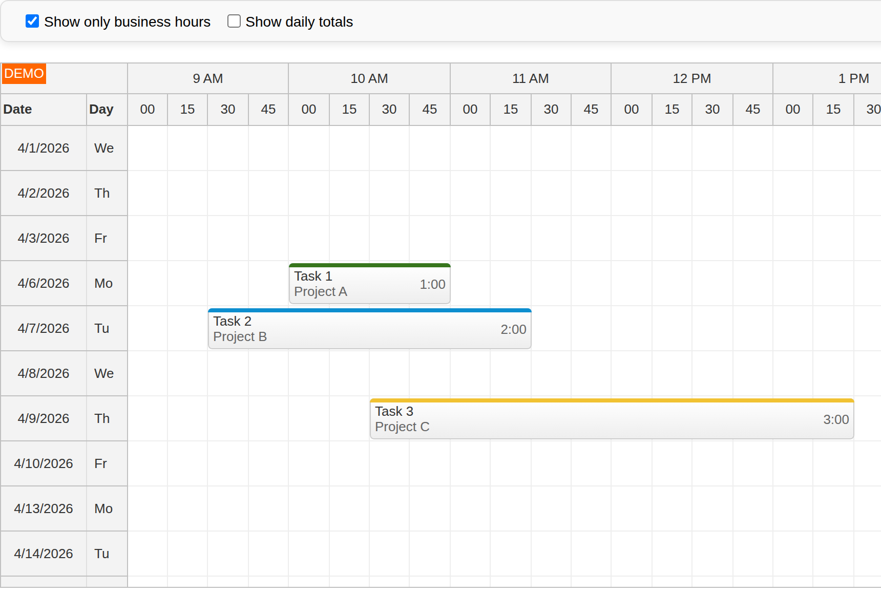
By default, the timesheet displays the full 24-hour range. In this sample, business hours are defined explicitly as 9 am to 5 pm. When you hide non-business hours, the Scheduler also removes weekend rows unless you enable businessWeekends.
The current toggle state is stored in showBusinessOnly:
const [showBusinessOnly, setShowBusinessOnly] = useState(false);

const changeBusiness = (event) => {
  setShowBusinessOnly(event.target.checked);
};
The checkbox updates that state:
<label>
  <input type="checkbox" onChange={changeBusiness} checked={showBusinessOnly} />
  Show only business hours
</label>
The Scheduler then inverts the flag and uses it for showNonBusiness:
<DayPilotScheduler
  businessBeginsHour={9}
  businessEndsHour={17}
  showNonBusiness={!showBusinessOnly}
  // ...
/>
How to Show Daily Totals in the React Timesheet?
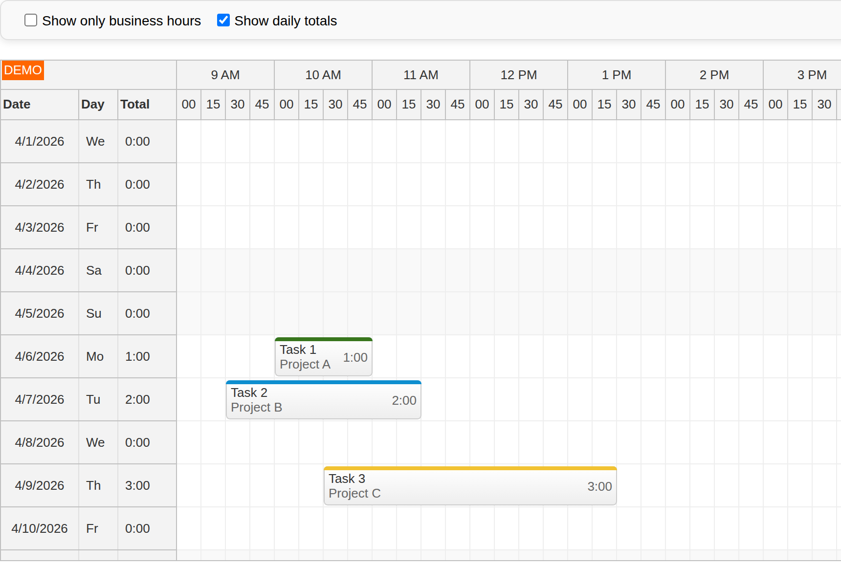
You can show the daily totals by adding a custom row header column and filling it in onBeforeRowHeaderRender.
Instead of storing two separate row-header configurations in state, the sample derives the current columns from the showDailyTotals checkbox:
const totalRowHeaderColumns = [
  { title: 'Date' },
  { title: 'Day', width: 40 },
  { title: 'Total', width: 60 },
];

const [showDailyTotals, setShowDailyTotals] = useState(false);
const rowHeaderColumns = showDailyTotals ? totalRowHeaderColumns : baseRowHeaderColumns;

<DayPilotScheduler
  rowHeaderColumns={rowHeaderColumns}
  // ...
/>
The third column is filled only when it exists:
onBeforeRowHeaderRender={(args) => {
  args.row.columns[0].horizontalAlignment = 'center';
  args.row.columns[1].text = args.row.start.toString('ddd');
  if (args.row.columns[2]) {
    args.row.columns[2].text = args.row.events.totalDuration().toString('h:mm');
  }
}}
The events.totalDuration() method of the DayPilot.Row object returns the combined length of all tasks displayed in that row.
How to Scroll to the Specified Time of Day in the React Timesheet?
To set the initial horizontal scrollbar position, use the scrollTo() method of the Scheduler component.
First, capture a reference to the DayPilot.Scheduler instance:
const [scheduler, setScheduler] = useState(null);

<DayPilotScheduler
  controlRef={setScheduler}
  // ...
/>
Then call scrollTo() when the control becomes available:
useEffect(() => {
  if (!scheduler) {
    return;
  }

  scheduler.scrollTo(startDate.addHours(9));
}, [scheduler]);
Because the date part is derived from startDate, the call scrolls horizontally to 9 am without moving the vertical position away from the first visible day.
How to Create a New Timesheet Record?
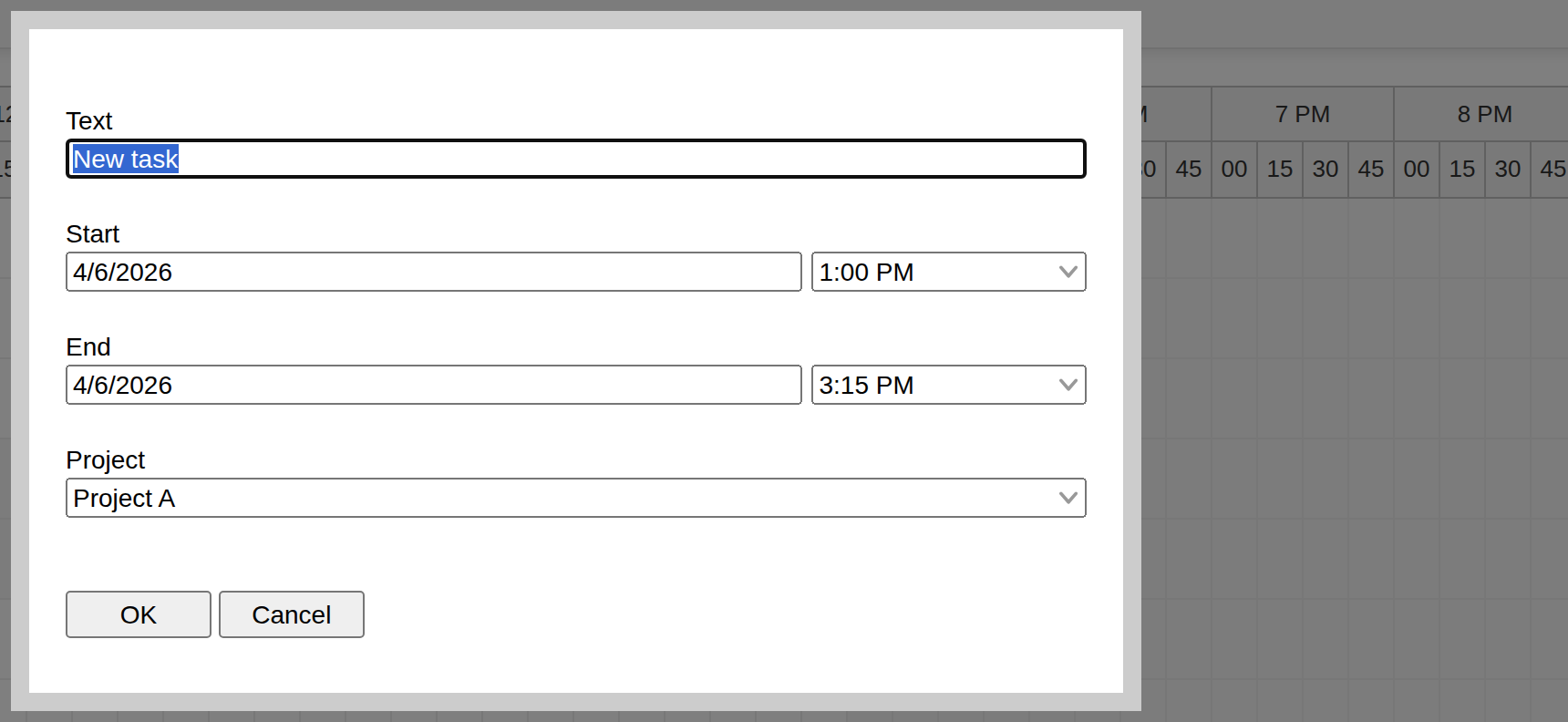
New timesheet records can be added using drag and drop. The timesheet fires the onTimeRangeSelected event handler when the user selects a time range.
The handler opens a modal dialog using DayPilot.Modal.form(). The form includes:
-
task text (text field)
-
task start and end (date/time fields)
-
project (searchable drop-down list)
The end field also validates that the selected end is not before the start.
onTimeRangeSelected={async (args) => {
  const form = [
    { name: 'Text', id: 'text' },
    { name: 'Start', id: 'start', type: 'datetime' },
    {
      name: 'End',
      id: 'end',
      type: 'datetime',
      onValidate: (validationArgs) => {
        if (validationArgs.values.end.getTime() < validationArgs.values.start.getTime()) {
          validationArgs.valid = false;
          validationArgs.message = 'End must be after start';
        }
      },
    },
    { name: 'Project', id: 'project', options: projects },
  ];
  const data = {
    id: DayPilot.guid(),
    start: args.start,
    end: args.end,
    project: projects[0].id,
    text: 'New task',
  };
  const modal = await DayPilot.Modal.form(form, data, { locale: 'en-us' });
  args.control.clearSelection();
  if (modal.canceled) {
    return;
  }
  setEvents((current) => [...current, modal.result]);
}}
Appending the result to events keeps the React state in sync with what the Scheduler displays.
How to Show Project Details in the Timesheet Tasks?

To display additional information inside each task box, use the onBeforeEventRender event handler. This hook lets you customize the event content and add active areas.
In this sample, the default event HTML is cleared and replaced by three active areas:
-
the task description at the top
-
the project name at the bottom
-
the task duration on the right
onBeforeEventRender={(args) => {
  const projectId = Number(args.data.project);
  const project = projects.find((item) => item.id === projectId) ?? projects[0];
  const duration = new DayPilot.Duration(args.data.start, args.data.end);

  args.data.barColor = project.color;
  args.data.html = '';
  args.data.areas = [
    {
      top: 5,
      left: 5,
      text: args.data.text,
    },
    {
      top: 20,
      left: 5,
      text: project.name,
      fontColor: '#666666',
    },
    {
      top: 13,
      right: 5,
      text: duration.toString('h:mm'),
      fontColor: '#666666',
    },
  ];
}}
The project color is used for the bar, border, and a lighter event background. This makes the project assignment visible at a glance without overwhelming the default Scheduler styling.
The available projects are defined using a simple array:
const projects = [
  { id: 1, name: 'Project A', color: '#38761d' },
  { id: 2, name: 'Project B', color: '#0d8ecf' },
  { id: 3, name: 'Project C', color: '#f1c232' },
];
Full Source Code
The complete timesheet logic lives in src/scheduler/Scheduler.jsx. The top-level App.jsx file only renders this component.
import { useEffect, useState } from 'react';
import { DayPilot, DayPilotScheduler } from 'daypilot-pro-react';

const startDate = DayPilot.Date.today().firstDayOfMonth();

const findFirstMonday = (date) => {
  let current = date;
  while (current.getDayOfWeek() !== 1) {
    current = current.addDays(1);
  }
  return current;
};

const firstMonday = findFirstMonday(startDate);

const projects = [
  { id: 1, name: 'Project A', color: '#38761d' },
  { id: 2, name: 'Project B', color: '#0d8ecf' },
  { id: 3, name: 'Project C', color: '#f1c232' },
];

const baseRowHeaderColumns = [
  { title: 'Date' },
  { title: 'Day', width: 40 },
];

const totalRowHeaderColumns = [
  { title: 'Date' },
  { title: 'Day', width: 40 },
  { title: 'Total', width: 60 },
];

const createEvents = () => [
  {
    id: 1,
    text: 'Task 1',
    start: firstMonday.addHours(10),
    end: firstMonday.addHours(11),
    project: 1,
  },
  {
    id: 2,
    text: 'Task 2',
    start: firstMonday.addDays(1).addHours(9).addMinutes(30),
    end: firstMonday.addDays(1).addHours(11).addMinutes(30),
    project: 2,
  },
  {
    id: 3,
    text: 'Task 3',
    start: firstMonday.addDays(3).addHours(10).addMinutes(30),
    end: firstMonday.addDays(3).addHours(13).addMinutes(30),
    project: 3,
  },
];

const Scheduler = () => {
  const [scheduler, setScheduler] = useState(null);
  const [events, setEvents] = useState(createEvents);
  const [showBusinessOnly, setShowBusinessOnly] = useState(false);
  const [showDailyTotals, setShowDailyTotals] = useState(false);

  useEffect(() => {
    if (!scheduler) {
      return;
    }

    scheduler.scrollTo(startDate.addHours(9));
  }, [scheduler]);

  const changeBusiness = (event) => {
    setShowBusinessOnly(event.target.checked);
  };

  const changeSummary = (event) => {
    setShowDailyTotals(event.target.checked);
  };

  const rowHeaderColumns = showDailyTotals ? totalRowHeaderColumns : baseRowHeaderColumns;

  return (
    <div>
      <div className="toolbar">
        <div className="toolbar-item">
          <label>
            <input type="checkbox" onChange={changeBusiness} checked={showBusinessOnly} />
            Show only business hours
          </label>
        </div>
        <div className="toolbar-item">
          <label>
            <input type="checkbox" onChange={changeSummary} checked={showDailyTotals} />
            Show daily totals
          </label>
        </div>
      </div>
      <DayPilotScheduler
        locale="en-us"
        viewType="Days"
        startDate={startDate}
        days={startDate.daysInMonth()}
        scale="CellDuration"
        cellDuration={15}
        timeHeaders={[{ groupBy: 'Hour' }, { groupBy: 'Cell', format: 'mm' }]}
        cellWidthSpec="Auto"
        cellWidthMin={25}
        eventHeight={40}
        rowMarginTop={2}
        rowMarginBottom={2}
        heightSpec="Max"
        height={450}
        allowEventOverlap={false}
        businessBeginsHour={9}
        businessEndsHour={17}
        showNonBusiness={!showBusinessOnly}
        rowHeaderColumns={rowHeaderColumns}
        onBeforeRowHeaderRender={(args) => {
          args.row.columns[0].horizontalAlignment = 'center';
          args.row.columns[1].text = args.row.start.toString('ddd');
          if (args.row.columns[2]) {
            args.row.columns[2].text = args.row.events.totalDuration().toString('h:mm');
          }
        }}
        onBeforeEventRender={(args) => {
          const projectId = Number(args.data.project);
          const project = projects.find((item) => item.id === projectId) ?? projects[0];
          const duration = new DayPilot.Duration(args.data.start, args.data.end);

          args.data.barColor = project.color;
          args.data.html = '';
          args.data.areas = [
            {
              top: 5,
              left: 5,
              text: args.data.text,
            },
            {
              top: 20,
              left: 5,
              text: project.name,
              fontColor: '#666666',
            },
            {
              top: 13,
              right: 5,
              text: duration.toString('h:mm'),
              fontColor: '#666666',
            },
          ];
        }}
        eventMoveHandling="Update"
        onEventMoved={(args) => {
          setEvents((current) =>
            current.map((item) =>
              item.id === args.e.data.id
                ? {
                    ...item,
                    start: args.newStart,
                    end: args.newEnd,
                  }
                : item,
            ),
          );
        }}
        eventResizeHandling="Update"
        onEventResized={(args) => {
          setEvents((current) =>
            current.map((item) =>
              item.id === args.e.data.id
                ? {
                    ...item,
                    start: args.newStart,
                    end: args.newEnd,
                  }
                : item,
            ),
          );
        }}
        timeRangeSelectedHandling="Enabled"
        onTimeRangeSelected={async (args) => {
          const form = [
            { name: 'Text', id: 'text' },
            { name: 'Start', id: 'start', type: 'datetime' },
            {
              name: 'End',
              id: 'end',
              type: 'datetime',
              onValidate: (validationArgs) => {
                if (validationArgs.values.end.getTime() < validationArgs.values.start.getTime()) {
                  validationArgs.valid = false;
                  validationArgs.message = 'End must be after start';
                }
              },
            },
            { name: 'Project', id: 'project', options: projects },
          ];
          const data = {
            id: DayPilot.guid(),
            start: args.start,
            end: args.end,
            project: projects[0].id,
            text: 'New task',
          };
          const modal = await DayPilot.Modal.form(form, data, { locale: 'en-us' });
          args.control.clearSelection();
          if (modal.canceled) {
            return;
          }
          setEvents((current) => [...current, modal.result]);
        }}
        events={events}
        controlRef={setScheduler}
      />
    </div>
  );
};

export default Scheduler;
History
-
April 14, 2026: Upgraded the sample to React 19, Vite 7, and DayPilot Pro for JavaScript 2026.2. Rebuilt the tutorial around inline Scheduler props and current-month demo data.
-
July 28, 2024: Upgraded to React 18.2, DayPilot Pro for JavaScript 2024.3. Adding a new task fixed (project reference).
-
May 30, 2023: Upgraded to React 18, DayPilot Pro for JavaScript 2023.2. Timesheet converted to functional component with hooks API.
-
July 26, 2021: Initial release.
 DayPilot