 DayPilot
Overview
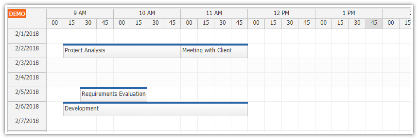
How to create a visual timesheet component that supports drag and drop in Angular.
The timesheet events display task description and duration.
You can switch the current employee using a drop-down list.
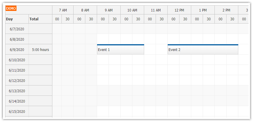
The timesheet shows the day name, total activity duration and a histogram in the row header (for each day).
You can use this project as a starting point for your own Angular timesheet application.
The attached Angular project includes a trial version of DayPilot Pro for JavaScript (see License below).
License
Licensed for testing and evaluation purposes. Please see the license agreement included in the sample project. You can use the source code of the tutorial if you are a licensed user of DayPilot Pro for JavaScript.
How to Create an Interactive Timesheet in Angular

To create a drag and drop timesheet in Angular, we will use the Angular Scheduler component that supports a timesheet view which displays days as rows. The time of day (up to 24 hours) will be displayed on the horizontal axis.
To add the timesheet to your Angular application, create a new TimesheetComponent class and include <daypilot-scheduler> from DayPilot Pro for JavaScript in the template.
The Angular version of DayPilot Pro can be installed using NPM from npm.daypilot.org.
npm install https://npm.daypilot.org/daypilot-pro-angular/trial/2026.1.6860.tar.gzTo create a Scheduler component using DayPilot, you need to import the necessary components and modules. This includes the DayPilot and DayPilotSchedulerComponent modules from the daypilot-pro-angular package.
The timesheet component template contains the <daypilot-scheduler> element with [config] and [events] attributes bound to Angular signals defined within the component.
The config signal is used to configure the Scheduler component:
In this example, the viewType property is set to
"Days", which means that the component displays days on the vertical axis (one day per row).The timeHeaders property is an array of objects that define time headers. The first time header row displays hour groups (
groupBy: "Hour") and the second row displays minutes (with cells corresponding to the scheduler grid cells).The scale property is set to
"CellDuration", which means that the component displays cells with a duration set using the cellDuration property (in minutes). In this case the cell duration is set to 15 minutes.The startDate property is set to
"2026-08-01"- this is the date of the first row. The days property is set to31.
import {Component, ViewChild, AfterViewInit, signal} from '@angular/core';
import {DayPilot, DayPilotModule, DayPilotSchedulerComponent} from 'daypilot-pro-angular';

@Component({
  selector: 'timesheet-component',
  standalone: true,
  imports: [DayPilotModule],
  template: `
    <daypilot-scheduler [config]="config" [events]="events" #timesheet></daypilot-scheduler>
  `,
  styles: [``]
})
export class TimesheetComponent {

  @ViewChild('timesheet')
  timesheet!: DayPilotSchedulerComponent;

  events = signal<DayPilot.EventData[]>([]);

  config = signal<DayPilot.SchedulerConfig>({
    viewType: "Days",
    timeHeaders: [
      {groupBy: "Hour"},
      {groupBy: "Cell", format: "mm"}
    ],
    scale: "CellDuration",
    cellDuration: 15,
    startDate: "2026-08-01",
    days: 31,
  });

}
Angular Timesheet Visual Configurator
Instead of creating a new Angular project from scratch, you can use the DayPilot UI Builder online application to configure the timesheet component and download an Angular project with all dependencies, boilerplate code and your configuration.
How to Show a Timesheet for a Selected Employee

Our Angular timesheet component displays data for a single employee. We will add a drop-down list above the timesheet that will let users switch the current employee.
Another option is to use the Angular Scheduler component in the standard “Resources” mode which shows a horizontal timeline for multiple employees displayed as rows.
However, we want to display the timesheet with days. The first step is to add the drop-down with a list of employees above the timesheet.
We can do that by adding a <select> element to the Angular template:
Employee:
<select [value]="employee()" (change)="employeeChanged($event)">
  @for (e of employees(); track e.id) {
    <option [value]="e.id">{{e.name}}</option>
  }
</select>
<daypilot-scheduler [config]="config" [events]="events" #timesheet></daypilot-scheduler>
You can see that the drop-down list loads the data from the employees signal.
To load the employee data, we add a call to getEmployees() to the ngAfterViewInit() event method:
employees = signal<any[]>([]);

employee = signal<string>('');

ngAfterViewInit(): void {
  this.ds.getEmployees().subscribe(employees => {
    this.employees.set(employees);
    this.employee.set(employees[0].id);
    this.loadEvents();
  });
}
To make sure that the first employee is selected when the page loads, we set the value of the employee property to the ID of the first item of the employees array.
The timesheet only loads the event records when there is a change of the selected value. This change event is handled by the method set using (change) attribute of the <select> element. The employeeChanged() method updates the employee signal and calls loadEvents(). We call loadEvents() directly from ngAfterViewInit() to load the initial data.
The loadEvents() method loads the timesheet events for the selected employee and updates the events signal:
employeeChanged($event: Event): void {
  const target = $event.target as HTMLSelectElement;
  this.employee.set(target.value);
  this.loadEvents();
}

loadEvents(): void {
  const from = this.timesheet.control.visibleStart();
  const to = this.timesheet.control.visibleEnd();
  this.ds.getEvents(from, to, this.employee()).subscribe(result => {
    this.events.set(result);
  });
}
Our Angular application uses a simple getEvents() implementation that loads the event data from a static array and filters them using the supplied parameters (start, end, employee):
import {Injectable} from '@angular/core';
import {Observable} from 'rxjs';
import {DayPilot} from 'daypilot-pro-angular';
import {HttpClient} from '@angular/common/http';

@Injectable()
export class DataService {

  events: any[] = [
    {
      id: 1,
      start: "2026-08-07T09:15:00",
      end: "2026-08-07T11:00:00",
      text: 'Task 1',
      employee: "P1",
      barColor: "#6aa84f"
    },

    // ...
  ];

  constructor(private http: HttpClient) {
  }

  getEvents(from: DayPilot.Date, to: DayPilot.Date, employeeId: string): Observable<any[]> {

    const selected = this.events.filter(e => e.employee === employeeId && !(new DayPilot.Date(e.end) < from || new DayPilot.Date(e.start) > to));

    // simulating an HTTP request
    return new Observable(observer => {
      setTimeout(() => {
        observer.next(selected);
      }, 200);
    });

  }

}
How to Show Duration of Timesheet Events

The Scheduler lets you adjust the appearance of events easily. You can use onBeforeEventRender event to provide your own HTML, set colors, add CSS classes and disable specific features (such as drag and drop events).
You can also add active areas - rectangular areas with custom content and possibly actions.
We will use the active areas to display event duration on the right side of an event:
onBeforeEventRender: args => {
  const duration = new DayPilot.Duration(args.data.start, args.data.end);
  args.data.areas = [
    { right: 2, top: 0, bottom: 0, width: 30, fontColor: "#999999", text: duration.toString('h:mm'), style: 'display: flex; align-items: center'}
  ];
}
You can see that we have set the active area position using CSS-like properties (right, top, bottom, width) in pixels. The fontColor is set to gray and we also center the text vertically using custom CSS styles (style property).
The active area content will be text that displays the calculated event duration in hours:minutes format.
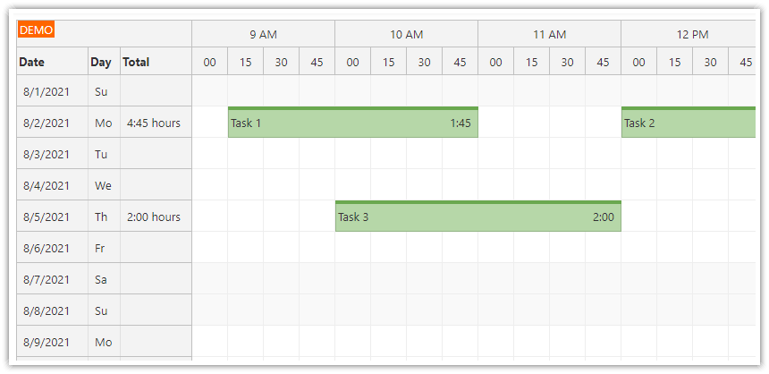
How to Show Day Names in the Timesheet Row Headers

The timesheet row headers display the date in the default column. As we want to add information about the day of week, we will add another column with a shortened day name.
It’s necessary to add the row header column definition to the config object. The default column with is 80 (pixels). The content of our day column will be short so we will use a smaller value (50 pixels):
config = signal<DayPilot.SchedulerConfig>({

  rowHeaderColumns: [
    {text: "Date"},
    {text: "Day", width: 50},
  ],

  // ...

});
Now that we have defined the column, we can set the content for each of the rows using onBeforeRowHeaderRender event:
onBeforeRowHeaderRender: args => {
  const day = args.row.start.toString("ddd");
  args.row.columns[1].text = `${day}`;
},
How to Calculate Daily Totals

In this step, we will add another column which will display a total duration of all events for that day.
First, define the new row using rowHeaderColumns property of the config.
config = signal<DayPilot.SchedulerConfig>({

  rowHeaderColumns: [
    {text: "Date"},
    {text: "Day", width: 50},
    {text: "Total", width: 40},
  ],

  // ...

});
Again, we will use onBeforeRowHeaderRender event to set the column content. The Angular Scheduler makes this easy, as the total duration of all columns is already accessible using args.row.events.totalDuration().
We just need to add a bit of formatting logic - we will need to convert the duration to hours:minutes format. If the duration is zero seconds, we will not display it at all.
onBeforeRowHeaderRender: args => {
  const duration = args.row.events.totalDuration();
  if (duration.totalSeconds() === 0) {
    return;
  }

  let hours = duration.toString('H:mm');
  if (duration.totalDays() >= 1) {
    hours = Math.floor(duration.totalHours()) + ':' + duration.toString('mm');
  }
  args.row.columns[2].text = `${hours}`;

},
How to Add Daily Histogram to Timesheet Row Header

In this step, we will improve our “Total” column with a histogram that provides a visual hint about the time usage.
In the bottom section of the row header cells, we have added an background active area (in light yellow) that represents the total available time (8 hours on workdays). This total time is calculated as the sum of all cells marked as business.
On top of that, we add another active area (dark yellow) that shows the proportion of time that is recorded as active in the timesheet.
onBeforeRowHeaderRender: args => {

  // ...

  const duration = args.row.events.totalDuration();

  const max = args.row.cells.all()
    .filter(cell => cell.properties.business)
    .map(cell => new DayPilot.Duration(cell.start, cell.end))
    .reduce((total, cell) => total.add(cell), DayPilot.Duration.ofHours(0));

  if (max.totalSeconds() === 0) {
    return;
  }

  let hours = duration.toString('H:mm');
  if (duration.totalDays() >= 1) {
    hours = Math.floor(duration.totalHours()) + ':' + duration.toString('mm');
  }
  args.row.columns[2].text = `${hours}`;

  // const max = DayPilot.Duration.ofHours(8);
  const pct = args.row.events.totalDuration().totalSeconds() / max.totalSeconds();
  args.row.columns[2].areas = [
    {
      bottom: 0,
      left: 0,
      width: 40,
      height: 4,
      backColor: "#ffe599",
    },
    {
      bottom: 0,
      left: 0,
      width: 40 * pct,
      height: 4,
      backColor: "#f1c232",
    }
  ];
},
Show/Hide Weekends and Non-Business Hours
By default, the timesheet component shows a complete timeline with 24 hours for each day, including non-business hours:

The vertical axis (which displays days) lists all days of the month, including weekends:

However, this is not always the best timesheet view. If there are no event data outside of working hours, the timesheet has a lot of empty space (16 of 24 hours).
That’s why we add an option to hide the non-business hours and make the timesheet grid more compact:

To show a checkbox that lets users show/hide the business hours in the timesheet, we add an <input> element to the Angular component template:
<input type="checkbox" id="nonbusiness" [checked]="config().showNonBusiness" (change)="toggleNonBusiness()"> <label for="nonbusiness">Show non-business days and hours</label>The checkbox reads the current value from the config signal using [checked]="config().showNonBusiness". When the checkbox is toggled, the toggleNonBusiness() method updates the showNonBusiness property via the signal:
toggleNonBusiness(): void {
  this.config.update(c => ({...c, showNonBusiness: !c.showNonBusiness}));
}
When the value of showNonBusiness is set to false, the Angular Scheduler will hide non-business hours and days from the timesheet.
config = signal<DayPilot.SchedulerConfig>({

  // ...
  showNonBusiness: false,
  // ...

});
The business hours are defined using businessBeginsHour and businessEndsHour properties:
The default business hours are defined as 9 a.m. to 5 p.m. (
businessBeginsHour: 9,businessEndsHour: 17).You can modify the business hours as needed, our business hours will be from 10 a.m. to 6 p.m.
config = signal<DayPilot.SchedulerConfig>({

  // ...
  businessBeginsHour: 10,
  businessEndsHour: 18,
  // ...

});
The weekends are marked as non-business by default. You can modify this behavior using businessWeekends property:
config = signal<DayPilot.SchedulerConfig>({

  // ...
  businessWeekends: true,
  // ...

});
This is how our timesheet looks when the non-business hours option is unchecked:

Full Source Code
This is the full TypeScript source code of our timesheet application.
The timesheet.component.ts file includes the timesheet component:
import {Component, ViewChild, AfterViewInit, signal} from '@angular/core';
import {DayPilot, DayPilotModule, DayPilotSchedulerComponent} from 'daypilot-pro-angular';
import {DataService} from "./data.service";
@Component({
selector: 'timesheet-component',
standalone: true,
imports: [DayPilotModule],
providers: [DataService],
template: `
<div class="toolbar">
<div class="toolbar-item">
Employee:
<select [value]="employee()" (change)="employeeChanged($event)">
@for (e of employees(); track e.id) {
<option [value]="e.id">{{e.name}}</option>
}
</select>
</div>
<div class="toolbar-item">
<input type="checkbox" id="nonbusiness" [checked]="config().showNonBusiness" (change)="toggleNonBusiness()"> <label for="nonbusiness">Show non-business days and hours</label>
</div>
</div>
<daypilot-scheduler [config]="config" [events]="events" #timesheet></daypilot-scheduler>
`,
styles: [``]
})
export class TimesheetComponent implements AfterViewInit {
@ViewChild('timesheet')
timesheet!: DayPilotSchedulerComponent;
employees = signal<any[]>([]);
employee = signal<string>('');
events = signal<DayPilot.EventData[]>([]);
config = signal<DayPilot.SchedulerConfig>({
rowHeaderColumns: [
{text: "Date"},
{text: "Day", width: 50},
{text: "Total", width: 40},
],
timeHeaders: [
{groupBy: "Hour"},
{groupBy: "Cell", format: "mm"}
],
scale: "CellDuration",
cellDuration: 15,
startDate: "2026-08-01",
days: 31,
viewType: "Days",
showNonBusiness: true,
businessWeekends: false,
allowEventOverlap: false,
onTimeRangeSelected: async (args) => {
const dp = args.control;
const modal = await DayPilot.Modal.prompt("Create a new task:", "Task 1");
dp.clearSelection();
if (modal.canceled) { return; }
dp.events.add({
start: args.start,
end: args.end,
id: DayPilot.guid(),
resource: args.resource,
text: modal.result
});
},
onEventMoved: (args) => {
args.control.message("Event moved: " + args.e.text());
},
onEventResized: (args) => {
args.control.message("Event resized: " + args.e.text());
},
eventDeleteHandling: "Update",
onEventDeleted: (args) => {
args.control.message("Event deleted: " + args.e.text());
},
onBeforeRowHeaderRender: args => {
const day = args.row.start.toString("ddd");
args.row.columns[1].text = `${day}`;
const duration = args.row.events.totalDuration();
const max = args.row.cells.all()
.filter(cell => cell.properties.business)
.map(cell => new DayPilot.Duration(cell.start, cell.end))
.reduce((total, cell) => total.add(cell), DayPilot.Duration.ofHours(0));
if (max.totalSeconds() === 0) {
return;
}
let hours = duration.toString('H:mm');
if (duration.totalDays() >= 1) {
hours = Math.floor(duration.totalHours()) + ':' + duration.toString('mm');
}
args.row.columns[2].text = `${hours}`;
const pct = args.row.events.totalDuration().totalSeconds() / max.totalSeconds();
args.row.columns[2].areas = [
{
bottom: 0,
left: 0,
width: 40,
height: 4,
backColor: "#ffe599",
},
{
bottom: 0,
left: 0,
width: 40 * pct,
height: 4,
backColor: "#f1c232",
}
];
},
onBeforeEventRender: args => {
const duration = new DayPilot.Duration(args.data.start, args.data.end);
args.data.areas = [
{ right: 2, top: 0, bottom: 0, width: 30, fontColor: "#999999", text: duration.toString('h:mm'), style: 'display: flex; align-items: center'}
];
}
});
constructor(private ds: DataService) {
}
toggleNonBusiness(): void {
this.config.update(c => ({...c, showNonBusiness: !c.showNonBusiness}));
}
employeeChanged($event: Event): void {
const target = $event.target as HTMLSelectElement;
this.employee.set(target.value);
this.loadEvents();
}
loadEvents(): void {
const from = this.timesheet.control.visibleStart();
const to = this.timesheet.control.visibleEnd();
this.ds.getEvents(from, to, this.employee()).subscribe(result => {
this.events.set(result);
});
}
ngAfterViewInit(): void {
const firstDay = this.timesheet.control.visibleStart().getDatePart();
const businessStart = this.timesheet.control.businessBeginsHour || 9;
const scrollToTarget = firstDay.addHours(businessStart);
this.timesheet.control.scrollTo(scrollToTarget);
this.ds.getEmployees().subscribe(employees => {
this.employees.set(employees);
this.employee.set(employees[0].id);
this.loadEvents();
});
}
}The data.service.ts file defines a DataService class that provides access to the data source:
import {Injectable} from '@angular/core';
import {Observable} from 'rxjs';
import {DayPilot} from 'daypilot-pro-angular';
import {HttpClient} from '@angular/common/http';

@Injectable()
export class DataService {

  events: any[] = [
    {
      id: 1,
      start: "2026-08-07T09:15:00",
      end: "2026-08-07T11:00:00",
      text: 'Task 1',
      employee: "P1",
      barColor: "#6aa84f"
    },
    {
      id: 2,
      start: "2026-08-07T12:00:00",
      end: "2026-08-07T15:00:00",
      text: 'Task 2',
      employee: "P1",
      barColor: "#6aa84f"
    },
    {
      id: 3,
      start: "2026-08-10T10:00:00",
      end: "2026-08-10T12:00:00",
      text: 'Task 3',
      employee: "P1",
      barColor: "#cc0000"
    },
    {
      id: 4,
      start: "2026-08-07T10:00:00",
      end: "2026-08-07T12:00:00",
      text: 'Task 4',
      employee: "P2",
      barColor: "#cc0000"
    },
  ];

  employees: any[] = [
    {name: "Person 1", id: "P1"},
    {name: "Person 2", id: "P2"},
    {name: "Person 3", id: "P3"},
    {name: "Person 4", id: "P4"},
    {name: "Person 5", id: "P5"},
  ];

  constructor(private http: HttpClient) {
  }

  getEvents(from: DayPilot.Date, to: DayPilot.Date, employeeId: string): Observable<any[]> {

    const selected = this.events.filter(e => e.employee === employeeId && !(new DayPilot.Date(e.end) < from || new DayPilot.Date(e.start) > to));

    // simulating an HTTP request
    return new Observable(observer => {
      setTimeout(() => {
        observer.next(selected);
      }, 200);
    });

    // return this.http.get("/api/events?from=" + from.toString() + "&to=" + to.toString());
  }

  getEmployees(): Observable<any[]> {

    // simulating an HTTP request
    return new Observable(observer => {
      setTimeout(() => {
        observer.next(this.employees);
      }, 200);
    });

    // return this.http.get("/api/events?from=" + from.toString() + "&to=" + to.toString());
  }

}
The package.json file defines the dependencies (Angular 21 and DayPilot Pro).
{
  "name": "angular-timesheet-quick-start-project",
  "version": "0.0.0",
  "license": "SEE LICENSE IN LICENSE.md",
  "scripts": {
    "ng": "ng",
    "start": "ng serve",
    "build": "ng build",
    "watch": "ng build --watch --configuration development",
    "test": "ng test"
  },
  "private": true,
  "dependencies": {
    "@angular/common": "^21.0.0",
    "@angular/compiler": "^21.0.0",
    "@angular/core": "^21.0.0",
    "@angular/forms": "^21.0.0",
    "@angular/platform-browser": "^21.0.0",
    "@angular/router": "^21.0.0",
    "daypilot-pro-angular": "https://npm.daypilot.org/daypilot-pro-angular/trial/2026.1.6860.tar.gz",
    "rxjs": "~7.8.0",
    "tslib": "^2.3.0"
  },
  "devDependencies": {
    "@angular/build": "^21.0.1",
    "@angular/cli": "^21.0.1",
    "@angular/compiler-cli": "^21.0.0",
    "typescript": "~5.9.2"
  }
}