Overview
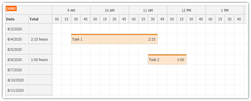
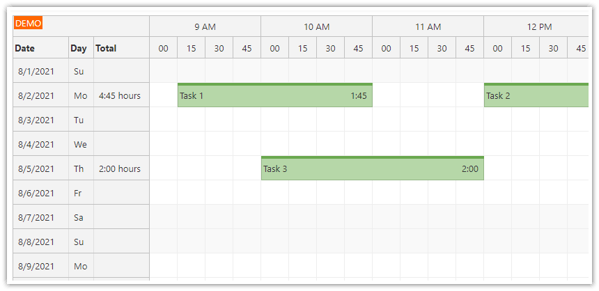
Angular 8 Timesheet component created using Angular Scheduler component from DayPilot Pro for JavaScript package (trial version, see License below).
Pre-configured Angular 8 project with source code and all required boilerplate.
You can generate your own Angular project with pre-configured Timesheet using Timesheet UI Builder application.
New version of Angular timesheet project
There is a new version of this tutorial available:
License
Licensed for testing and evaluation purposes. Please see the license agreement included in the sample project. You can use the source code of the tutorial if you are a licensed user of DayPilot Pro for JavaScript.
Minimum Angular Timesheet Configuration

This is the minimum Timesheet configuration that will display the current month, one day per row. The timesheet view is created using Scheduler component that is switched to "Days" mode. This mode displays days on the horizontal axis and hours of day on the vertical axis:
import {Component, ViewChild, AfterViewInit} from "@angular/core";
import {DayPilot, DayPilotSchedulerComponent} from "daypilot-pro-angular";
import SchedulerPropsAndEvents = DayPilot.SchedulerPropsAndEvents;

@Component({
  selector: 'timesheet-component',
  template: `
    <daypilot-scheduler [config]="config" [events]="events" #timesheet></daypilot-scheduler>
  `,
  styles: [``]
})
export class TimesheetComponent implements AfterViewInit {

  @ViewChild("timesheet", {static: false})
  timesheet: DayPilotSchedulerComponent;

  events: any[] = [];

  config: SchedulerPropsAndEvents = {
    startDate: DayPilot.Date.today().firstDayOfMonth(),
    days: DayPilot.Date.today().daysInMonth(),
    viewType: "Days",
  };

  constructor() {
  }

}
Ajdusting the Timesheet Appearance

We will configure the timesheet to display 15-minute cells:
config: SchedulerPropsAndEvents = {
  // ...
  scale: "CellDuration",
  cellDuration: 15,
};
The time header will display hours and minutes in two rows:
config: SchedulerPropsAndEvents = {
  // ...
  timeHeaders: [
    {groupBy:"Hour"},
    {groupBy:"Cell", format:"mm"}
    ],

};
We will define two row header columns ("Date", "Day of week"). The first column will display the default text (the date). The second column will display a day of week - we set the column content using onBeforeRowHeaderRender event handler:
config: SchedulerPropsAndEvents = {
  // ...
  rowHeaderColumns: [
    {title: "Date"},
    {title: "Day of week", width: 100},
  ],
  onBeforeRowHeaderRender: function (args) {
    args.row.columns[0].text = args.row.start.toString("dddd");
  },
};
And we will also add a checkbox that lets users show/hide the non-business hours:
@Component({
  selector: 'timesheet-component',
  template: `
    <div class="toolbar">
        Timesheet config:
        <div class="toolbar-item">
         <input type="checkbox" id="nonbusiness" [(ngModel)]="config.showNonBusiness"> <label for="nonbusiness">Show non-business hours</label>
        </div>
    </div>
    <daypilot-scheduler [config]="config" [events]="events" #timesheet></daypilot-scheduler>
  `,

// ...
Full Source Code
And here the final timesheet configuration:
import {Component, ViewChild, AfterViewInit} from "@angular/core";
import {DayPilot, DayPilotSchedulerComponent} from "daypilot-pro-angular";
import {DataService} from "./data.service";
import SchedulerPropsAndEvents = DayPilot.SchedulerPropsAndEvents;

@Component({
  selector: 'timesheet-component',
  template: `
    <div class="toolbar">
        Timesheet config:
        <div class="toolbar-item">
         <input type="checkbox" id="nonbusiness" [(ngModel)]="config.showNonBusiness"> <label for="nonbusiness">Show non-business hours</label>
        </div>
    </div>
    <daypilot-scheduler [config]="config" [events]="events" #timesheet></daypilot-scheduler>
  `,
  styles: [`
      .toolbar {
          margin: 10px 0px;
          font-size: 14px;
          display: flex;
          align-items: center;
      }

      .toolbar-item {
          display: flex;
          align-items: center;
          margin-left: 5px;
      }

  `]
})
export class TimesheetComponent implements AfterViewInit {

  @ViewChild("timesheet", {static: false})
  timesheet: DayPilotSchedulerComponent;

  events: any[] = [];

  config: SchedulerPropsAndEvents = {
    locale: "en-us",
    timeHeaders: [
      {groupBy:"Hour"},
      {groupBy:"Cell", format:"mm"}
      ],
    scale: "CellDuration",
    cellDuration: 15,
    cellWidthSpec: "Auto",
    cellWidthMin: 20,
    eventHeight: 40,
    startDate: DayPilot.Date.today().firstDayOfMonth(),
    days: DayPilot.Date.today().daysInMonth(),
    viewType: "Days",
    showNonBusiness: true,
    businessWeekends: false,
    allowEventOverlap: true,
    rowHeaderColumns: [
      {title: "Date"},
      {title: "Day of week", width: 100},
    ],
    onBeforeRowHeaderRender: function (args) {
      args.row.columns[0].text = args.row.start.toString("dddd");
    },
    timeRangeSelectedHandling: "Enabled",
    onTimeRangeSelected: args => {
      const dp = this.timesheet.control;
      DayPilot.Modal.prompt("Create a new event:", "Event 1").then(modal => {
        dp.clearSelection();
        if (!modal.result) { return; }
        dp.events.add(new DayPilot.Event({
          start: args.start,
          end: args.end,
          id: DayPilot.guid(),
          resource: args.resource,
          text: modal.result
        }));
      });
    },
  };

  constructor(private ds: DataService) {
  }

  ngAfterViewInit(): void {
    var from = this.timesheet.control.visibleStart();
    var to = this.timesheet.control.visibleEnd();
    this.ds.getEvents(from, to).subscribe(result => {
      this.events = result;
    });
  }

}
 DayPilot
