Run The Configurator
Start a new project at https://builder.daypilot.org.
Features
- The online UI configurator lets you customize the JavaScript Scheduler component appearance using point-and-click interface.
- The preview Scheduler instance is updated in real time. It also supports drag and drop operations (event creating, moving, deleting) so you can test the functionality.
- Download a complete project with all dependencies (JavaScript and Angular projects are supported). The generated project includes a trial version of DayPilot Pro for JavaScript.
Configuration Properties

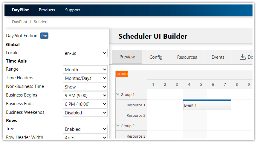
The Scheduler UI Builder displays a set of common Scheduler properties on the left. You can use the drop-down list to select an new value and see the result it immediately in the preview instance of the Scheduler (displayed on the right side):

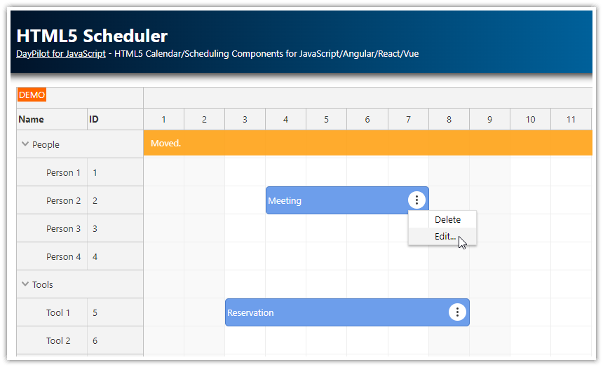
The preview Scheduler changes its appearance in real time - you can see the effect of the selected value immediately. The preview Scheduler is interactive - you can test the drag and drop functionality as well:

The UI Builder also updates the JavaScript "config" object in real time:

You can use this object when creating a new DayPilot.Scheduler instance in your JavaScript application:
<div id="dp"></div>

<script>
  var dp = new DayPilot.Scheduler({
    locale: "en-us",
    days: DayPilot.Date.today().daysInMonth(),
    startDate: DayPilot.Date.today().firstDayOfMonth(),
    timeHeaders: [
      {
        "groupBy": "Month"
      },
      {
        "groupBy": "Day",
        "format": "d"
      }
    ],
    // ...
  });
  dp.init();
</script>
Or you can simply generate and download a complete project (including all dependencies) using the "Generate" button:

This will start a download of a zip file that includes a HTML5 page with the Scheduler, initialized using the selected options, and a trial version of DayPilot Pro library.
JavaScript Scheduler Time Range

The "Range" options lets you select the time range displayed by the Scheduler:
- Day
- Week
- Month
- Year
It translates to "startDate" and "days" properties. Example for the "Month" time range option:
{
  days: DayPilot.Date.today().daysInMonth(),
  startDate: DayPilot.Date.today().firstDayOfMonth(),
  // ...
}
The available range options only cover common scenarios. You can use custom values if the pre-built options don't meet your needs.
JavaScript Scheduler Time Headers

The time headers option lets you select one of the predefined time header rows combinations:
- Months/Days
- Weeks/Days
- Days/Hours
- Days/Hours/15Min
This property also configures the Scheduler grid scale (cell duration) to match the time headers.
Example Scheduler configuration for "Months/Days":
{
  timeHeaders: [
    {
      "groupBy": "Month"
    },
    {
      "groupBy": "Day",
      "format": "d"
    }
  ],
  scale: "Day",
  // ...
}
Example Scheduler configuration for "Days/Hours/15Min":
{
  timeHeaders: [
    {
      "groupBy": "Day",
      "format": "dddd, d MMMM yyyy"
    },
    {
      "groupBy": "Hour"
    },
    {
      "groupBy": "Cell",
      "format": "mm"
    }
  ],
  scale: "CellDuration",
  // ...
}
Hiding Non-Business Hours

By default, it displays the full timeline (including non-business hours). The UI Builder lets you configure the Scheduler to only display business hours.
The business hours are defined using a hours of day (business begins -> business ends) and days of week. The hour range only applies when the grid scale is smaller than 1 day.
Example Scheduler configuration for hidden non-business hours (with business weekends):
{
  showNonBusiness: false,
  businessWeekends: true,
  // ...

}
The Scheduler also supports programmatic customization of the timeline - if the combination of business hours options doesn't work for a specific use case you can hide selected time cells using onIncludeTimeCell event handler or create the timeline manually (by defining individual cells).
Scheduler Grid Cell Width

The "Cell Width" property offers several several pre-configured cell widths:
- Auto
- 20 pixels
- 30 pixels
- 40 pixels
- 50 pixels
- 60 pixels
- 100 pixels
The "Auto" option activates auto cell width mode where the Scheduler calculates the cell width automatically to fill the available space (this option prevents the horizontal scrollbar from appearing).
Event Actions (Drag and Drop)

You can use the UI Builder to customize the event behavior. The following actions can be configured:
- event creating
- event moving
- event resizing
- event deleting
- event click action
- event bubble (hover)
- event context menu (right click)
The configurator translates the selected option to the config using two items:
- property that sets the default action (e.g. eventMoveHandling = "Update")
- event handler that lets you run custom code (e.g. eventMoved)
Scheduler config example for event creating:
{
  timeRangeSelectedHandling: "Enabled",
  onTimeRangeSelected: function (args) {
    DayPilot.Modal.prompt("Create a new event:", "Event 1").then(function(modal) {
      var dp = args.control;
      dp.clearSelection();
      if (!modal.result) { return; }
      dp.events.add(new DayPilot.Event({
        start: args.start,
        end: args.end,
        id: DayPilot.guid(),
        resource: args.resource,
        text: modal.result
      }));
    });
  },
  // ...
}
Loading Data using REST API
The generated JavaScript project includes the config based on your customization, static set of resources (rows) and an empty set of events:
<script>
  var dp = new DayPilot.Scheduler("dp", {
    locale: "en-us",
    cellWidthSpec: "Fixed",
    cellWidth: 40,
    // ...
  });
  dp.resources = [
    {name: "Resource 1", id: "R1" },
    {name: "Resource 2", id: "R2" }
  ];
  dp.events.list = [];
  dp.init();
</script>
In a typical web application you'll want to load the resources and events from the server side using REST API.
The Scheduler includes a helper methods for loading resources and events in JSON format.
Loading Resources
You can load resources using DayPilot.Scheduler.rows.load() method:
dp.rows.load("/api/resources");The specified URL should return the resources array in JSON format. Example response:
[
    {"name": "Resource 1", "id": "R1" },
    {"name": "Resource 2", "id": "R2" }
]
Loading Events
You can load events using DayPilot.Scheduler.events.load() method:
dp.events.load("/api/events");This URL must return a JSON array with the event data:
[
  {
    "id": "1",
    "resource": "R1",
    "start": "2018-01-04T00:00:00",
    "end": "2018-01-08T00:00:00",
    "text": "Event 1"
  }
] DayPilot


