 DayPilot
 Replacement")
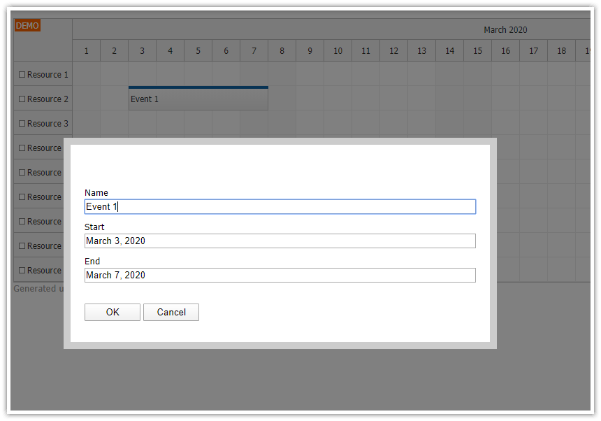
Overview
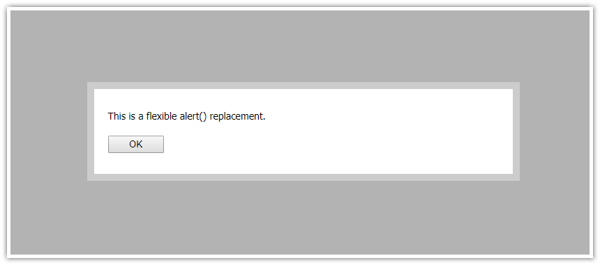
The open-source DayPilot.Modal dialog allows displaying custom modal dialogs (specified using HTML or loaded from a URL). It also includes a simplified API for replacing the built-in browser dialogs (alert(), confirm(), prompt() methods).
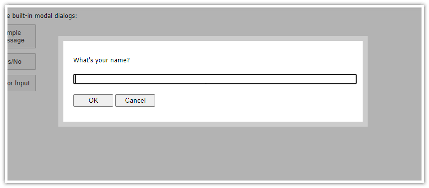
The standard prompt() modal dialog can be replaced using DayPilot.Modal.prompt() method.
The replacement provides a few advantages over the built-in function:
You can use custom CSS to adjust the appearance
The description can be specified as plain text or HTML
The modal dialog can be moved using drag and drop
Ensure that the modal dialog has the same appearance in all browser
You can override the text of the OK/Cancel buttons
Includes DayPilot.Modal 3.10.1 (see also release history).
See also examples of other DayPilot.Modal features.
License
Apache License 2.0
Live Demo
See Also

Modal Dialog Builder: Build a custom modal dialog using an online application!
API: prompt() vs. DayPilot.Modal.prompt()
The DayPilot.Modal.prompt() API is as close to the standard prompt() function as possible:
Standard prompt():
var result = prompt("Please enter your name:", "John Doe");
if (result) {
  console.log("Name:", result);
}
DayPilot.Modal.prompt():
DayPilot.Modal.prompt("Please enter your name:", "John Doe").then(function(args) {
  if (args.result) {
    console.log("Name:", args.result);
  }
});
Using await (in async methods):
const args = await DayPilot.Modal.prompt("Please enter your name:", "John Doe");
if (args.result) {
  console.log("Name:", args.result);
}
The main difference is that the DayPilot.Modal.prompt() returns a Promise instead of the entered string.
The third parameter (options) can be used to specify additional properties of the modal dialog.
DayPilot.Modal.prompt("Please enter your name:", "John Doe", {top: 200, autoFocus: false}).then(function(args) {
  if (args.result) {
    console.log("Name:", args.result);
  }
});
If you don't specify the default value (string) you can also pass the options object as the second parameter. The DayPilot.Modal.prompt() method will detect the parameter type automatically:
DayPilot.Modal.prompt("Please enter your name:", {top: 200, autoFocus: false}).then(function(args) {
  if (args.result) {
    console.log("Name:", args.result);
  }
});
CSS Themes
The default theme is built-in and you don't need to include any additional CSS file to use it.
This example project uses two additional CSS theme that you can use in your project.
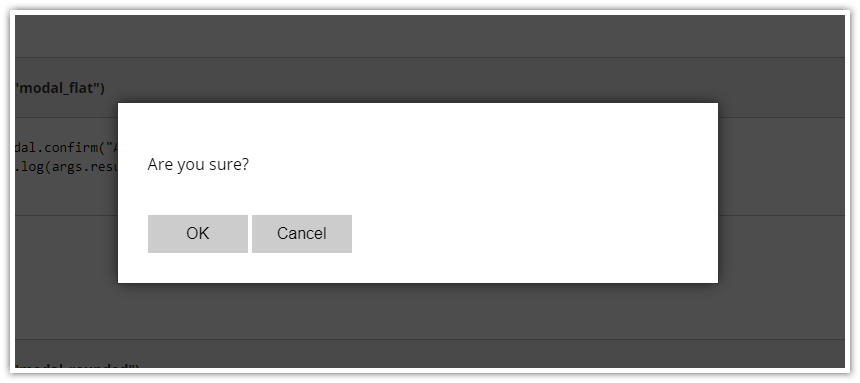
CSS Theme: "modal_flat"

JavaScript:
DayPilot.Modal.prompt("Your name:", { theme: "modal_flat" }).then(function(args) {
    console.log(args.result);
});
CSS:
.modal_flat_background { background-color: #000; opacity: 0.7; }
.modal_flat_main { border: 1px solid #333; box-shadow: 0px 0px 15px -2px rgba(0,0,0,0.75);  }
.modal_flat_main, .modal_flat_main input, .modal_flat_main button {  font-size: 16px; }
.modal_flat_main input, .modal_flat_main button {  padding: 5px; box-sizing: border-box; }
.modal_flat_inner { padding: 30px; background: #fff; color: #000; }
.modal_flat_content { margin: 20px 0px;}
.modal_flat_input { margin: 20px 0px;}
.modal_flat_buttons { margin-top: 40px; }
.modal_flat_main button { background-color: #ccc; color: #000; padding: 10px 20px; border: 0px; cursor: pointer; outline: none; width: 100px;  }
CSS Theme: "modal_rounded"

JavaScript:
DayPilot.Modal.prompt("Your name:", { theme: "modal_rounded" }).then(function(args) {
    console.log(args.result);
});
CSS:
.modal_rounded_background { background-color: #000; opacity: 0.75; }
.modal_rounded_main { border-radius: 4px; }
.modal_rounded_main, .modal_rounded_main input, .modal_rounded_main button {  font-size: 14px; }
.modal_rounded_inner { padding: 20px; background: #fff; color: #000; border-radius: 8px; }
.modal_rounded_main input, .modal_rounded_main button {  padding: 5px; box-sizing: border-box; border-radius: 4px; border: 1px solid #ccc; }
.modal_rounded_content { margin: 10px 0px;}
.modal_rounded_input { margin: 20px 0px;}
.modal_rounded_buttons { margin-top: 30px; margin-bottom: 10px; }
.modal_rounded_main button { background-color: #2367bf; color: white; padding: 10px 0px; border: 0px; cursor: pointer; outline: none; width: 100px; }
button.modal_rounded_cancel { margin-left: 10px; border: 1px solid #2367bf; background-color: #fff; color: #2367bf; }