 DayPilot
License
Apache Software License 2.0
Features
Displays HTML or a standalone page
Modal - hides the background with a semi-transparent div
Draggable modal window
Auto-stretching to show all content
Client-side solution that works with any server-side platform (PHP, Node.js, Ruby)
Built-in support for ASP.NET WebForms on the server side (PostBack)
Works well with jQuery (but jQuery is not required)
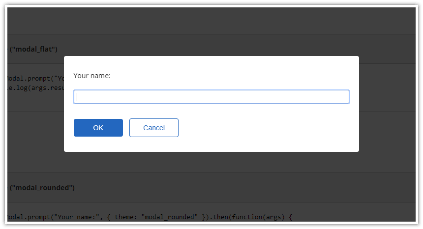
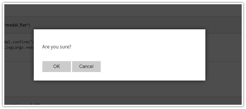
Includes replacements for
alert(),prompt()andconfirm()Dynamic form building using form()
Full CSS styling using themes
New: Modal Dialog NPM Package
Since version 2.9, DayPilot Modal is available as a NPM package (@daypilot/modal). You can add it to your project using npm install command:
npm install @daypilot/modal --saveNew: Dynamic Content Building
Since version 3.0, DayPilot Modal supports building the content dynamically. See more in examples.
Modal Dialog Overview
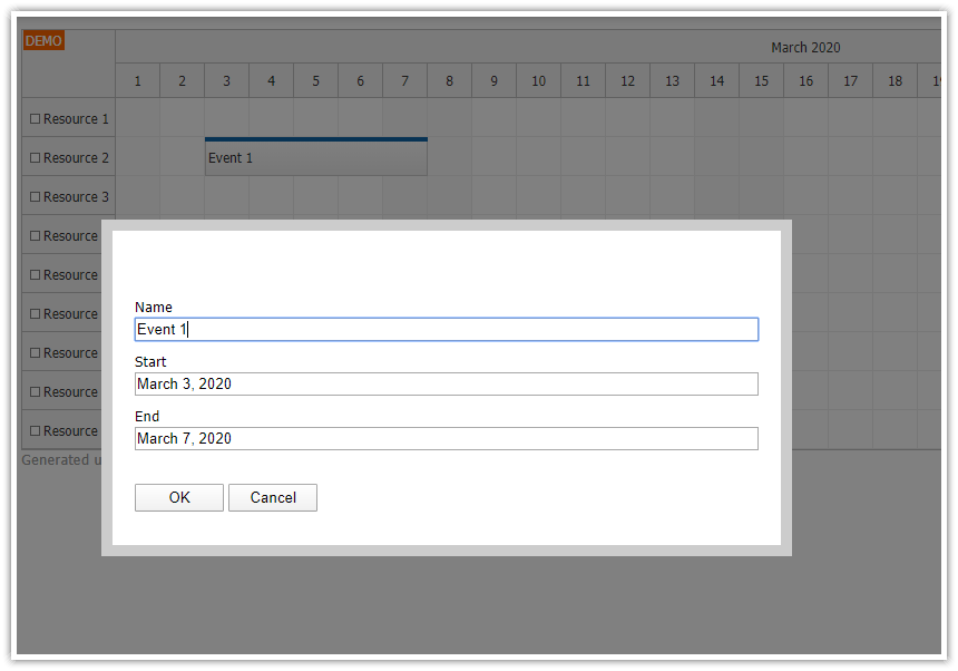
The modal dialog creates an overlay <div> that masks the web page and displays the specified content on top of it. The overlay prevents users from accessing the page and forces them to deal with the modal dialog first. By default, the masking layer has a semi-transparent background - it provides a hint that the page is not accessible but you can still see page content.
The content of the dialog can be defined in multiple ways:
a standalone page defined using a URL
custom HTML
custom DOM element
simplified content of predefined dialogs that replace alert(), confirm() and prompt() functions
The dialog is auto-adjusting, it stretches its size to display the full content without scrollbars.
The dialog can be closed by clicking the masking layer or programmatically by calling DayPilot.Modal.close() from within the dialog.
The appearance can be modified using a CSS theme. Two CSS themes are built-in and you can easily create your own theme.
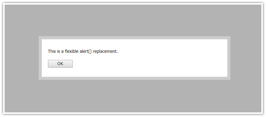
Simple Modal Announcement: alert()

You can show a simple modal dialog that displays a specified text and an OK button using the alert() method:
DayPilot.Modal.alert("Hello, World!");The API is intentionally made as simple as possible so you can use it as a quick replacement for the built-in alert() function. Read more about the alert() replacement.
Displaying Standalone Pages in the Modal Dialog
You can display a standalone page in the modal dialog using showUrl() method:
var modal = new DayPilot.Modal({
  onClosed: function(args) {
    console.log("Modal dialog closed");
  },
  // ...
});
modal.showUrl("Edit.aspx");
Displaying HTML in the Modal Dialog
You can also define the content using HTML:
var modal = new DayPilot.Modal({
  onClosed: function(args) {
    console.log("Modal dialog closed");
  },
  // ...
});
modal.showHtml("<h1>Hello</h1>");
API Documentation
CSS Themes
There are two built-in themes available: modal_default and modal_min. You can change the theme using DayPilot.Modal.theme property.
The default theme (modal_default):

CSS:
.modal_default_main { border: 10px solid #ccc; max-width: 90%; }
.modal_default_content { padding: 10px 0px; }
.modal_default_inner { padding: 20px; }
.modal_default_input { padding: 10px 0px; }
.modal_default_buttons { padding: 10px 0px; }
.modal_default_form_item { margin: 10px 0px; }
.modal_default_form_item.modal_default_form_title { font-size: 2em; font-weight: bold; }
.modal_default_form_item input { width: 100%; }
.modal_default_form_item_label { margin: 2px 0px; }
.modal_default_background { opacity: 0.3; background-color: #000; }
.modal_default_ok { padding: 3px; width: 80px; }
.modal_default_cancel { padding: 3px; width: 80px; }
"modal_min"

CSS:
.modal_min_main { border: 1px solid #ccc; max-width: 90%; }
.modal_min_background { opacity: 0.3; background-color: #000; }
.modal_min_ok { padding: 3px 10px; }
.modal_min_cancel { padding: 3px 10px; }
Custom CSS Theme
You can also create a custom CSS theme:
All CSS classes that belong to the theme need to be prefixed by the theme name.
Include the CSS with the theme classes.
Set the theme property
Example:
JavaScript
var modal = new DayPilot.Modal({theme: "my_modal_theme"});CSS
.my_modal_theme_main { border: 10px solid #990000; }
.my_modal_theme_background { opacity: 0.5; background-color: #000; }
Move the Dialog by Dragging

The modal dialog can be moved using drag and drop (use the border). This feature is enabled by default. You can disable it using dragDrop property.
Nested Dialogs
It is possible to open another modal dialog from an already open dialog. You need to create the DayPilot.Modal instance in the main page (not inside the modal). You can access the main page using window.parent.
AutoStretch
If autoStretch is set to true (default) the window will stretch its height automatically to avoid a vertical scrollbar.
You can also call stretch() manually when needed:
modal.stretch();Built-In Dialog Replacements (alert, prompt, confirm)
Closing the Modal Dialog
JavaScript
Call DayPilot.Modal.close() from within the modal page. The optional parameter will be passed to .onClosed event handler.
var result = { action: "Saved" };
DayPilot.Modal.close(result);
Note that the client-side library (daypilot-modal.js) has to be included in the modal page as well.
ASP.NET MVC
See: How to show a modal dialog in ASP.NET MVC Razor
ASP.NET WebForms
Call Modal.Close() on the page displayed inside the modal dialog (DayPilot.Modal-2.2.cs or DayPilot.Modal-2.2.vb is required):
Modal.Close();Passing result data to the main page
You can pass a custom object to the modal dialog when closing it.
On the server side, use a Hashtable to create a more complex object:
Hashtable ht = new Hashtable();
ht["refresh"] = "yes";
ht["message"] = "Event updated.";
Modal.Close(ht);
You can access this object on the client side in onClosed event handler.
var modal = new DayPilot.Modal();
modal.onClosed = function(args) {
  console.log(args.result.message);
};
modal.showUrl("Edit.aspx");
Using the modal popup with UpdatePanel
At this moment, Modal.Close() doesn't work if you call it during asynchronous PostBack. You need to add the close button to PostBack triggers:
<asp:UpdatePanel ID="UpdatePanel" runat="server">
  <ContentTemplate>
  ...
  </ContentTemplate>
  <Triggers>
    <asp:PostBackTrigger ControlID="ButtonOK" />
  </Triggers>
</asp:UpdatePanel>
You can also update the modal dialog height automatically after the UpdatePanel height changes:
<script type="text/javascript">
Sys.WebForms.PageRequestManager.getInstance().add_endRequest(function (sender, args) {
  modal.stretch();
});
</script>