 DayPilot
All browser JavaScript engines include support for simple modal dialog that can be used to display a message:

JavaScript:
alert("Hi!");It has several drawbacks:
It only displays plain text.
The appearance is defined by the browser and can't be changed.
It's truly "modal" and blocks access to the browser window (try running while (true) alert("Hi!");).
It blocks JavaScript execution until it's closed.
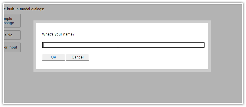
DayPilot Modal Dialog (open-source) includes a simple alert() replacement which addresses these issues. You can use it as a simple drop-in replacement (but note the different return value handling model):
DayPilot.Modal.alert("Hi!");License
DayPilot.Modal is available under Apache License 2.0 (open-source).
Live Demo
See Also

Modal Dialog Builder: Build a custom modal dialog using an online application!
Features
Custom HTML
CSS Styling
Simple built-in CSS theme (no additional dependencies)
Customizable dimensions and position
Supports drag and drop moving
Returns a Promise object for result handling
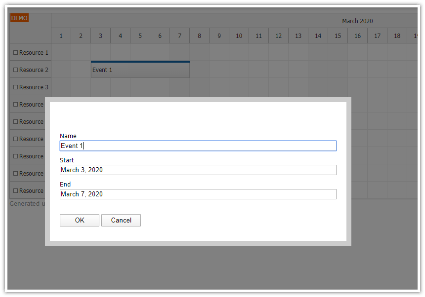
DayPilot.Modal includes additional rich features, such as dynamic form building - see examples
Quick alert() Example

<script src="daypilot.modal.js"></script>
<script>
  DayPilot.Modal.alert("Hello, World!");
</script>
Dialog Configuration
DayPilot.Modal.alert(message[, options]);The options parameter lets you specify additional properties of the modal dialog. The following properties are supported:
left (number; left position in pixels, use null to center the modal dialog)
top (number; top position in pixels, default value: 40)
scrollWithPage (boolean; scroll with page or stay fixed, default value: true)
theme (string; CSS theme name)
dragDrop (boolean; enables drag and drop using the modal border, default value: true)
For a full list of properties, see DayPilot.Modal.
Customizing the Alert Dialog Position
To display the modal dialog in the upper-left corner, use left and top properties:
DayPilot.Modal.alert("Upper-Left Corner", { left: 10, top: 10});CSS Theme of the Alert Dialog
All classes used to mark the modal dialog elements are prefixed with the theme name and an underscore. This way you can create a custom theme that doesn't interfere with other CSS classes used on the web page.
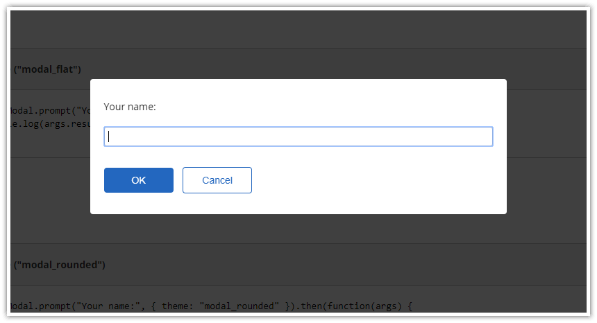
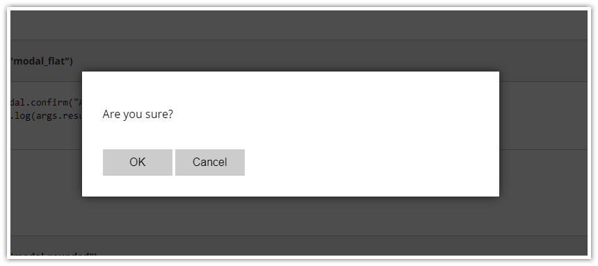
"Flat" CSS Theme

JavaScript:
DayPilot.Modal.alert("Hello, World!", { theme: "modal_flat" });CSS:
.modal_flat_background { background-color: #000; opacity: 0.7; }
.modal_flat_main { border: 1px solid #333; box-shadow: 0px 0px 15px -2px rgba(0,0,0,0.75);  }
.modal_flat_main, .modal_flat_main input, .modal_flat_main button {  font-size: 16px; }
.modal_flat_main input, .modal_flat_main button {  padding: 5px; box-sizing: border-box; }
.modal_flat_inner { padding: 30px; background: #fff; color: #000; }
.modal_flat_content { margin: 20px 0px;}
.modal_flat_input { margin: 20px 0px;}
.modal_flat_buttons { margin-top: 40px; }
.modal_flat_main button { background-color: #ccc; color: #000; padding: 10px 20px; border: 0px; cursor: pointer; outline: none; width: 100px;  }
"Rounded" CSS Theme

JavaScript:
DayPilot.Modal.alert("Hello, World!", { theme: "modal_rounded" });CSS:
.modal_rounded_background { background-color: #000; opacity: 0.75; }
.modal_rounded_main { border-radius: 4px; }
.modal_rounded_main, .modal_rounded_main input, .modal_rounded_main button {  font-size: 14px; }
.modal_rounded_inner { padding: 20px; background: #fff; color: #000; border-radius: 8px; }
.modal_rounded_main input, .modal_rounded_main button {  padding: 5px; box-sizing: border-box; border-radius: 4px; border: 1px solid #ccc; }
.modal_rounded_content { margin: 10px 0px;}
.modal_rounded_input { margin: 20px 0px;}
.modal_rounded_buttons { margin-top: 30px; margin-bottom: 10px; }
.modal_rounded_main button { background-color: #2367bf; color: white; padding: 10px 0px; border: 0px; cursor: pointer; outline: none; width: 100px; }
button.modal_rounded_cancel { margin-left: 10px; border: 1px solid #2367bf; background-color: #fff; color: #2367bf; }
Waiting for the Modal to Close
JavaScript doesn't allow synchronous blocking code waiting for user input (without freezing the browser). That's why the DayPilot.Modal.alert() method returns a Promise which you can use to execute custom code after closing the alert dialog:
DayPilot.Modal.alert("Hello, World!").then(function(args) {
    if (args.result) {
        console.log("You clicked OK.");
    }
    else {
        console.log("You canceled the modal dialog.");
    }
});
The args parameter structure is as follows:
args.result (result object, in case of alert() it can be "OK" string or undefined value)
args.canceled (boolean; this property is set to true when the alert dialog was closed by clicking the background)