Overview
The React Scheduler has a built-in progress bar support. The duration bar displayed at the top of events can be switched to a progress bar mode that displays percentage.
In this tutorial, we will explore ways to display a custom progress bar in Scheduler events.
Includes a trial version of DayPilot Pro for JavaScript (see License below)
License
Licensed for testing and evaluation purposes. Please see the license agreement included in the sample project. You can use the source code of the tutorial if you are a licensed user of DayPilot Pro for JavaScript.
How to add custom content to React Scheduler events

The React Scheduler component lets you customize the event content. There are several options:
Specify raw HTML
Insert custom JSX
Use active areas
By default, the event text is HTML-encoded to prevent XSS attacks. There is also an option to specify raw HTML instead:
onBeforeEventRender: args => {
args.data.html = "<b>bold text</b>";
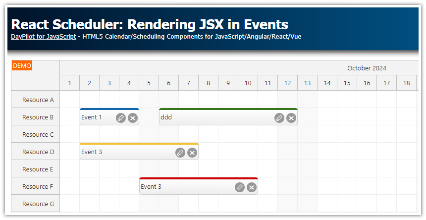
}The React Scheduler also provides an option to insert JSX which is described in a separate tutorial (React Scheduler: Rendering JSX in Events).
In this tutorial, we will use the event active areas feature to add a progress bar to the event bottom.
Change the event text alignment

First, it’s necessary to change the vertical alignment of the event content to make space for the progress bar.
By default, the event content div (marked with scheduler_default_event_inner class) centers the text vertically using display: flex and align-items: center styles.
body .scheduler_default_event_inner {
    align-items: start;
    padding-top: 5px;
}
Add a progress bar using an active area

Now we can add the progress bar using an active area:
onBeforeEventRender: args => {
  const progress = args.data.progress || 0;
  args.data.areas = [
    {
      left: 2,
      right: 2,
      bottom: 2,
      height: 6,
      html: `<div class="progress-bar" style="width: ${progress}%"></div>`
    }
  ];
}
This method uses onBeforeEventRender event handler to customize the event content.
We read the progress bar percentage value from args.data.tags.progress. The args.data property holds the original event data object:
events: [
  {
    id: 1,
    text: "Event 1",
    start: "2022-05-02T00:00:00",
    end: "2022-05-05T00:00:00",
    resource: "A",
    tags: {
      progress: 50
    }
  },

  // ...

]
As you can see, we have used a tags object to add the custom property. Although it is possible to add custom properties directly to the event data object, it is recommended to use the tags object to prevent possible name conflicts. See also DayPilot.Event.data structure description.
The progress bar itself is displayed using two nested elements:
The progress bar is wrapped in an object created using an active area. The position of the active area is set using
top,left,bottomandheightproperties (relative to the event object). In this case, we use an absolute position specified in pixels. It’s worth mentioning that you can also specify the position using a date (start, end properties). That lets you create date-based objects (such as event phases).The inner
<div>element displays the progress bar. It has a gray background and the width corresponds to the progress bar value (in percent).
Progress bar CSS:
.progress-bar {
    position: absolute;
    inset: 0;
    background-color: #aaa;
    border-radius: 3px;
}
We will also add a label that displays the progress bar value as a number using another active area.
onBeforeEventRender: args => {
  const progress = args.data.progress || 0;
  args.data.areas = [

    // ...

    {
      left: 4,
      right: 4,
      bottom: 10,
      height: 12,
      fontColor: "#666",
      style: "font-size: 11px",
      text: `${progress}%`
    }
  ];
}