 DayPilot
Overview
Create a calendar/scheduler UI with a timeline displayed on the vertical axis.
The time cell unit can be set to a range of values, from minutes to weeks.
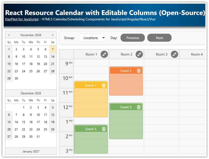
Resources (machines, rooms, cars, people) are displayed on the horizontal axis as columns.
The downloadable React project includes a trial version of DayPilot Pro for JavaScript (see License below)
License
Licensed for testing and evaluation purposes. Please see the license agreement included in the sample project. You can use the source code of the tutorial if you are a licensed user of DayPilot Pro for JavaScript. Buy a license.
React Scheduler with Vertical and Horizontal Timeline
There is a React Scheduler component that can display a timeline on the horizontal axis and resources side-by-side as rows:

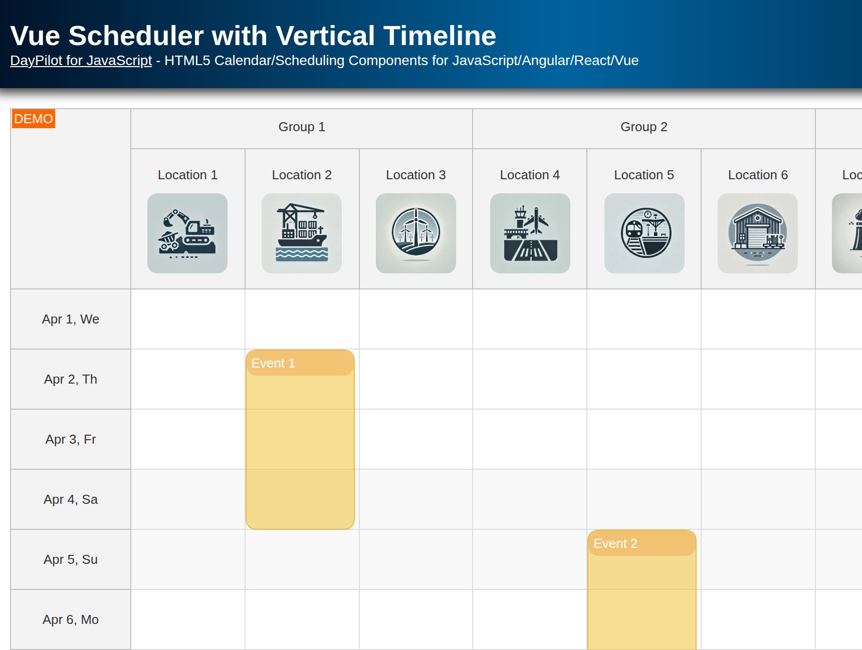
Recently, DayPilot added a new feature that allows displaying a full timeline on the vertical axis using the React Calendar component:

Show Resources as Columns in React Calendar
You can show resources as columns. To switch the React Calendar component to the resource-scheduling calendar mode, use the viewType property:
{
  viewType: "Resources",
  // ...
}
The default view fills the available width. You can also use a fixed column width mode which can help with displaying a large number of columns. The calendar will display a horizontal scrollbar that lets users access all columns.
To define the resources/columns, you can use the columns property of the config object:
useEffect(() => {

  const columns = [
    {name: "Resource A", id: "A"},
    {name: "Resource B", id: "B"},
    {name: "Resource C", id: "C"},
    {name: "Resource D", id: "D"},
    {name: "Resource E", id: "E"},
    {name: "Resource F", id: "F"},
    {name: "Resource G", id: "G"}
  ];

  // load resource and event data using config
  setConfig(prevConfig => ({
    ...prevConfig,
    columns
  }));


}, []);
Vertical Timeline Scale Customization

You can set the duration of the React calendar cells using the scale property.
The calendar time scale can be set to one of the predefined values:
Week
Day
Hour
Minute
A custom number of minutes (e.g., half days, 8-hour shifts, etc.)
The resources (such as machines, tools, devices, locations) are displayed on the horizontal axis, with each resource displaying its timeline as a column.
By default, the time header cells correspond to the calendar grid cells. However, if necessary, you can independently adjust the duration of these header cells.
Calendar config:
{
  viewType: "Resources",
  scale: "Day",
  // ...
}
Timeline Length
The length of the timeline is not limited. The React calendar rendering is optimized and this helps maintaining a good performance when displaying a large number of columns (resources) and a long timeline.
To set the length of the timeline, use the days property.
Calendar config:
{
  viewType: "Resources",
  scale: "Day",

  startDate: "2027-01-01",
  days: 31,

  // ...
}
Snap to Grid

By default, the events snap to the calendar grid cells.
You can turn the snap-to-grid feature off and move the events freely during drag and drop.
Calendar config:
{
  // ...
  snapToGrid: false,
  // ...
}
Hierarchy of Resources

If you need to display a larger number of columns, you may improve the React calendar readability by organizing the columns into a tree hierarchy.
There can be one or more group levels.
The hierarchy can correspond to the physical arrangement of the resources (building, room, rack).
You can also use the tree to group resources by type (cars, tools, people).
Calendar config:
{
  // ...
  columns: [
    { name: "People", children: [
         { name: "John", id: "J" },
         { name: "Mary", id: "M" },
      ]
    },
    { name: "Tools", children: [
         { name: "Hammer", id: "H" },
         { name: "Saw", id: "S" },
         { name: "Screwdriver", id: "SD" },
      ]
    },
  ],
  // ...
}
Full Source Code
This is the source code of our React calendar/scheduler component that shows resources as columns and a vertical timeline.
import React, { useEffect, useRef, useState } from 'react';
import { DayPilot, DayPilotCalendar } from "daypilot-pro-react";

const VerticalScheduler = () => {
  const schedulerRef = useRef();

  const [config, setConfig] = useState({
    viewType: "Resources",
    scale: "Day",
    cellHeight: 40,
    days: 30,
    startDate: "2027-05-01",
    onTimeRangeSelected: async (args) => {
      const dp = args.control;
      const modal = await DayPilot.Modal.prompt("Create a new event:", "Event 1");
      dp.clearSelection();
      if (modal.canceled) { return; }
      dp.events.add({
        start: args.start,
        end: args.end,
        id: DayPilot.guid(),
        resource: args.resource,
        text: modal.result,
        owner: "AB"
      });
    },
    onBeforeEventRender: args => {
      if (!args.data.barColor) {
        args.data.barColor = "#36b7ff";
      }
      if (!args.data.owner) {
        args.data.owner = "??";
      }

      args.data.areas = [];
      args.data.areas.push({
        bottom: 5,
        right: 10,
        width: 28,
        height: 28,
        action: "None",
        backColor: args.data.barColor,
        fontColor: "#fff",
        padding: 1,
        text: args.data.owner,
        style: "border-radius: 50%; border: 2px solid #fff; font-size: 16px; text-align: center;",
      });
    }
  });

  useEffect(() => {

    const events = [
      {
        id: 1,
        text: "Event 1",
        start: "2027-05-02T00:00:00",
        end: "2027-05-05T00:00:00",
        resource: "A",
        owner: "AB"
      },
      {
        id: 2,
        text: "Event 2",
        start: "2027-05-03T00:00:00",
        end: "2027-05-05T00:00:00",
        resource: "C",
        barColor: "#5bbe2d",
        barBackColor: "#93c47d",
        owner: "BK"
      },
      {
        id: 3,
        text: "Event 3",
        start: "2027-05-02T00:00:00",
        end: "2027-05-04T00:00:00",
        resource: "D",
        barColor: "#f1c232",
        barBackColor: "#f1c232",
        owner: "FH"
      },
      {
        id: 4,
        text: "Event 4",
        start: "2027-05-02T00:00:00",
        end: "2027-05-04T00:00:00",
        resource: "E",
        barColor: "#cc4125",
        barBackColor: "#ea9999",
        owner: "IG"
      }
    ];

    const columns = [
      {name: "Resource A", id: "A"},
      {name: "Resource B", id: "B"},
      {name: "Resource C", id: "C"},
      {name: "Resource D", id: "D"},
      {name: "Resource E", id: "E"},
      {name: "Resource F", id: "F"},
      {name: "Resource G", id: "G"}
    ];

    // load resource and event data using config
    setConfig(prevConfig => ({
      ...prevConfig,
      events,
      columns
    }));

    // to improve performance, you can use the direct API to load resources and events instead:
    // getScheduler().update({events, resources});

  }, []);

  const getScheduler = () => schedulerRef.current?.control;

  return (
    <div>
      <DayPilotCalendar
        {...config}
        startDate={"2027-05-01"}
        days={31}
        scale={"Day"}
        ref={schedulerRef}
      />
    </div>
  );
}
export default VerticalScheduler;