 DayPilot
Features
How to customize the Angular Scheduler appearance using CSS themes
Live switching of CSS themes
Show/hide the event duration bar
Sample themes included (White, Transparent, Blue, Green)
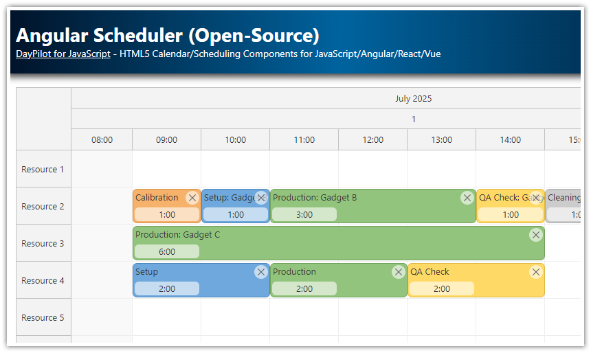
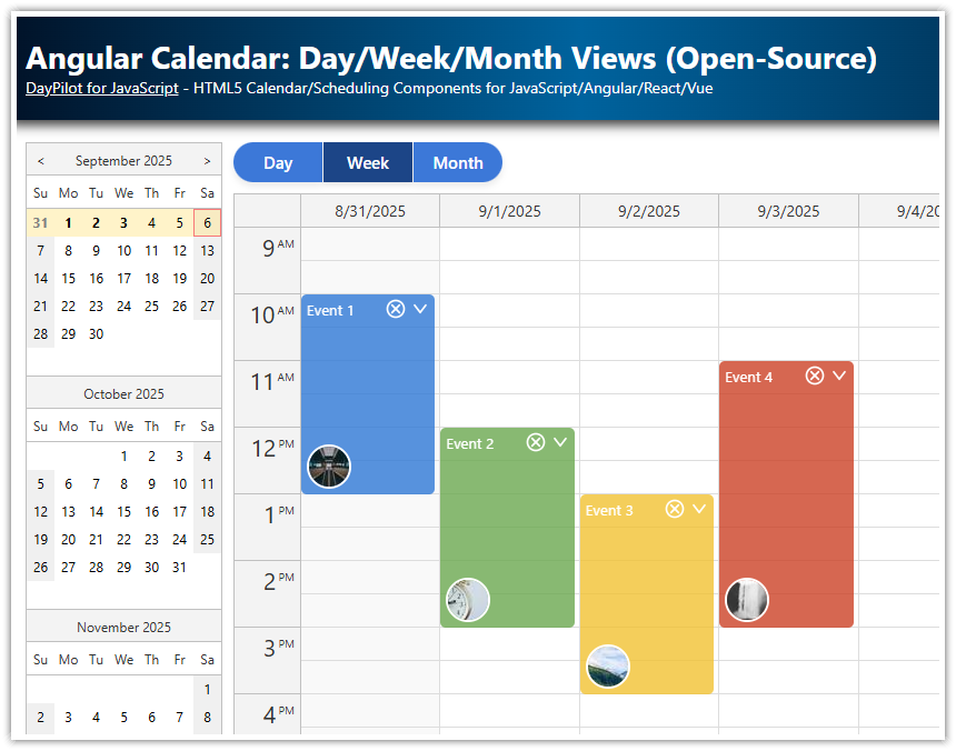
Scheduler CSS Themes
The Angular Scheduler component from the open-source DayPilot Lite for JavaScript scheduling library includes full support for CSS styling. See how to apply a different theme or create a new one.
Default CSS Theme

The "scheduler_default" theme is built in and it doesn't require any additional CSS file to be included. It is used automatically if no other theme is specified.
If you want to use the default theme with minor modifications, there are two options:
You can add a custom style that uses
!importantrule or a more specific selector to override the default appearance. This can work well for testing purposes and for just a few changes.You can also create a new theme using the Theme Designer and make the modifications in the generated CSS file. The default configuration used by the Theme Designer corresponds to the default theme (
"scheduler_default").
Blue Theme

You can use the "scheduler_blue" CSS theme by setting config.theme value to "scheduler_8".
scheduler.component.ts
// ...
export class SchedulerComponent {
  // ...
  config = signal<DayPilot.SchedulerConfig>({
    theme: "theme_blue",
    // ...
  });
  // ...
}
It requires the scheduler_blue.css file to be included.
styles.css
@import url('themes/scheduler_blue.css');
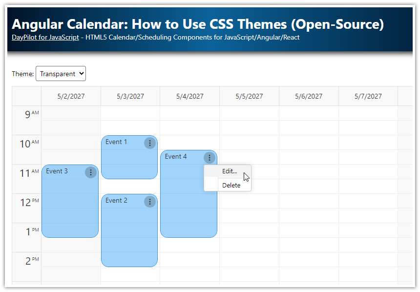
/* ... */Transparent CSS Theme

scheduler.component.ts
// ...
export class SchedulerComponent {
  // ...
  config = signal<DayPilot.SchedulerConfig>({
    theme: "theme_transparent",
    // ...
  });
  // ...
}
styles.css
@import url('themes/scheduler_transparent.css');
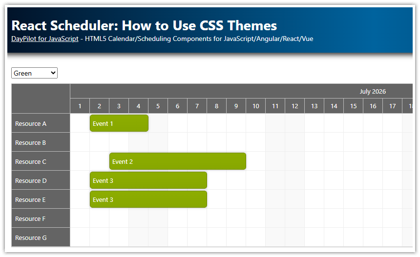
/* ... */Green CSS Theme

scheduler.component.ts
// ...
export class SchedulerComponent {
  // ...
  config = signal<DayPilot.SchedulerConfig>({
    theme: "theme_green",
    // ...
  });
  // ...
}
styles.css
@import url('themes/scheduler_green.css');

/* ... */
White CSS Theme

scheduler.component.ts
// ...
export class SchedulerComponent {
  // ...
  config = signal<DayPilot.SchedulerConfig>({
    theme: "theme_white",
    // ...
  });
  // ...
}
styles.css
@import url('themes/scheduler_white.css');

/* ... */
Duration Bar
Some themes may include support for a duration bar which is displayed at the top of the event boxes. The duration bar can be turned off by removing the styles from the CSS theme. You can also use durationBarVisible property to hide it:
// ...
export class SchedulerComponent {
  // ...
  config = signal<DayPilot.SchedulerConfig>({
    durationBarVisible: false,
    // ...
  });
  // ...
}
Creating a Custom CSS Theme for the Scheduler Component

If you want to create your own CSS theme that matches the color scheme of your application you can use the online Theme Designer to create a new theme. It supports changing the most common properties (such as font family and size, padding, background and text color, etc.) and it generates a complete CSS file for you. You can use it as it is or customize it by manual editing (see also the list of all CSS classes used by the Scheduler).
Changing the Theme on the Fly
The Angular project that is available for download at the top of this article supports changing the Scheduler theme on the fly using a drop-down list. The selected value is bound to the config.theme property and the Scheduler automatically updates the theme when it detects a configuration change.
import { Component, ViewChild, AfterViewInit, signal } from "@angular/core";
import { CommonModule } from "@angular/common";
import { FormsModule } from "@angular/forms";
import { DayPilot, DayPilotModule, DayPilotSchedulerComponent } from "@daypilot/daypilot-lite-angular";
import { DataService } from "./data.service";

type ThemeItem = {
  name: string;
  value: string;
  durationBarSupport?: boolean;
};

@Component({
  selector: "scheduler-component",
  standalone: true,
  imports: [CommonModule, FormsModule, DayPilotModule],
  providers: [DataService],
  template: `
    <div class="toolbar">
      Theme:
      <select
        [ngModel]="config().theme"
        (ngModelChange)="onThemeChange($event)"
      >
        @for (item of themes; track item.value) {
          <option [value]="item.value">{{ item.name }}</option>
        }
      </select>

      @if (!durationBarNotSupported) {
        <label>
          <input
            type="checkbox"
            [ngModel]="config().durationBarVisible"
            (ngModelChange)="onDurationBarVisibleChange($event)"
          />
          Show duration bar
        </label>
      }
    </div>

    <daypilot-scheduler [config]="config" [events]="events" #scheduler></daypilot-scheduler>
  `,
  styles: [` /* ... */ ` ],
})
export class SchedulerComponent implements AfterViewInit {
  @ViewChild("scheduler")
  scheduler!: DayPilotSchedulerComponent;

  events = signal<DayPilot.EventData[]>([]);

  themes: ThemeItem[] = [
    { name: "Default", value: "scheduler_default", durationBarSupport: true },
    { name: "Green", value: "scheduler_green" },
    { name: "Blue", value: "scheduler_blue" },
    { name: "Transparent", value: "scheduler_transparent" },
    { name: "White", value: "scheduler_white" },
  ];

  config = signal<DayPilot.SchedulerConfig>({
    timeHeaders: [{ groupBy: "Month" }, { groupBy: "Day", format: "d" }],
    scale: "Day",
    eventHeight: 40,
    days: DayPilot.Date.today().daysInYear(),
    startDate: DayPilot.Date.today().firstDayOfYear(),
    theme: "scheduler_default",
    durationBarVisible: true,
    rowMarginTop: 2,
    rowMarginBottom: 2,
    onTimeRangeSelected: async (args) => {
      const dp = this.scheduler.control;
      const modal = await DayPilot.Modal.prompt("Create a new event:", "Event 1");
      dp.clearSelection();
      if (modal.canceled) {
        return;
      }
      dp.events.add({
        start: args.start,
        end: args.end,
        id: DayPilot.guid(),
        resource: args.resource,
        text: modal.result,
      });
    },
  });

  constructor(private ds: DataService) {}

  onThemeChange(theme: string): void {
    this.config.update((c) => ({ ...c, theme }));
  }

  onDurationBarVisibleChange(durationBarVisible: boolean): void {
    this.config.update((c) => ({ ...c, durationBarVisible }));
  }

  get durationBarNotSupported(): boolean {
    const theme = this.config().theme;
    return !this.themes.find((t) => t.value === theme)?.durationBarSupport;
  }

  ngAfterViewInit(): void {
    this.ds.getResources().subscribe((result) => {
      this.config.update((c) => ({
        ...c,
        resources: result,
      }));
    });

    const from = this.scheduler.control.visibleStart();
    const to = this.scheduler.control.visibleEnd();

    this.ds.getEvents(from, to).subscribe((result) => {
      this.events.set(result);
    });

    const thisMonth = DayPilot.Date.today().firstDayOfMonth();
    this.scheduler.control.scrollTo(thisMonth);
  }
}