 DayPilot
")
Overview
Touch-friendly event controls for the JavaScript event calendar using active areas.
Custom drag handles for moving and resizing events on touch and desktop.
Tap-activated context menu and inline delete button.
Uses DayPilot Pro for JavaScript (trial version included).
License
Licensed for testing and evaluation purposes. Please see the license agreement included in the sample project. You can use the source code of the tutorial if you are a licensed user of DayPilot Pro for JavaScript.
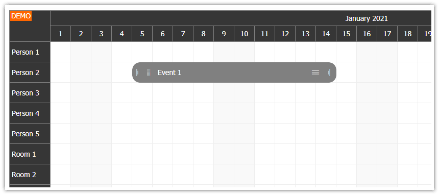
Adding Touch-Friendly Active Areas
The standard event calendar supports touch gestures out of the box — tap-and-hold to move, for example. But on a touch device, those implicit gestures are invisible. There is no cursor change to hint at what is possible.
Active areas solve this by placing explicit, visible controls inside the event box. Each area is a positioned rectangle with an icon and a built-in action. Users see the handle, tap it, and the expected behavior starts immediately — no tap-and-hold required.
We define the active areas in the onBeforeEventRender handler. This keeps the appearance logic on the client side, separate from the event data. It also means the areas are applied automatically to events added at runtime via events.add().
Here is the complete handler with all four active areas:
onBeforeEventRender: (args) => {
  args.data.areas = [
    {
      left: 4,
      top: 2,
      height: 20,
      width: 20,
      symbol: "icons/daypilot.svg#move-vertical",
      fontColor: "#666666",
      action: "Move",
      toolTip: "Drag to move",
      visibility: "TouchVisible",
      style: "cursor: move;"
    },
    {
      right: 4,
      top: 28,
      height: 20,
      width: 20,
      symbol: "icons/daypilot.svg#x-2",
      borderColor: "#666666",
      borderRadius: 10,
      padding: 3,
      fontColor: "#666666",
      toolTip: "Delete",
      visibility: "TouchVisible",
      style: "cursor: pointer;",
      onClick: async (args) => {
        const e = args.source;
        dp.events.remove(e);
      }
    },
    {
      right: 4,
      top: 4,
      height: 20,
      width: 20,
      symbol: "icons/daypilot.svg#threedots-v",
      fontColor: "#666666",
      borderColor: "#666666",
      borderRadius: 10,
      padding: 3,
      action: "ContextMenu",
      toolTip: "More actions",
      visibility: "TouchVisible",
      style: "cursor: pointer;"
    },
    {
      left: "calc(50% - 10px)",
      width: 20,
      height: 20,
      bottom: 0,
      symbol: "icons/daypilot.svg#resize-bottom",
      fontColor: "#666666",
      action: "ResizeEnd",
      toolTip: "Drag to resize",
      visibility: "TouchVisible",
      style: "cursor: s-resize;"
    },
  ];
},
SVG Icons
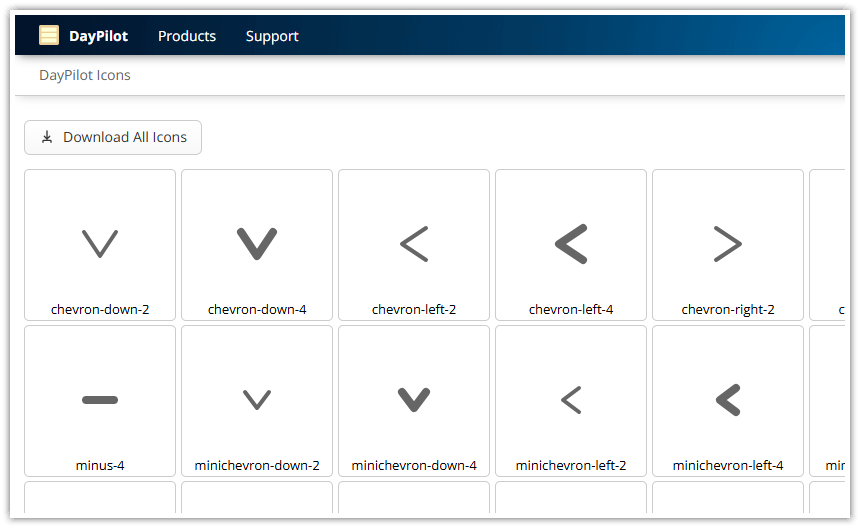
The active areas use icons from the bundled DayPilot SVG icon set (icons/daypilot.svg). Each icon is referenced using the symbol property with the format icons/daypilot.svg#icon-name.
The fontColor property controls the icon color. A medium gray (#666666) works well against the default light event background.
The context menu and delete icons use additional styling to create a circular button appearance: borderColor draws an outline, borderRadius: 10 rounds it into a circle, and padding: 3 adds space between the icon and the border.
Adaptive Visibility
Each icon area uses visibility: "TouchVisible". This adapts the display based on the input method:
Touch devices: The icons are always visible, giving users a clear target to tap.
Desktop: The icons appear only on hover, keeping the event box clean when the controls are not needed.
Other options are "Visible" (always shown) and "Hover" (hover only, no touch support).
Making Space for the Icons
The move handle sits on the left side and the context menu and delete icons sit on the right. To prevent the default event text from overlapping with these controls, we add CSS padding to the event inner element:
.calendar_default_event_inner {
  padding-left: 20px;
  padding-right: 28px;
}
The class name calendar_default_event_inner targets the default calendar theme. If you use a custom theme, replace calendar_default with your theme name.
Move Handle
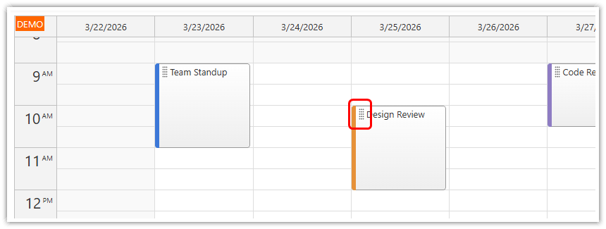
The move handle sits in the upper-left corner of the event. The action: "Move" setting activates drag-and-drop immediately on touch or mousedown — no tap-and-hold delay.
{
  left: 4,
  top: 2,
  height: 20,
  width: 20,
  symbol: "icons/daypilot.svg#move-vertical",
  fontColor: "#666666",
  action: "Move",
  toolTip: "Drag to move",
  visibility: "TouchVisible",
  style: "cursor: move;"
}
The position and size are defined using left, top, width, and height properties. All values are in pixels, relative to the event box.
Delete Icon
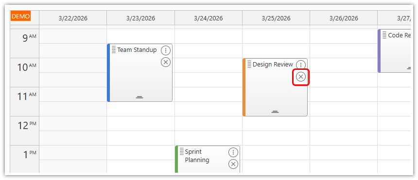
The delete icon appears below the context menu icon on the right side. Instead of using a built-in action, it uses an onClick handler that removes the event directly:
{
  right: 4,
  top: 28,
  height: 20,
  width: 20,
  symbol: "icons/daypilot.svg#x-2",
  borderColor: "#666666",
  borderRadius: 10,
  padding: 3,
  fontColor: "#666666",
  toolTip: "Delete",
  visibility: "TouchVisible",
  style: "cursor: pointer;",
  onClick: async (args) => {
    const e = args.source;
    dp.events.remove(e);
  }
}
The borderColor, borderRadius, and padding properties create a circular button outline, making the delete action visually distinct from the other icon areas.
Context Menu
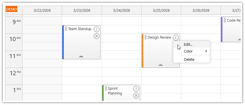
The three-dot icon in the upper-right corner opens a context menu on tap or click.
{
  right: 4,
  top: 4,
  height: 20,
  width: 20,
  symbol: "icons/daypilot.svg#threedots-v",
  fontColor: "#666666",
  borderColor: "#666666",
  borderRadius: 10,
  padding: 3,
  action: "ContextMenu",
  toolTip: "More actions",
  visibility: "TouchVisible",
  style: "cursor: pointer;"
}
The menu is a DayPilot.Menu instance assigned to the calendar's contextMenu property. It supports nested submenus — the color picker below is defined as a child items array:
contextMenu: new DayPilot.Menu({
  items: [
    {
      text: "Edit...",
      onClick: async (args) => {
        const e = args.source;
        const modal = await DayPilot.Modal.prompt("Edit event name:", e.text());
        if (modal.canceled) { return; }
        e.data.text = modal.result;
        dp.events.update(e);
      }
    },
    {
      text: "Color",
      items: colors.map((c) => ({
        text: c.name,
        onClick: (args) => {
          args.source.data.barColor = c.id;
          dp.events.update(args.source);
        }
      }))
    },
    {
      text: "-"
    },
    {
      text: "Delete",
      onClick: (args) => {
        dp.events.remove(args.source);
      }
    },
  ]
}),
The "-" text creates a visual separator between menu sections.
Resize Handle
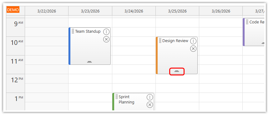
A centered handle at the bottom of the event allows changing the event duration (end time). The action: "ResizeEnd" activates the resize immediately on touch or mousedown.
{
  left: "calc(50% - 10px)",
  width: 20,
  height: 20,
  bottom: 0,
  symbol: "icons/daypilot.svg#resize-bottom",
  fontColor: "#666666",
  action: "ResizeEnd",
  toolTip: "Drag to resize",
  visibility: "TouchVisible",
  style: "cursor: s-resize;"
}
The left: "calc(50% - 10px)" expression centers the 20-pixel-wide handle horizontally within the event box.
Disabling Default Drag and Drop
By default, events can be moved by dragging anywhere on the event body (moveBy: "Full"). On desktop, the cursor changes at the top/bottom edges to indicate resize. On touch, moving requires a tap-and-hold gesture.
Since we have explicit move and resize handles, we disable the default behavior:
moveBy: "None",This ensures that only the active area handles trigger move and resize, making the behavior consistent across desktop and touch devices.
Calendar Dimensions
The default calendar dimensions are designed for desktop use. For better touch usability, the cell and header sizes are increased:
cellHeight: 30,
headerHeight: 30,
hourWidth: 60,
Larger cells make it easier to tap a specific time slot on a phone. The hourWidth value controls the width of the time column on the left side.
Full Source Code
<!DOCTYPE html>
<html>
<head>
  <meta charset="utf-8"/>
  <meta name="viewport" content="width=device-width, initial-scale=1">
  <title>JavaScript Calendar: Touch-Friendly Event Controls</title>

  <!-- ... -->

  <!-- DayPilot library -->
  <script src="js/daypilot/daypilot-all.min.js"></script>

  <style>
    /* make space for the icons */
    .calendar_default_event_inner {
      padding-left: 20px;
      padding-right: 28px;
    }
  </style>

</head>
<body>
<div class="header">
  <h1><a href='https://code.daypilot.org/70608/html5-event-calendar-for-touch-devices-ipad-iphone-android'>JavaScript Calendar: Touch-Friendly Event Controls</a></h1>
  <div><a href="https://javascript.daypilot.org/">DayPilot for JavaScript</a> - HTML5 Calendar/Scheduling Components for JavaScript/Angular/React/Vue</div>
</div>

<div class="main">
  <div id="dp"></div>
  <div class="generated">Generated using <a href="https://builder.daypilot.org/">DayPilot UI Builder</a>.</div>
</div>

<script>
  const colors = [
    {name: "Blue", id: "#3c78d8"},
    {name: "Green", id: "#6aa84f"},
    {name: "Red", id: "#e06666"},
    {name: "Orange", id: "#e69138"},
    {name: "Purple", id: "#8e7cc3"},
  ];

  const dp = new DayPilot.Calendar("dp", {
    viewType: "Week",
    cellHeight: 30,
    headerHeight: 30,
    hourWidth: 60,
    moveBy: "None",
    eventClickHandling: "Disabled",
    eventMoveHandling: "Update",
    onEventMoved: (args) => {
      console.log("Event moved: " + args.e.text());
    },
    eventResizeHandling: "Update",
    onEventResized: (args) => {
      console.log("Event resized: " + args.e.text());
    },
    timeRangeSelectedHandling: "Enabled",
    onTimeRangeSelected: async (args) => {
      const modal = await DayPilot.Modal.prompt("Create a new event:", "Event 1");
      const calendar = args.control;
      calendar.clearSelection();
      if (modal.canceled) { return; }
      calendar.events.add({
        start: args.start,
        end: args.end,
        id: DayPilot.guid(),
        text: modal.result,
        barColor: colors[0].id
      });
    },
    contextMenu: new DayPilot.Menu({
      items: [
        {
          text: "Edit...",
          onClick: async (args) => {
            const e = args.source;
            const modal = await DayPilot.Modal.prompt("Edit event name:", e.text());
            if (modal.canceled) { return; }
            e.data.text = modal.result;
            dp.events.update(e);
          }
        },
        {
          text: "Color",
          items: colors.map((c) => ({
            text: c.name,
            onClick: (args) => {
              args.source.data.barColor = c.id;
              dp.events.update(args.source);
            }
          }))
        },
        {
          text: "-"
        },
        {
          text: "Delete",
          onClick: (args) => {
            dp.events.remove(args.source);
          }
        },
      ]
    }),
    onBeforeEventRender: (args) => {
      args.data.areas = [
        {
          left: 4,
          top: 2,
          height: 20,
          width: 20,
          symbol: "icons/daypilot.svg#move-vertical",
          fontColor: "#666666",
          action: "Move",
          toolTip: "Drag to move",
          visibility: "TouchVisible",
          style: "cursor: move;"
        },
        {
          right: 4,
          top: 28,
          height: 20,
          width: 20,
          symbol: "icons/daypilot.svg#x-2",
          borderColor: "#666666",
          borderRadius: 10,
          padding: 3,
          fontColor: "#666666",
          toolTip: "Delete",
          visibility: "TouchVisible",
          style: "cursor: pointer;",
          onClick: async (args) => {
            const e = args.source;
            dp.events.remove(e);
          }
        },
        {
          right: 4,
          top: 4,
          height: 20,
          width: 20,
          symbol: "icons/daypilot.svg#threedots-v",
          fontColor: "#666666",
          borderColor: "#666666",
          borderRadius: 10,
          padding: 3,
          action: "ContextMenu",
          toolTip: "More actions",
          visibility: "TouchVisible",
          style: "cursor: pointer;"
        },
        {
          left: "calc(50% - 10px)",
          width: 20,
          height: 20,
          bottom: 0,
          symbol: "icons/daypilot.svg#resize-bottom",
          fontColor: "#666666",
          action: "ResizeEnd",
          toolTip: "Drag to resize",
          visibility: "TouchVisible",
          style: "cursor: s-resize;"
        },
      ];
    },
  });
  dp.init();

  const app = {
    init() {
      const events = [
        {
          id: "1",
          start: DayPilot.Date.today().addHours(9),
          end: DayPilot.Date.today().addHours(11),
          text: "Team Standup",
          barColor: "#3c78d8"
        },
        {
          id: "2",
          start: DayPilot.Date.today().addHours(13),
          end: DayPilot.Date.today().addHours(15),
          text: "Sprint Planning",
          barColor: "#6aa84f"
        },
        {
          id: "3",
          start: DayPilot.Date.today().addDays(1).addHours(10),
          end: DayPilot.Date.today().addDays(1).addHours(12),
          text: "Design Review",
          barColor: "#e69138"
        },
        {
          id: "4",
          start: DayPilot.Date.today().addDays(2).addHours(14),
          end: DayPilot.Date.today().addDays(2).addHours(16),
          text: "Client Call",
          barColor: "#e06666"
        },
        {
          id: "5",
          start: DayPilot.Date.today().addDays(3).addHours(9),
          end: DayPilot.Date.today().addDays(3).addHours(10).addMinutes(30),
          text: "Code Review",
          barColor: "#8e7cc3"
        }
      ];
      dp.update({events});
    }
  };
  app.init();
</script>

</body>
</html>
History
March 24, 2026: Modernized. Removed PHP/SQLite backend (pure client-side JavaScript). Replaced icon font with SVG icons. Updated to modern JavaScript (const/let, arrow functions, async/await). Added context menu with edit/color/delete actions and inline delete button. Increased calendar dimensions for touch usability.
December 14, 2015: Initial release (PHP/JavaScript).