Overview
Learn how to use the React Scheduler to display milestones.
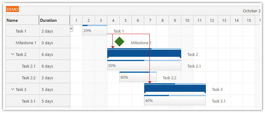
By default, the milestones are displayed using green diamonds.
You can change the milestone color, shape, and description.
Milestones can use custom SVG icons.
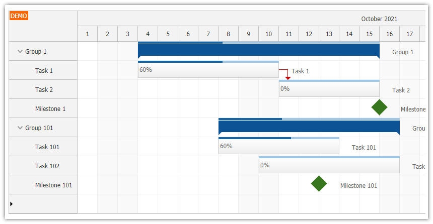
You can use visual links to connect related milestones.
Includes a trial version of DayPilot Pro for JavaScript (see License below)
License
Licensed for testing and evaluation purposes. Please see the license agreement included in the sample project. You can use the source code of the tutorial if you are a licensed user of DayPilot Pro for JavaScript.
React Scheduler Component
This milestone view is based on the React Scheduler component from DayPilot Pro for JavaScript library.
The Scheduler is designed to display events but it can also display milestones - icons placed at specified date/time locations.
How to display a milestone in the scheduler?

To display a milestone, include a new item in the events array and set type: "Milestone".
The required data fields:
idstartresourcetype
You don’t have to include end date. The text property is not required either - it is not displayed anyway. To learn how to display a description next to the milestone, see below.
this.setState({
  events: [
    {
      id: 1,
      start: "2022-01-03T00:00:00",
      resource: "B",
      type: "Milestone",
    },
    // ...
  ],
});
How to use custom milestone colors?
You can set a custom color of the milestone icon using backColor property of the data object.
Blue milestone
this.setState({
  events: [
    {
      id: 2,
      start: "2022-01-03T00:00:00",
      resource: "C",
      type: "Milestone",
      backColor: "#3c78d8",
      text: "Milestone 2"
    },
    // ...
  ],
});
Yellow milestone
this.setState({
  events: [
    {
      id: 3,
      start: "2022-01-04T00:00:00",
      resource: "D",
      type: "Milestone",
      backColor: "#f1c232",
      text: "M3"
    },
    // ...
  ],
});
Red milestone
this.setState({
  events: [
    {
      id: 4,
      start: "2022-01-02T00:00:00",
      resource: "E",
      type: "Milestone",
      backColor: "#cc0000",
      text: "M4"
    },
    // ...
  ],
});
Color defined using CSS
Another option is to use a custom CSS class that will define the background-color style:
this.setState({
  events: [
    {
      id: 8,
      start: "2022-01-09T00:00:00",
      resource: "B",
      type: "Milestone",
      cssClass: "milestone-black",
      text: "M8"
    },
    // ...
  ],
});
Scheduler.css:
.milestone-black .scheduler_default_event_inner {
    background-color: black;
}
How to display a milestone description next to the icon?

Standard Scheduler events use the text property of the data object to specify the text that will be displayed in the event box. Milestones are too small to display any text inside so by default the text property is ignored.
To display the text property value on the right side of a milestone, you can use the htmlRight property.
Remember that all properties that start with html* treat the content as raw HTML which will not be encoded. If the text is provided by the user, it’s necessary to encode the text to prevent XSS attacks.
This onBeforeEventRender handler uses the description specified using text property and displays it next to the icon on the right side.
onBeforeEventRender: args => {
  if (args.data.type === "Milestone") {
    args.data.htmlRight = DayPilot.Util.escapeHtml(args.data.text);
  }
},
To control the distance between the milestone icon and the description, use the eventHtmlRightMargin property. The default value is 10 (pixels).
this.state = {
  eventHtmlRightMargin: 0,
  // ...
};
By default, the text is vertically centered. You move the text to the top of the row using CSS:
.scheduler_default_event_right {
    align-items: start;
}
After reducing the margin and moving the text to the top it looks like this:

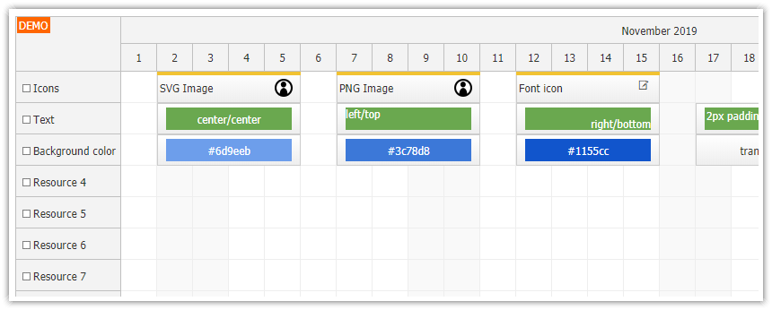
How to change the milestone icon shape?
The default shape is a diamond - created using a square that is rotated using CSS:
.scheduler_default_task_milestone .scheduler_default_event_inner {
  position: absolute;
  top:16%;
  left:16%;
  right:16%;
  bottom:16%;
  background: #38761d;
  border: 0px none;
  transform: rotate(45deg);
}
Circle icon
Milestone:
{
  id: 5,
  start: "2022-01-04T00:00:00",
  resource: "C",
  type: "Milestone",
  backColor: "#cc0000",
  cssClass: "milestone-circle",
  text: "M5"
},
CSS:
.milestone-circle .scheduler_default_event_inner {
    border-radius: 25px;
}
Square icon
Milestone:
{
  id: 6,
  start: "2022-01-04T00:00:00",
  resource: "C",
  type: "Milestone",
  backColor: "#cc0000",
  cssClass: "milestone-square",
  text: "M6"
},
CSS:
.milestone-square .scheduler_default_event_inner {
    transform: rotate(0);
}
SVG icon
You can also hide the default object and display a custom icon using an active area:
this.setState({
  events: [
    {
      id: 7,
      start: "2022-01-11T00:00:00",
      resource: "E",
      type: "Milestone",
      cssClass: "milestone-blank",
      text: "M7",
      areas: [
        {left: 0, right:0, top: 0, bottom: 0, symbol: "daypilot.svg#figure", fontColor: "#00639e"}
      ]
    },
    // ...
  ],
});
CSS:
.milestone-blank .scheduler_default_event_inner {
    transform: rotate(0);
    background: none;
}
How to restrict drag and drop moving to horizontal (time) direction?
Use moveVDisabled: true in the event data object.
onBeforeEventRender: args => {
  if (args.data.type === "Milestone") {
    // ...
    args.data.moveVDisabled = true;
  }
},
How to delete a milestone?

Standard events use a built-in icon displayed in the upper-right corner. In case of a milestone, this icon will be misplaced and it’s better to turn it off.
Globally:
eventDeleteHandling = "Disabled"Per item (add to the event data object):
onBeforeEventRender: args => {
  if (args.data.type === "Milestone") {
    // ...
    args.data.deleteDisabled = true;
  }
},
You can add an option to delete a milestone using a custom context menu:
onBeforeEventRender: args => {
  if (args.data.type === "Milestone") {
    // ...
    args.data.contextMenu = new DayPilot.Menu({
      items: [
        {
          text: "Delete", onClick: args => this.scheduler.events.remove(args.source)
        }
      ]
    })
  }
},
How to add links between milestones?

The Scheduler supports links between events and you can also use links to connect two milestones or a milestone with an event:
this.setState({
  // ...
  links: [
    {
      from: 4,
      to: 5
    },
    {
      from: 5,
      to: 6
    },
  ]
});
By default, the links use FinishToStart type that connect the end of the source (from) milestone with the start of the target (end) milestone.
You can change the link type using type property:
this.setState({
  // ...
  links: [
    {
      from: 4,
      to: 5,
      type: "StartToStart"
    },
  ]
});